Building Design relaunches
UK architecture weekly Building Design unveils its new look, created by editorial designer Matthew Ball.
Both the tabloid magazine and the website have been redesigned.
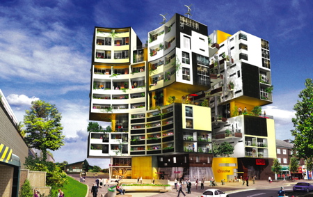
This Friday's cover features a rendering of a proposed apartment building in Sidcup, London, by Studio Egret West (above).
Here is a statement on the new design by BD editor Amanda Baillieu:
--
"Any redesign can only be a starting point in a paper or magazine’s development. BD’s previous design was only two years old but felt not simply old fashioned, but out of step with a more confident profession.
"You only have to look at the job pages of BD every week to know there’s a boom, and now seems a particularly exciting time to be an architect. I wanted the new design to reflect this newfound optimism and to make BD look more sophisticated without losing the sense that it’s a paper — with a short shelf life.
"After a lot of discussion we have stayed as BD but changed the colours and font. Working with designer Matthew Ball, we wanted BD's design to look younger and fresher; the choice of red and orange for the masthead is a way of combing the BD’s “red top" persona with the more contemporary design-conscious orange.
"The font we’ve chosen is Flama, which has never been used in the UK before and was designed by a Portuguese typographer called Mario Feliciano. I like it because it has enough weight to work speak loudly as a headline font but uses softer curves than the shaper edged Amplititude that we have been using.
"We also think it’s highly legible with some interesting characteristics such as the lower case ‘l’, which is reminiscent of European signage typefaces.
"We also looked at the format, unchanged in 37 years, which is based on a broadsheet folded in half. We thought a change to a classic tabloid format, like the Independent for example, might look more elegant.
"We tried it and it was interesting to see, but it was pointless. The novelty factor was outweighed by the impact on the pages, which simply started to look squashed.
"BD is a newspaper so there seemed no good reason to make it feel more like a magazine. In the end the only change has been a slight increase in the width (as much as the presses will allow) and a shaving of 10mm off the length to give the paper a slightly squarer feel.
"We are also making more use of sidebars and other entry points to stories like captions and quotes. BD is a quick read, and that’s what you like, but we have tried to make it even quicker without dumbing down.
"The front page uses the sixth column to promote stories that are inside, while we’ve tried to make the navigation clearer by breaking it into two sections – news and comment which are in the red section – and building reviews, technical coverage and culture in the blue.
"Page numbers have moved so they are more visible and the web address is printed on every page. And I think we have used space more effectively by getting rid of the clunky white band at the top of the page.
"The web site is not simply BD’s weekly content uploaded to the web – it has different content and a different feel. Community has become an overused word when applied to the web, but BD’s loyal following means this was a natural way for us to go.
"Having looked at a lot of different sites ourselves we also felt that that most architects’ sites were either pretentious or obscure. We want to be popular, fun and accessible, and the site has to be easy to use and free."