Jonathan Barnbrook at the Design Museum
Live from the Design Museum: here are some images of work by graphic designer Jonathan Barnbrook that are on show at the Design Museum in London, as part of the Friendly Fire exhibition of his work.
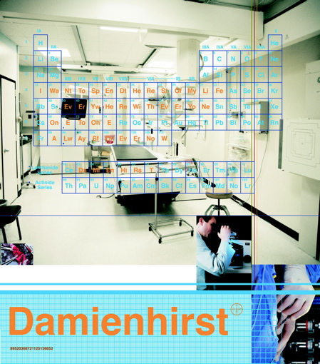
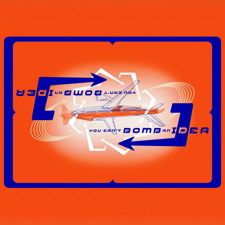
Top image: You Can’t Bomb an Idea screen print 2004. Above: Damien Hirst – I Want to Spend… front cover, 1997
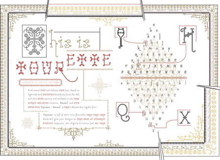
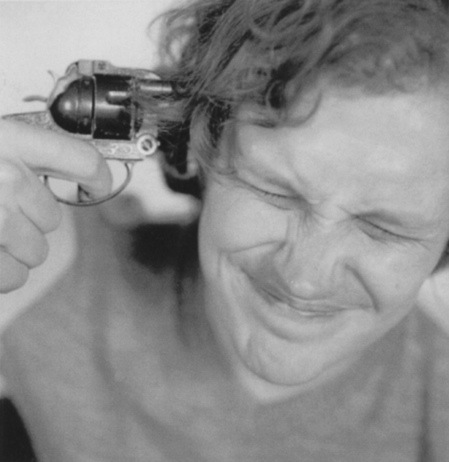
Above: Tourette font, 2005. Below: David Bowie Heathen album cover, 2002

The show opened last week and continues until 10 October.
Above: Jonathan Barnbrook
Below is a press release from the Design Museum about the show:
--
JONATHAN BARNBROOK - Friendly Fire
19 June to 10 October 2007
Jonathan Barnbrook has emerged in the past two decades as one of the UK’s most consistently innovative graphic designers. Pioneering the notion of graphic design with a social conscience, he makes strong statements about corporate culture, consumerism, war and international politics, and through his work in both commercial and non-commercial spheres combines wit, political savvy and bitter irony in equal measures. The Design Museum will exhibit the first British retrospective of his work in Jonathan Barnbrook
Friendly Fire from 19 June to 10 October.
Specially designed for the museum by the Barnbrook studio, Friendly Fire will trace Barnbrook’s career from early experiments in pure typography, pioneering motion graphics in the early 1990s, to more recent print work including the Damien Hirst monograph, I Want To Spend the Rest of My Life Everywhere, with Everyone, One to One, Always, Forever, Now, album design for David Bowie, and projects with collaborators such as the anti-corporate collective Adbusters. Drawn from the designer’s own archive, the work represented will span a wide range of graphic design disciplines.
Founding his studio in 1990 and Virus Foundry in 1997, Barnbrook is perhaps best known for his provocatively named fonts, such as Mason, Exocet, Bastard, Prozac, Nixon and Drone. The controversy surrounding this work stems from its subversive nature and strong social commentary. Barnbrook multi layers meaning and style – working with language and letterforms in an ingenious way.
He uses advertising to reveal anti-corporate messages and exhibitions to promote non-commercial work. The London based studio, which Barnbrook prefers to keep small, has long been preoccupied with projects that question the role of graphic design in society. Friendly Fire alludes to Barnbrook’s critique of his own profession and his commitment to politically motivated design.
The exhibition will be accompanied by the publication of Jonathan Barnbrook’s first monograph Barnbrook Bible, published by Booth-Clibborn Editions.