
At the Royal College of Art Show Two last month, architecture graduate Gemma Douglas presented her conceptual design for a combined Ministry of Defence headquarters and integration centre for citizens arriving in the UK.

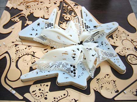
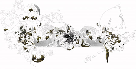
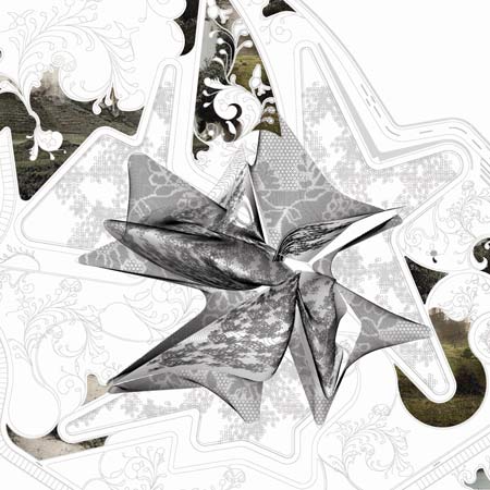
Using imagery derived from needlepoint and heraldry, which Douglas feels represent ideas of Britishness, the building is designed for a fictional new state called Albion in the Thames estuary.

Here’s an explanation from Douglas:
–
UKHQ
Less than half the population of Britain consider themselves British (YouGov poll, 2007)
How can the British town hall, the apparent public face of a community, be updated to reflect a society in constant flux, with a tendency for nostalgic perception of a bygone era?

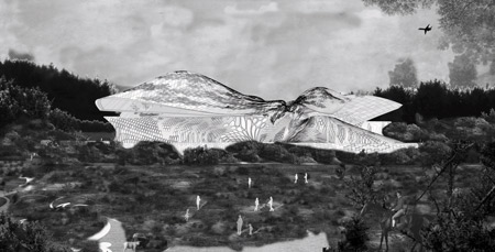
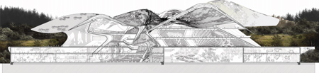
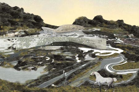
Albion Town Hall is reinvented as a Home Office Department of Britishness and secure immigrant accommodation, to act as the headquarters of a region with displaced populations of soldiers, relocated civil servants and potential new British citizens, and to nurture growth of identity in a new town.

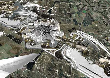
Village greens become secure landscaping, acting as a buffer between industrial and residential areas.

Can architecture help ensure our cultural survival? A British embassy in Britain explores the ambiguity and fluidity of Britishness, as a first port of call for new citizens arriving in the UK, alongside a relocated Ministry of Defence Heaquarters.

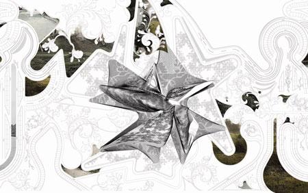
Cross stitch, heraldry, and the picturesque appear as reinvented symbols of our national heritage and form a seemingly benign landscape simultaneously nurturing and securing new citizens and a central government department encouraging assimilation and integration.

–
Posted by Rose Etherington


July 12th, 2008 at 9:55 am
Cool
Fabric identity for the Ministry of Defence – that’ll get them to discover their softer side… whatever!
Like it very much
July 12th, 2008 at 10:52 am
I love it. Graphic design converted into architecture. Flower power for the ministry of defence…
July 12th, 2008 at 10:59 am
As a style of a design this one is already out of date, so i believe there is no use to consider it as an architecture. Also I doubt that the architecture consist only from a design that can be seen only from airplane.
I would say: if it was a design for a cd cover that was released 5 years ago that it is ok, but at the moment you get F.
July 12th, 2008 at 11:19 am
lace architecture… it was only a matter of time for lingerie fetishists to cross over and cover the world with lace…. darn, this planet is getting dumber by the minute….
July 12th, 2008 at 11:21 am
This sounds like a script for a sci-fi film. Or something form Mao’s China: a reorientation center. Ominiously combined with the Ministry of Defense.
As to the building, from what I can make out, it suffers from the Hadid effect. But I can sympathize with the core idea. Unfortunately, nothing is forever.
July 12th, 2008 at 4:01 pm
“Less than half the population of Britain consider themselves British” – well I suppose I know now why the U.K police is called “Scotland yard”.
The reinvented symbols ,Cross stitch, heraldry seem to put quite an appearance .Would love to see more about structure.
July 12th, 2008 at 9:57 pm
2d > 3d?
Its very difficult to grasp what this is, from poor and vague description.
Is the landscape formation purely for the graphic visual effect from that airplane view, or is actually intended to be useful in some way?
July 12th, 2008 at 10:16 pm
Nice work – Are all graduating students from all the schools going to be able to post?
July 13th, 2008 at 12:11 am
brilliant! more drawings please
July 13th, 2008 at 5:33 am
Congratulations Gemma, your project looks fantastic. Very nice.
July 13th, 2008 at 5:37 am
I definitely LUV it! Dun care if it’s another “K” word.
July 13th, 2008 at 3:40 pm
cool
July 13th, 2008 at 5:46 pm
eye candy. but ultimately superficial. the programm is a rather an utopian allusion, a tongue-in-cheek comment at most.
such designs drafted in maya and cohorts, simply fail one tries to add a “normal” section. the form needs some interior correspondence and not just boring slabs and even less imaginative street facades…
besides these hick-ups, nice eye candy.
July 14th, 2008 at 8:41 am
I think the project is blends well into the context (albeit an imaginary one) or perhaps the context blended well into the project? nonetheless this is very promising and inventive work.. good job..
July 14th, 2008 at 3:28 pm
Is that a unicorn in the last rendering?
July 14th, 2008 at 5:17 pm
Huh?
Ok its visually pretty…. from a graphic design point of view, but I really fail to see how it actually translates into architecture from a functional stand point. Perhaps I missed the briefing’s objective.
All in all however, I give it an A for imagination – too bad the renderings weren’t clearer…. it really is hard to picture beyond an arial-view concept
July 15th, 2008 at 2:52 am
Like a flower
July 15th, 2008 at 12:43 pm
ridiculous.
what is the architecture world coming to.
please, save your facile pattern making for graphic design school.
July 15th, 2008 at 1:21 pm
This work is truly outstanding. The critical thesis Douglas has laid out is exceptionally challenging and questioning ideas of ‘britishness’ and exploring how our cultural survival can be strengthened through architecture is a wonderful starting point to generate a theoretical architecture.
Critics who dismiss it as CD cover/ out of date or eye candy totally miss the point.
Well done!
July 15th, 2008 at 3:00 pm
Well this work seems to be arousing some strong feelings! I think its superb – a bold gesture that unites landscape and building in one seamless proposal.
Its seems people have a problem with scale- but when one visits an english country garden or landscaped area one can always appreciate the macro and micro – its not as though the inhabitants of the building would not be able to appreciate the pattern and decorative nature of the plan.
I love it.
July 16th, 2008 at 10:32 am
i think it is another show for computer skills… nothing else what abig deal
July 16th, 2008 at 10:33 am
wooowwww
July 16th, 2008 at 11:51 am
i think it is another show for computer skills..nothing else..what abig deal!!!
July 16th, 2008 at 11:53 am
not impressed
July 16th, 2008 at 3:24 pm
Nothing more than visual attraction. Everything stars and end on website. It’s a wrong way for architecture.
July 16th, 2008 at 10:46 pm
Sorry i never got to see the show. I’ve seen far more “ridiculous” reasons for buildings and think the conceptual reasoning is quite interesting; as a landscape piece i feel it makes some statement, however i would have liked to see some sections to get a better idea of how the intergration spaces of this community would work.
All in all you should be proud though Gemma, I look forward to seeing your first built schemes.
S
July 20th, 2008 at 12:53 pm
heeeyyyyy!!!!!!!!
)))
It’s WONDERFUL!!!!!!!!!!!
that’s the kind of buildings I wanna see around!!!!!!!!!!!!!!!!!!!!
wish you a lot of progress Gemma Douglas
July 21st, 2008 at 12:05 am
The theoretical standpoint seems so weak and naively utopian, if not reactionnary !
For which purpose would the Ministry of Defense mime a flower ? that is such a inaccurate metaphore… Using this kind of commercial makeup for the architecture of such an institution is so dumb and ignorant of the complexities of the problems raised…
Furthermore, the Architecture seems nothing more than a outdated pattern put onto a building that doesn’t take any advantage of its apparent, but illusory complexity.
Pathetical.
July 22nd, 2008 at 6:40 pm
fantastic!!!! love it…….best thing that i’ve seen at the RCA show! well done girl!
July 28th, 2008 at 2:05 pm
Organic, classic and bold attempt of design. I think the designer should be encouraged, honoured and further promoted for New Age Building Design for coming generation. I feel like patting The Desinger.
September 9th, 2008 at 4:39 pm
Go Gem di Gem! xxx