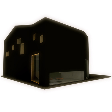
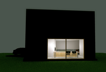
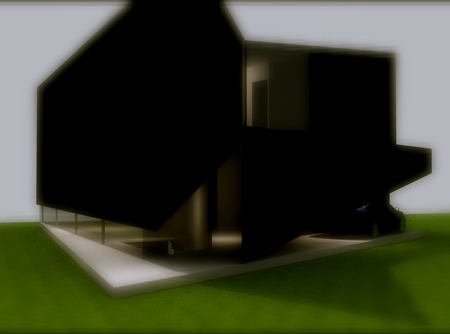
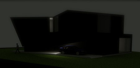
Ferson house by Collectiv4
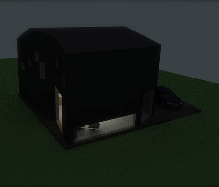
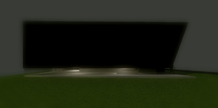
Belgian architects Collectiv4 have designed a house where the entire exterior is covered in black polyurethane.
Here's some information about the project from the architects:
--
We are Belgian architecture firm based in Leuven. After gaining experience for eight years we tried a new approach to potential clients and started with a range of conceptional studies.
In this case, which is an actual project for the Ferson family (not conceptual), we proposed to the client an unexpected proposal for his housing problem and they fell in love instantly.
After a long walk on a path of an extreme concept we had to come back and downscale the project due to budgetary reasons. At this point the project became a quest because the clients had already fallen in love with our first concept.
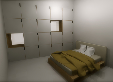
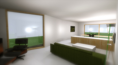
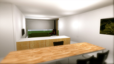
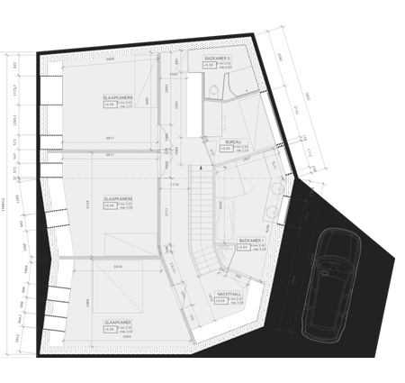
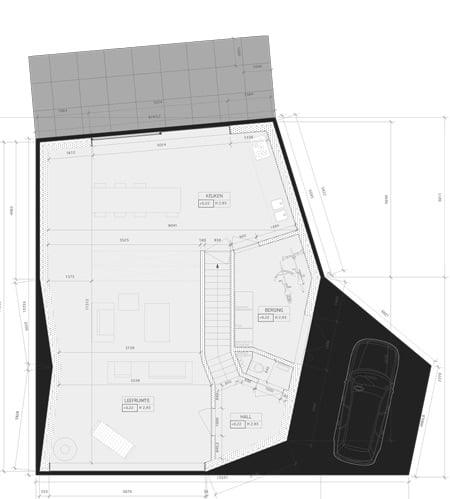
Instead of putting the original concept on a diet, this would remand our clients too much to the first concept, we came up with a compact, simple shaped volume that is spacious enough for a modern family with two up-growing boys.
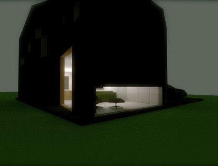
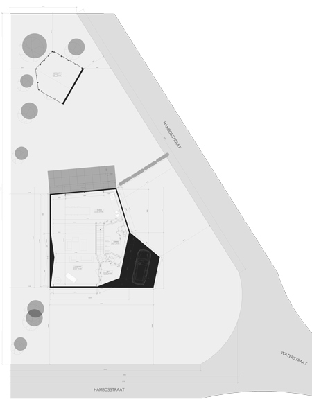
The only thing left from the original concept is the finish of the outer shell, a black polyurethane based waterproof coating (both on walls and roof).