
Trapezoid, a watch designed for fashion brand Issey Miyake by Japanese designer Naoto Fukasawa, has gone on sale.

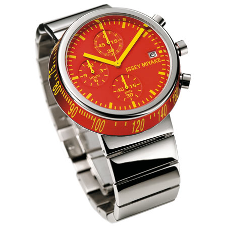
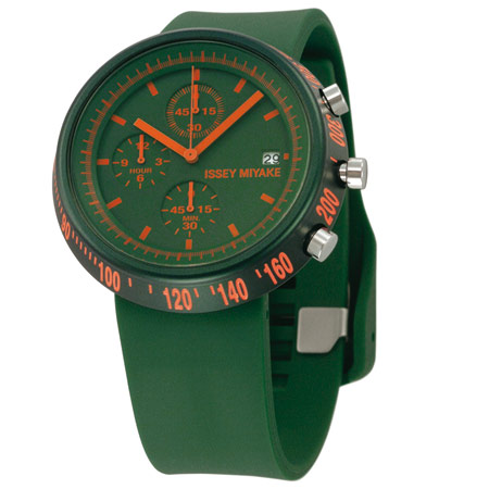
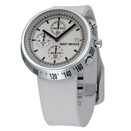
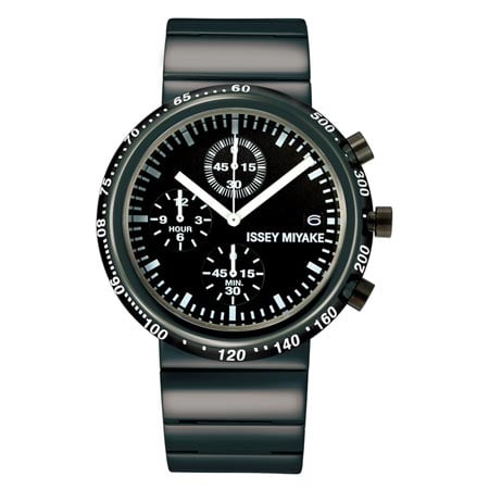
The sloping bezel displays numbers that are stretched like road markings so that they appear normally when seen straight-on.

Retailers Biegel have provided the following text, written by Fukasawa:
–
Designed by Naoto Fukasawa.
As the name “TRAPEZOID” suggests, I first had the image of a trapezoid form in rotation. So, the bezel is cut steeply, and a tachymeter is provided on it. Numbers are proportioned like speed limits painted on a road surface – stretched in height to be readable normally when viewed from the front, despite their steep angles around the circumference.
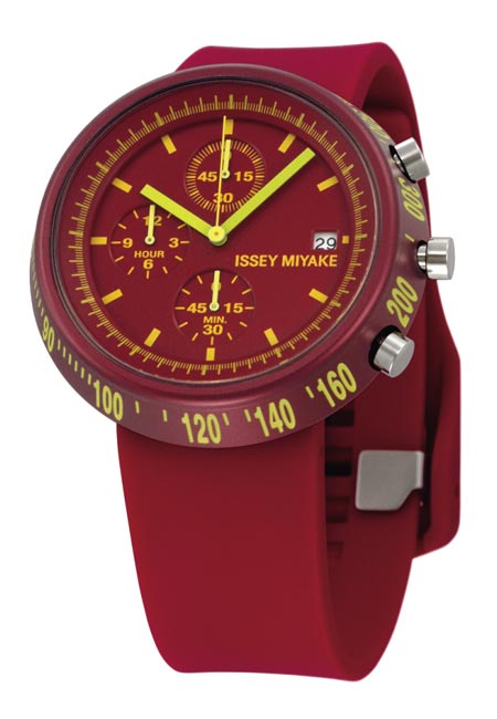
It’s a familiar scene and effect, and I’ve used it now in combination with chronograph functions. In the same way, fashion and motor sports are unified via the use of strong color contrasts; for example, yellow numbers against a red face, and yellowgreen against a blue face.

–
Posted by Matylda Krzykowski


November 25th, 2008 at 7:51 pm
luv ly
November 25th, 2008 at 8:31 pm
Great graphic job, although in reality this watch is too thick for my liking, which makes me then wonder if its just to justify the ’stretched numbers’ effect ?
November 25th, 2008 at 9:54 pm
I think these are really quite wonderful. But, who wears a watch anymore?
November 25th, 2008 at 11:02 pm
Nice colours – but rubber straps are a no-go. They don’t last.
November 25th, 2008 at 11:36 pm
cheap looking.
November 25th, 2008 at 11:37 pm
Very very nice
November 26th, 2008 at 1:50 am
Great looking. Does anyone know how much the rubber strap colored ones go for? Thanks.
November 26th, 2008 at 2:03 am
I got say it’s the work of ‘ shooting arrows in the right center of the tenth ring’.
oh, it’s 200 yards away ~
November 26th, 2008 at 2:10 am
Miyake is just wonderful!
Simple and beautiful!
What a pleasure!
November 26th, 2008 at 2:52 am
I’m living in Hong Kong at the moment and I’ve seen this watch selling in shops since last year…. it’s not new at all. I’m sure some others have seen it on sale too. Strange….. I like it anyhow
November 26th, 2008 at 5:31 am
somethings not quite right, miyake is definitely cooler than this. low on ‘desire’ value. also maybe all watch designers should get a typography class before setting out.
nice colour contrasts though!
November 26th, 2008 at 9:37 am
I want them all! I would change you my wife with fourth one
November 26th, 2008 at 2:41 pm
great graphics indeed
November 26th, 2008 at 3:54 pm
Cosign @ StanleyK, this watch is already on the market, not new at al.
Considered copping it a few months ago, but prefer the real-deal (IWC, Rolex, Jaques Droz, etc.).
November 26th, 2008 at 6:56 pm
NONONONONONONONONONONOOOOOOOOOOOOOOOOOOOOOOOOOOOOOOOOOOOOOOOOOOOOOOO!!!!!!!!!!!!!!!!!!!!!!!!!!!!!!!!!!
((((((((((((((((((
Naoto Fukasawa is one of my favorite designers!!!!, but why!!!!??, why has copy the IKEPOD WATCHES!!!!!!!, NOOOOOOOOOOOOOOOO……OHHHHH MY GOODDDDDDDDDDDDDDDDDDDD……..:((((((((((((((((((((
MUMMY SAY ME THAT IT´S FALSE!!!!!!!
November 26th, 2008 at 10:41 pm
in fact, it was released about two years ago along with the twelve (which is a far more interesting design IMO). however, there were some new colors released a couple months ago.
@kingmu, real men wear watches.
@harpreet, are you sure you know who are you talking about? naoto fukasawa typography expertise borders mastery. look at his seiko power design project 2007 collection for a taste. http://www.seiko-watch.co.jp/p_design/e/products/2007.html
November 26th, 2008 at 11:10 pm
i have always liked fukasawa but i think recently he’s dropping his standards, and there isn’t really anything i like about these to be honest. not as nice as his last watches for miyake which i didn’t particularly like either.
December 7th, 2008 at 6:52 am
dezeen haters. these are ill watches period.