Vinegar Cafe by Himematsu Architecture

| 17 comments

vinegarcafe.jpg

Tokyo architect Shinichiro Himematsu has designed a cafe adjacent to a vinegar factory in Fukuoka, Japan.

vinegarcafe-4.jpg

The cafe, in a converted 130-year-old house, serves dishes using the vinegar from the factory.

vinegarcafe-2.jpg

The following is from Himematsu Architecture:

--

Vinegar Cafe SU

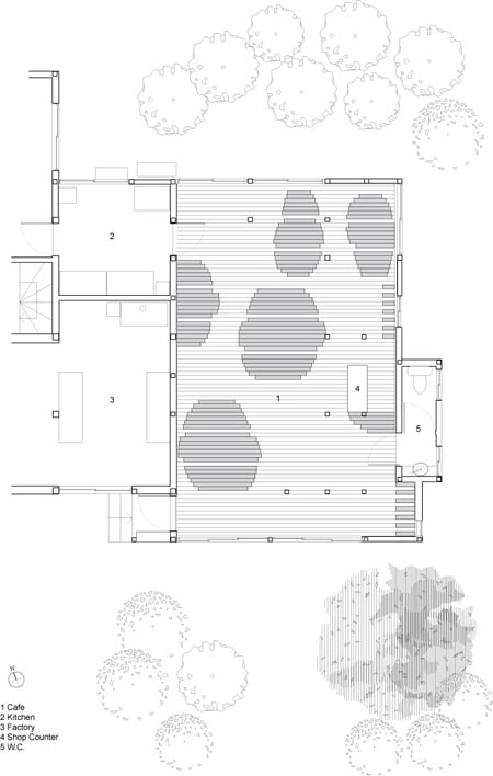
This project is to renovate a 130-year old private house into a café and factory in Fukuoka Japan. The café sells the vinegar produced by attached factory and serves dishes based on them.

vinegarcafe-3.jpg

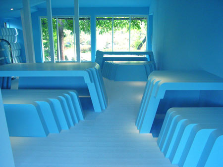
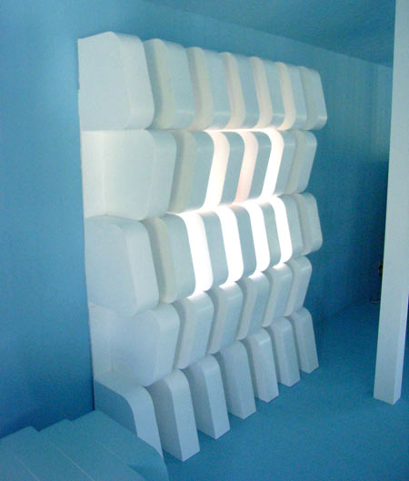
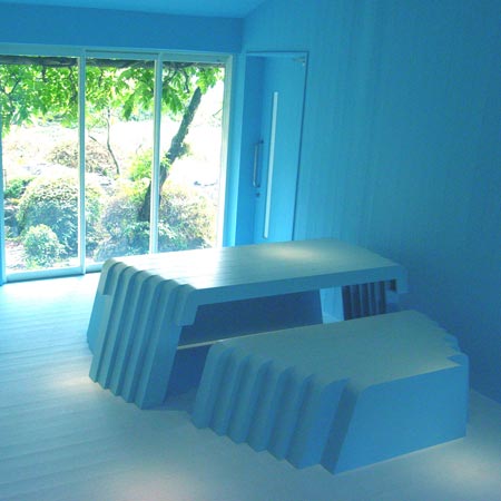
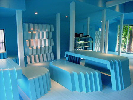
An ivy-covered house exterior is kept intact to harmonize with peaceful village and natural surroundings. On the other hand, interior of the house was reconstructed dramatically under the theme “Slice”.

vinegarcafe-5.jpg

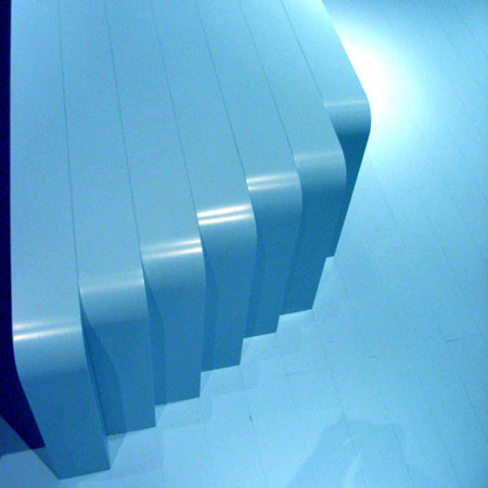
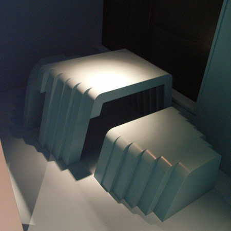
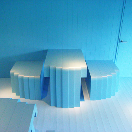
A primary element of the interior is blue bumpy surface composed of tables, chairs shelves and a counter that creates the effect of “Slice”. The floor, wall and ceiling have 105mm interval lines of panel joints that continue to furniture assembled from the parts sliced at the same interval.

vinegarcafe-7.jpg

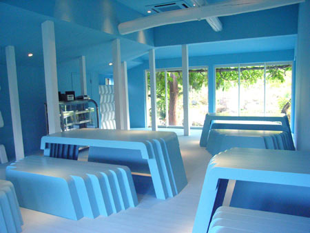
Sliced tools is scattered in the space by considering building structures which is not removable recklessly to increase the effect. In spite of extremely artificial space, continuity between inner space and outside garden gives visitors calmness and comfort to support lunch experience.

vinegarcafe-8.jpg

vinegarcafe-6.jpg

vinegarcafe-9.jpg

One Response to Vinegar Cafe by Himematsu Architecture

  1. Tyler says:

    I don’t understand.

  2. tiago says:

    me neither.

  3. pketh says:

    what part don’t you guys understand?
    I think the main gist of it is that the cuts/slices for all the furniture and it’s arrangement is at the same width as the planks of wood in the floor. So the overall effect of the room is that you have these horizontal lines shared by both the floor and the furniture cohesively running through. It’s easier to see in the plan view at the bottom.

  4. pketh says:

    I like the idea behind the Vinegar Cafe by Himematsu Architecture. Giving the furniture a ‘sliced’ look and having those slices be exactly the same width as the floor and ceiling wood panels is a really cool way to unify a room, and comes across as very unique and interesting.

    But for a place called the Vinegar Cafe which sells dishes based on local vinegar from a nearby factory, the overall look feels very trendy and sterile. encouraging of short non-intimate visits, rather than long enjoyable meals (which you’d also pay more for).

    it’s also kind of anal of the designers to make the furniture immovable, and thus less flexible, in order to preserve that overarching theme (parti) of connecting lines. Also, they state that there is a “continuity between inner space and outside garden gives visitors calmness and comfort to support lunch experience.” But there isn’t even a single plant on the inside, further reinforcing the sterility.

  5. peter says:

    It’s both cool and cool.

  6. Ma Ba says:

    Nothing to understand guys…

  7. Ajua says:

    Yo tampoco…

  8. Tammy says:

    the question is why the chairs need to be so big (as wide as the tables) and take up so much floor space.

  9. iamreply says:

    Tyler Says:

    November 30th, 2008 at 9:26 am
    I don’t understand.

    Typical of a lot of people who read this blog. Just looking at the pretty pictures. You probably read Wallpaper too huh.

  10. M says:

    doesn’t look very enjoyable…

  11. One says:

    Another master piece of a Japanese architecture which the finish says more than it concept… Yet the idea is not a copy of anything, let us say very very original.. is it good?

  12. betuwill says:

    a schoolisch idea,…drived not in a very professional way,..it laks detail on all levels within an interior project and the scale just doesnt feel right,…not convincing at all!!

  13. JJ says:

    Relly Nice!
    It could be fun to check the exterior of the Cafe, “which was kept intact”, supposed to be totaly diferent, tried to check at Himematsu, but no way…

  14. birdie says:

    STYROFOAM MADNESS!

  15. xtiaan says:

    wow they have 5 tables, makes me wonder how much it costs to eat here!

  16. kgt says:

    That was avant guard… 10 years ago…

  17. El Greco says:

    The project could have been improved by merging the furniture with the floor, i.e. applying a radius where the base of tables/benches meet floor… as if slices from the floor were lifted up to form the furniture. Thus, greater continuity between the horizontal surface and the furniture objects.

    Did anyone notice that in plan he has reinterpreted the idea of the karesansui? The most famous example being Ryoan-ji. http://en.wikipedia.org/wiki/Zen_garden

Leave a Reply

Your email address will not be published. Required fields are marked *

*

You may use these HTML tags and attributes: <a href="" title=""> <abbr title=""> <acronym title=""> <b> <blockquote cite=""> <cite> <code> <del datetime=""> <em> <i> <q cite=""> <strike> <strong>