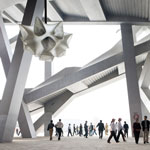
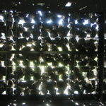
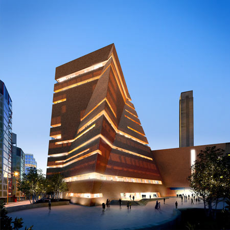
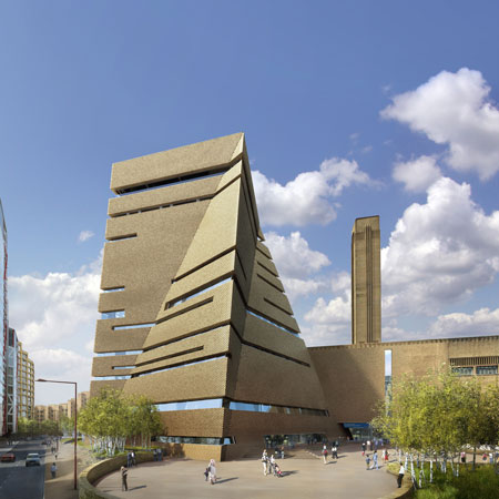
Here are new images of architects Herzog & de Meuron’s extension to the Tate Modern art gallery in London, which was recently granted planning permission.

More details plus images of the architects earlier design for the extension in our earlier story.

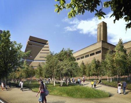
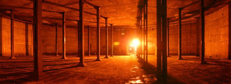
The extension will add a new wing and also convert underground tanks (below), previously used to store oil for the former power station, into new galleries.

More Herzog & de Meuron stories on Dezeen:
.


April 7th, 2009 at 6:46 pm
i appreciate the link to the previous version– the development is certainly more interesting than the project itself.
April 7th, 2009 at 7:08 pm
any idea what the skin is gonna be? it looks like brick by day, but at night there is a glowy internal system.
April 7th, 2009 at 7:24 pm
Its like a mini Tyrrell Corporation headquarters.
April 7th, 2009 at 7:26 pm
Although this is an improvement (in my opinion) on the first story posted on Dezeen about this project, I still think the extension doesn’t interact well with the old power station building. Maybe see the Van Gogh Museum in Amsterdam as an example of a really nice expansion to a gallery. Granted, the Van Gogh expansion is an adjacent building and not a literal above ground connection and there may not be room on this site for that option, I think it is still a relevent case study of aestheticly different but still connected gallery spaces.
April 7th, 2009 at 7:26 pm
What a fantastic design! These guys did it again!
April 7th, 2009 at 8:34 pm
This is a bit better than v1 no? second image kind of kills it…
April 7th, 2009 at 9:33 pm
i do prefer this one actually, much simple approach & it goes well with d’ existing. As I could imagine d’ space of underground tanks would be quite dramatic, I think d’ tate modern is about inside, rather than stacking d’ fancy glass boxes of d’ previous one.
April 7th, 2009 at 10:45 pm
It’s somewhat better than the original ‘mountain of boxes’, but I still don’t understand what they’re trying to achieve with this.. Why create something in a clashing style that will compete with (and diminish) the original structure, instead of complementing it? It doesn’t seem like a H&dM design at all – are they just trying to break out of their ‘box’?
April 7th, 2009 at 11:31 pm
much better then the earlier version, feels more natural with the already existing building!
April 8th, 2009 at 12:00 am
pretty cool! like this simple complex form …
April 8th, 2009 at 12:04 am
version one was much better not just in terms of creativity and vision but it feels more H&deM..
April 8th, 2009 at 12:37 am
Big fan of H&deM. But I believe this extension will kill an amazing project of the Tate Modern itself!
Geometry completely denies the existing if only facade panels are trying to correspond but just on a material level.
April 8th, 2009 at 4:35 am
Don’t judge this one by the renders.
I think HdM are turning the humble brick into a beautiful translucent screen.
Just wait and see.
April 8th, 2009 at 7:18 am
Much much better than version 1, however, as soon as I saw the second image, my heart sank. Boring boring boring, and totally ruins the character of such a beautiful historic building.
April 8th, 2009 at 8:45 am
Ruins the pure lines of the Tate.
April 8th, 2009 at 8:48 am
I think it goes well with the existing building both huge brick monoliths. I only like the first image, the other two are very flat rendered, without contrast or texture.
April 8th, 2009 at 9:38 am
really (really) cant understand this thing… i dig these kind of shapes in many cases and beside the big tanky tate building i like the ide of create something more fragile… but to be honest this design study destroys the feel of tate (the garden, the entrance, the material, everythign is so important to this place)… if seen a lot of projects by HdM which are in strong contect to the existing buildings (caixa, hamburg, etc) but this is so boring and obviously a step backward for the tate
April 8th, 2009 at 12:13 pm
oh nooooo…..what have they done??? *sigh*
April 8th, 2009 at 1:27 pm
Link to Get an Impression how it would look like built
http://thomasmayerarchive.de/details.php?image_id=64156&mode=search&l=deutsch
April 8th, 2009 at 1:48 pm
the landscape utside the tate is abysmal anyway. i wouldnt worry about changing that.
April 8th, 2009 at 4:01 pm
I feel SAD…Tate was such a fantastic place and now…
April 9th, 2009 at 12:21 am
Just a terrible thing to do to such a nice museum.
I don’t know why architects can’t respect the original building.
Having been several times, I really enjoyed the main hall and the outside space in front and on the side of the building. I wonder how the people who live across the street in the circular condo building must feel…
April 9th, 2009 at 4:19 pm
So sad………what a contradiction.
April 10th, 2009 at 4:51 am
Is it just me, or does this look almost just like the Herzog de Meuron museum in Golden Gate Park in San Francisco. Same perforated cor-ten steel skin, twisting sort of general form, and ribbon windows that are set back behind the steel. The one in San Francisco is amazing, so I’m not saying its a bad thing, just saying…
April 10th, 2009 at 10:48 am
i used to like 90% of H&deM projects, but i have to confess that this thing, the Paris project and the Madrid bottle opener stuff are really making me feel sad… angry even… What happened to them ? Going too big?
Ill have to revise my opinion about how great H&deM work is.
April 10th, 2009 at 8:19 pm
not really,not this time,not anymore lately .They lost the “je ne sais quoi.
April 12th, 2009 at 1:45 am
pbozarth, I was going to say the same. This design looks a lot like the tower from the De Young Musem in San Francisco. They must be fascinated with that kind of form lately.
May 12th, 2009 at 1:26 am
http://www.youtube.com/watch?v=Hypdk-EW2zo&feature=channel_page
May 27th, 2009 at 1:21 pm
Why this monstrual building next to the great earlier extension is a big question to me. I didn’t like the first design, I don’t like this one. What happened to rectangular lines? Are they out of fashion?!
September 23rd, 2009 at 5:57 pm
i think this version needs kudos, change is inevitable, and i think its time they went ” out of their box” to dwelve into their sparsely used craziness
H and M is evolving.