
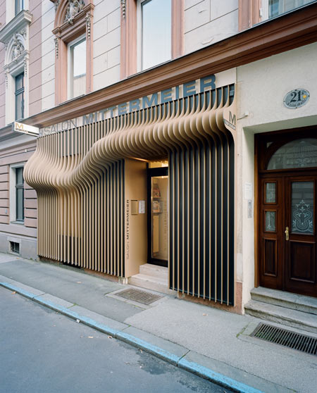
The Salon Mittermeier hair salon in Linz by Austrian architects Xarchitekten features a facade with a "three-dimensional architectural (hair) wave".

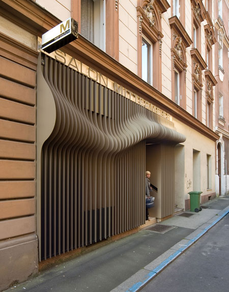
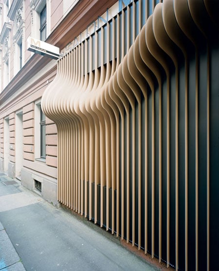
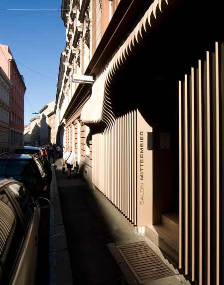
Completed last year, the store front is composed of waterjet-cut, laminated profiles arranged along the facade to create an undulating wave.

Photos are by David Schreyer.

Here's some more information from Xarchitekten:
--
Hairstyle Interface
Salon Mittermeier
For the redevelopment of the façade of the Hair Couture Salon, which is situated in a quiet side street near the busy shopping axes of the city, the function of the hairdresser’s was to be transferred to the exterior to attract attention.

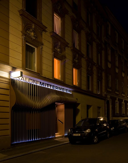
The entire façade now acts as an effective store sign through a three-dimensional architectural (hair) wave, which runs along the exterior. At the same time, this dynamic design fulfils another important function: vertically, it runs like a curtain over the glazed façade, offers a degree of privacy, and thus supports the atmosphere and the character of the salon.

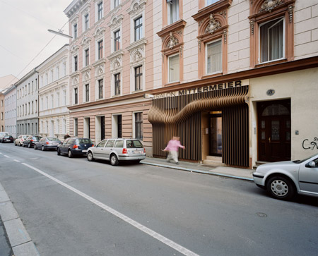
By looking different from each viewpoint in the street, the three-dimensional (hair) wave proves attractive to passers-by. The appearance of the flowing hair as well as the above inscription, were incorporated into the façade in a way that maintains the relationship with the building’s axes. In this way it harmonises extremely well with the generally uniform environment.

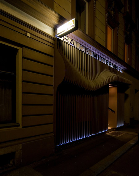
Laminated sheets, arranged vertically with varied spacing and at a right angle to the façade, were used as the material for the (hair) wave. The shapes of the individual sheets were created by a 3D construction process. The shapes were formed using a waterjet cutter. The context of the implementation also includes the colours of the laminated sheets; a golden shade literally swaying between blond and brunette. An integrated handrail in the entrance of the façade demonstrates that despite attaching importance to the basic concept, the function has always been taken into account.

Text: Andreas Kump 2008
Translation: Anja Ganley 2009
Location: Steingasse, Linz
Client: Salon Mittermeier
Direct order 2006
Start of planning: 2006
Start of construction: 2007
Construction: Laminated sheets - slats
Formed with waterjet cutter
Completion date: May 2008
Project-planners: xarchitects, Linz-Vienna
Partners: David Birgmann, Bettina Brunner, Rainer Kasik, Max Nirnberger, Lorenz Prommegger.
Collaborator: Anna Moser.

WTF is this?!
three dimensional architectural hairwaves?
looks like someone had an three dimensional architectural stroke.
the idea is quite nice… as architecture it would win if there would be an relation wih the facades to the left and to the right! and the lightning could be better… the effect of the wave is more or less gone by night! and what about the label on the top right? why not make the 3d parts more extreme so this could be mounted directly without that ugly metal work… after all the interaction between form and fuction isnt really satisfiying… a missed chance imho ;-)
In Brasil we can´t use the public space of the sidewalk like they did.
I like the final result, but I think that the wave could slightly disapear in it´s begin and in the end.
strange – why that outlay?
did you mean "Layout?"
ste what would you put forth as a contemporary definition/interpretation of form and function?
a few thoughts:
I think the wave would look less intrusive if the ends were not so abrupt. (Perhaps the wave could slowly “fade out” at each end? where in nature do waves simply drop off?)
I also think the wave is too pronounced. More sublty might give it greater impact.
(less is more in other words)
The material is too similar to the stone brickwork around it. It loses definition as a result. A brushed aluminum or stainless steel might be more dramatic.
yeah! maybe they could have turned the haiwave at the ends into an giant hair-dryer.
Interesting facade study… Why not?!
What about the interior? How does the ‘theme’ continue..?
It looks quite unfinished… That wave hasn’t a clear way, it is nor intrusive, nor gentle. Interesting idea but presented in a poor state. The lighting is also poor.
Too many pictures about the same thing. Just repeating the view. What happens in a frontal view?
Is there any picture of the interior of the salon?
Very nice and creative facade. Fits well in the historical context. Looks good by night! Thanks
Unrefined/underdeveloped is my initial reaction.
Its a very easy method which brings intense wow-factor; its unfortunate though because the wow-factor could’ve been 10x more- I think that its a perfect example of poorly executed geometrics and limited/lazy deveopment.
This is something budget cuts can’t be blamed for – I mean, come on!
the office da project banq was done much better…
http://www.yatzer.com/assets/Image/2009/february/BANQ_restaurant/BANQ_restaurant_by_Office_dA_photos_by_John_Horner_at_yatzer_4.jpg
looks like a giant heater
Tis good.
Dont worry David, one day they might build yours.
what about pattern flow down to the ground/footpath? why not, then it becomes less of a facade and more of an image that projects the stores identity.
Such a shame its limited to the facade. that’s all ;-)
to hmmm
i wouldn’t go that far an say that there is one definition of the form-function relationship these days… but for me form has either to have a reason or at least a way led to it (morphogenese) or it sould be outside of the context… in this example its an uninspired thing somewhere in between (and you can call me old fashioned for that) so its a bit of a masquerade…
looks like a cat tail underneath a blanket.
im surprised how negative eveyone is about this.
Yes I agree the lighting could have been done better but i think its a very tasteful facade! keep up the nice work!
nice, but where’s the interior shots.
it is just about surface my friends. appearance, wooow effect. and then?
im mongolian person/student/ nice nice nice .dezeen i love you