
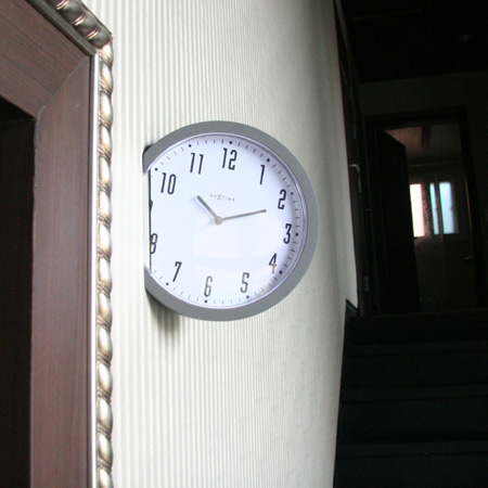
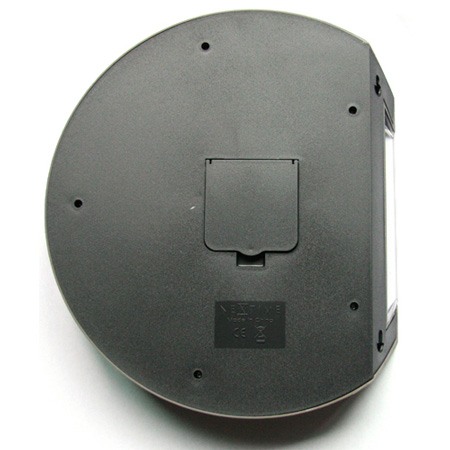
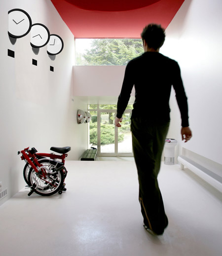
Hong Kong designer Leo Yiu has created a clock that protrudes at an angle from the wall it's mounted on.

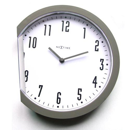
Called Insert, the timepiece has a slice cut from one side of the face that creates a flat edge for hanging it.

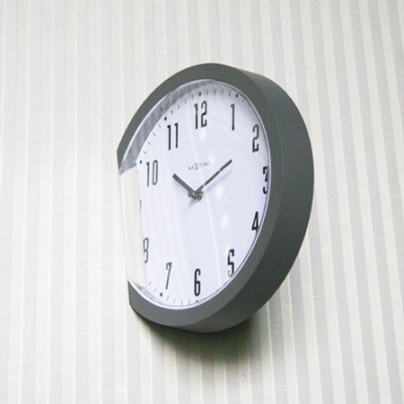
Yiu created the design for clock manufacturer Nextime.

Yiu describes the project as "a simple idea to change the way we see the clock".

See all our stories about watches and clocks in our special category.

pointless…u can only see it from one angle!
Why not?
since you’ll actually be able to see the back of this they should have made more effort with it.
Great idea! And about the practical side (mentioned in the previous comments), every design has its good and not so good side.
I like it, and I think the back on view is fine. You don’t need to hide everything. It’s cool, I like also that it is at a slight angle.
You would only use this where the angle works. Probably could have used more effort on the back, but it’s really cool in the right place.
this is neat, i like the idea… keep the numbers!
its idiosyncratic character outweighs any supposed practicality. heck, analog timekeeping is impractical (or i’m just mentally lazy and prefer digital output). i like simple deft design moves that make you take a second look, and this is a good example.
Really guys?
This would be great mounted on a side wall facing, let’s say you’re desk. Instead of mounting them flush so you have to look at them all in perspective, you would have what looks like an instrument cluster.
I like this, especially in the Willy Wonka, half cut clock sense.
Awesome! Looks like someone threw it against the wall and it stuck. I really like it, and I don’t agree with the detractors who don’t like the back. This is what would happen if a clock crashed into a wall! Simple, attractive…way to make some art!
i like it and think it is harmless…brilliant idea to my view. it is a bit of fun to a spaece can’t see what wrong with this design
There’s nothing wrong with the back side.
It’s normal back appearance is on purpose. It’s supposed to look like a real clock inserted into the wall, not the fake half clock mounted on a wall that it is.
pretending to be for the sake of pretending, post-modern?
lateral thinking…
the Brompton in the last image is indeed very cool
Totally fantastic! Let me join the chorus shutting down ICanHasCheezburgr’s griping. A whole lot of ideas come thru Dezeen, and a very very few actually show us a common item through an entirely new lens, WHILE retaining its function, WITHOUT costing a fortune to manufacture. Hell yes! (I do agree that Yiu could have made the back either really slick, or really ugly-utilitarian. But this designer is operating at a very high level, and I’m willing to give him the benefit of the doubt.)
thanks you guy giving me a useful comments
i just wanna show “clock design” can be think in different way….not only on the dial ,on the 2D outlook.
love the last image, very sculptural… nice clock
I think it really shows design + art merged in a fun way!
congrats!
amsam is right on…nice economical wall timepiece, better without the company logo.
Nice aproach..where can i buy it?
The back looks unattractive..
Hola, me gustaría saber donde puedo comprarlo en sevilla, España
Un saludo