Winners of Dutch Design Awards 2010
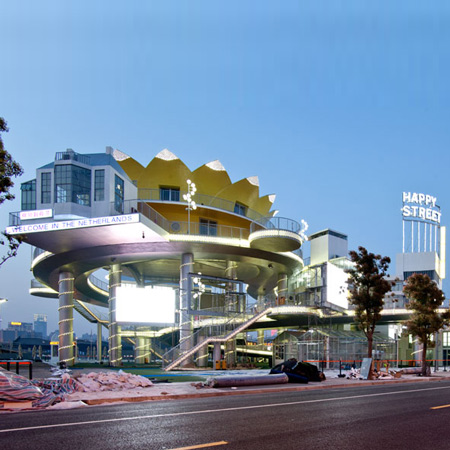
The Dutch pavilion for Shanghai Expo 2010 by architect John Kormeling has won the overall prize for the best Dutch design project at the Dutch Design Awards 2010.
Called Happy Street, the project was awarded the Golden Eye award for the best project in all award categories.
Scroll down to see all the winning projects from this year's awards, announced at a ceremony in Eindhoven on Saturday as part of Dutch Design Week, with captions provided by the judges.
More about the Happy Street project in our earlier story.
Dutch Design Week continues until 31 October.
Spatial
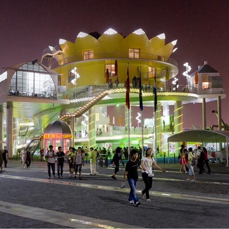
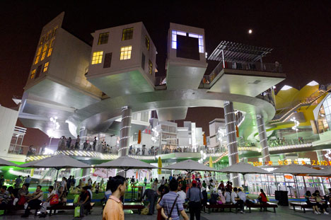
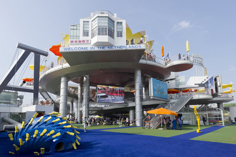
BEST PUBLIC EXTERIOR: Happy Street by John Körmeling (above and top)
Happy Street is not so much a depiction of the Netherlands as it is but rather as how it can be dreamed. Strong elements are the routing and the well-chosen sightlines between the houses. Happy Street makes no secret of its temporary nature, which is made manifest through features such as welded joints left visible.
Studio: John Körmeling
Designer: John Körmeling
Principal: Holland Expo
Photography: John Körmeling, Peter Cox
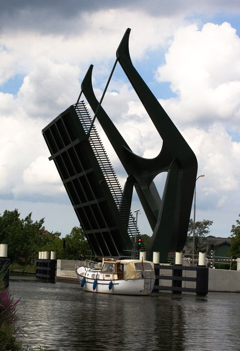
BEST PRODUCT PUBLIC SPACE: ‘Prayer of Shadow Protection’, bridge Vrouwenakker by Nio Architecten (above)
The sculptural design is the result of shaping the traditional drawbridge. Both closed and open, the photogenic bridge offers a beautiful silhouette. Once again an example of the tendency to turn bridges into recognisable identity carriers.
Design: NIO architecten
Principal: Provincie Noord-Holland
Design team: Sean Matsumoto, Maurice Nio, Giuseppe Vultaggio
Photography: Bianca de Wit
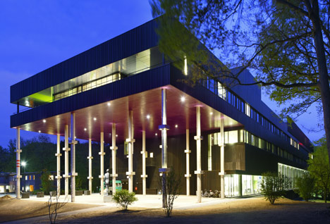
BEST INTEROR COMMERCIAL: Rehabilitation centre Groot Klimmendaal by Architectenbureau Koen van Velsen (above)
The building proves that the social care sector is becoming increasingly important and that functionality and spatial design can play a major part in a situation in which consumers have more and more choice.
Studio: Architectenbureau Koen van Velsen
Designer: Koen van Velsen
Principal: Stichting Arnhems revalidatiecentrum Groot Klimmendaal
Photography: Rob t Hart,René de Wit
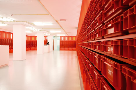
BEST INTERIOR PRIVATE: Library University of Amsterdam by Studio Roelof Mulder & bureau Ira Koers (above)
The concept results in a ‘family’ of integrated elements which, although related, also have an identity of their own. The space is characterised by clarity, colour richness, humour, and a strong graphic quality.
Studio: Studio Roelof Mulder & Bureau Ira Koers
Designers: Roelof Mulder & Ira Koers
Principals: Universiteit van Amsterdam
Photography: Courtesy Roelof Mulder & Ira Koers

BEST INTERIOR CULTURAL: Hermitage Amsterdam by Merkx + Girod, Hans van Heeswijk architecten, Michael van Gessel (above)
Almost everything in the Hermitage in Amsterdam seems successful: the architectural intervention by Van Heeswijk, the interior by Merkx and Girod and the garden design by Michael van Gessel. The contributions from such diverse designers have created a fascinating layeredness determined by common characteristics such as the refined elaboration and the absence of frills.
Project: Hermitage Amsterdam
Short project description: ontwerp vaste museuminterieur en (tijdelijke) openingstentoonstelling
Design: Merkx+Girod architecten
Team: Evelyne Merkx, Patrice Girod, Abbie Steinhauser, Josje Kuiper, Iris Derks, Ruben Bus, Olav van de Brekel in samenwerking met: Hans van Heeswijk architecten (architectuur) Michael van Gessel (landschapsarchitectuur)
Principal: Stichting Hermitage aan de Amstel, Amsterdam
Photography: Roos Aldershoff
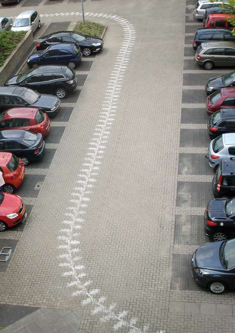
BEST AUTONOMEUS SPATIAL DESIGN: Sand Carpets by Muurbloem design studio; Gonnette Smits, Astrid Stoltenborg (above)
A disarmingly simple way to lend just about any conceivable spot temporarily a ceremonial appearance. The innovative nature is largely due to the technique with the roller.
Studio: Muurbloem design studio
Designers: Gonnette Smits, Astrid Stoltenborg
Principal: Woonbeurs 2009
Photography: Muurbloem design studio
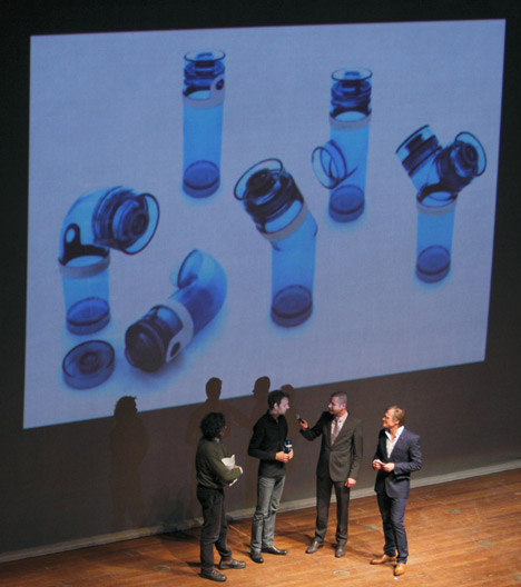
DDA DESIGN & SUSTAINABILITY by the City of Eindhoven: Pipe bottles by DWARS ontwerp; Mark Schulte (above)
A series of five plastic, connectable and easy to wash water bottles and one of five porcelain carafes. The shape of water pipe unions makes Western consumers in restaurants aware of the fact that large parts of the world are deprived of fresh drinking water. And there is more. With the proceeds of these bottles, the initiators fund sanitary facilities and the longest water pipe in the third-world countries. With their design, the designers responded to this sustainable and daring idea.
Studio: DWARS ontwerp
Designer: Mark Schulte
Principal: Jointhepipe.org (Amsterdam), Geraldo Vallen en Lorenzo de Rita
Communication
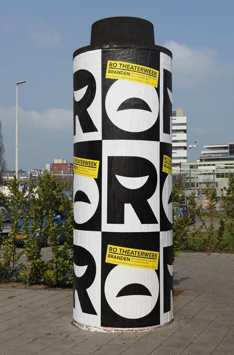
BEST VISUAL IDENTITY: Ro Theater by 75b (above)
The letters of the name Ro contain the pictograms for laughing and crying. Rather a cliché, but according to the jury it matches the programming of the Rotterdam theatre. The house style of the Ro Theater has recently been introduced and still needs time to catch on. With the appealing design, which offers great diversity of images, this will certainly happen.
Studio: 75B
Principal: Ro Theater
Photography: Ro Theater
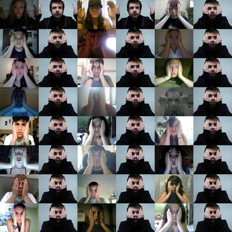
BEST DESIGN DIGITAL MEDIA: C-Mon & Kypski - More Is Less by Jonathan Puckey, Roel Wouters (above)
The phenomenon of crow sourcing has reached the video clip. All visitors to the website Oneframeoffame.com may contribute to the video clip of the song More is Less, created by the Utrecht band C-Mon & Kypski. They imitate the poses of the band members in front of their own webcam and post the recording to the website. One image of each submitted video is used in the video clip. The makers promise to refresh the image every hour. The jury members find the design of the video clip not all that special, but the fact that thousands of people took part in one-frame-of-fame proves that the concept is strong.
Studio: Jonathan Puckey, Roel Wouters
Designers: Jonathan Puckey, Roel Wouters
Principal: C-mon & Kypski
Directed by Roel Wouters & Jonathan Puckey
Producer: Vincent Lindeboom
Technical: Martijn Pannevis & Jonathan Puckey
Choreographer: Sabine Linz
Director of Photography: Sal Kroonenberg
Gaffer: Nicholas Burrough
Editor: Margien Rogaar
Costume Design: Niki Mens
Funded by TAXfonds & Jamm Records
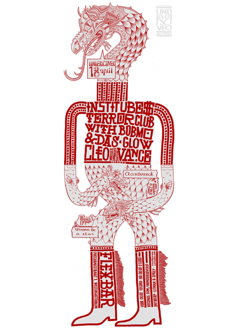
BEST GRAPHIC DESIGN: Series of posters for Undercover festivals by Yvo Sprey en Letman; Yvo Sprey, Job Wouters (above)
It does not happen very often that two designers work separately and then combine their productions. In the case of the series posters for Undercover parties, this working method creates a stunning design that is characterised by a strong autonomous character and extraordinary typography.
Studio: Job Wouters a.k.a. Letman i.s.m. Yvo Sprey e.a.
Designers: Job Wouters a.k.a. Letman i.s.m. Yvo Sprey e.a.
Principal: Undercover
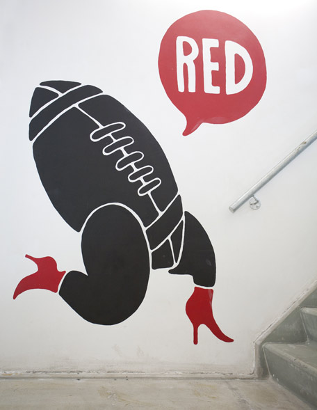
BEST ILLUSTRATION: Nike-Illustrations by Piet Parra (above)
The oeuvre of illustrator and graphic designer Piet Parra is characterised by a very personal style that is particularly appealing to young people. T-shirts featuring his images are to them real must-haves. Parra is much in demand with diverse companies such as Nike and Submarine, who think his style suits them well, too.
Illustrator/designer: Piet Parra
Location: Precinct 5 store Amsterdam
Client: Nike (RED project) & Precinct 5
Photography: Abel Minnee
BEST MOTION DESIGN: Children’s Poststamp animation by Paul Postma, Christian Borstlap, Jasper Boeke (above)
In the animation “Er zijn meer dan 11 triljoen dingen te leren” the simple figures on the Children’s Poststamps designed by Christian Borstlap are brought to life in a catching way. Accompanied by the song "Brother John" by Clutchy Hopkins & Lord Kenjamin, the theme of the Children’s Stamps, ‘Let children learn’ is depicted in a clear manner.
Studio: Paul Postma, Christian Borstlap, Jasper Boeke
Principal: Stichting Kinderpostzegels Nederland
Photography: Paul Postma
Product
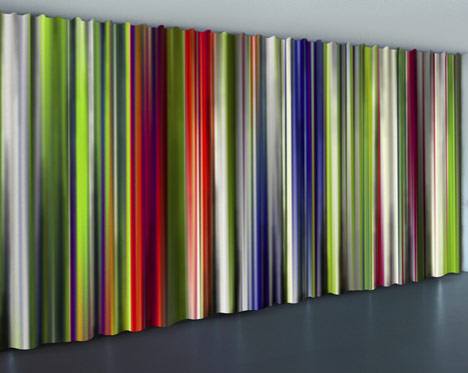
BEST PRODUCT LIVING: Mazzo curtaining by Jeroen Vinken (above)
Jacquard-woven lengths of curtain materials, each with a different image in a minimum of colours provide nonetheless an almost complete colour palette. Smart, well-thought out and functional pattern design.
Studio: Jeroen Vinken
Designer: Jeroen Vinken
Photography: Jeroen Vinken
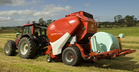
BEST INDUSTRIAL PRODUCT: Balen Lely Welger RP245 by Lely (above)
After the tractors, it’s time for the trailers to look tough and sturdy. A successful approach to car design approach in this agro-industrial product: hay mower and baler in one. The design also ensures an improvement of the reduction of dust released during the compression of mown hay into bales.
Studio: FLEX/the INNOVATIONLAB B.V.
Designer: FLEX/the INNOVATIONLAB B.V.
Principal: Lely Industries N.V.
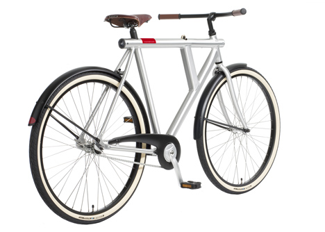
BEST CONSUMER PRODUCT: VANMOOF No 5 stadsfiets by VANMOOF (above)
A safety lock placed in the minimalist triangular frame and LED lighting make this distinctive bike sturdy yet functional for daily use in the big city. Retro in appearance but technically definitely 2010.
Studio: VANMOOF
Designer: Sjoerd Smit
Principal: VANMOOF
Photography: VANMOOF
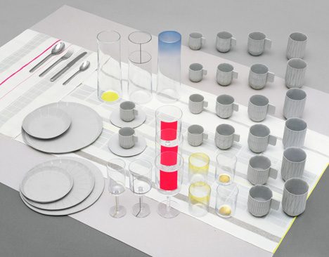
BEST PRODUCT AUTONOMEUS DESIGN: Paper Table by Scholten & Baijings (above)
The starting point as folded paper tableware remains intriguingly visible in the actual translation of these shapes into dinnerware with porcelain, glass and textile elements. Just like the sketches, the various components have a fresh and individualistic appearance.
Design: 'Paper Table'
Studio: Scholten & Baijings
Designers: Scholten & Baijings
Principals: Het Audax Textielmuseum, Royal Leerdam Crystal en Koninklijke van Kempen & Begeer. With thanks to Europees Keramisch Werkcentrum.
Photography: Detailfoto’s ‘Colour Glass’ en ‘Cutlery’ door Scheltens & Abbenes, overig Scholten & Baijings
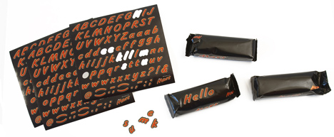
BEST PRODUCT PACKAGING: Mars Messages by FHV BBDO; Mark Muller, Gijs Sluijters, Joris Tol, Demy Sapthu, Thomas Aberson,
Joris van Elk (above)
When the packaging and the product - a chocolate bar filled with a fudge substance – have become so familiar, you can afford to play with it. The wrapper remained ‘virgin’ black. But the consumer can now put his/her own message on the packaging by using a sticker sheet with letters in red Mars typography. Simple and great fun.
Studio: FHV BBDO
Designers: Mark Muller, Gijs Sluijters, Joris Tol, Demy Sapthu, Thomas Aberson, Joris van Elk
Principals: Mars
Photography: FHV BBDO
See also:
.
 |
 |
|
| Last year's Golden Eye award winner |
More about Dutch Design Week |
More about Happy Street |