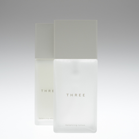
THREE packaging by Nendo
Japanese designers Nendo have designed stackable packaging for a range of products by Japanese cosmetics brand THREE.

The bottles have been designed to resemble blocks of stone that can be displayed together in any configuration.

The products can be displayed by stacking them in different ways.

Light and dark shades of grey distinguish the different products.

Photographs are by Masayuki Hayashi.
Read all our stories about Nendo in our special category.

Here's some more information from the designers:
We designed packaging design for Japanese cosmetic brand “THREE”
“THREE” designed by nendo / Design concept
The packaging design for cosmetics brand THREE. The brand name refers to the three keywords that describe THREE’s fundamental values: ‘natural, honest and creative’.

The brand honours the bounty of nature by using natural ingredients whenever possible. It is honest about its ingredients, allowing no genetically modified products, artificial scents or colours.

And it respects the creative generation of style that is free and unconstrained by existing attitudes.

Our motif for integrating these three core values into the packaging was the image of blocks carved from natural stone.

Blocks of stone are a natural material shaped patiently by human hand; stacked together, they become architecture, freely formed by human creativity and the attributes of the materials.

The final design for the products is a simple one that resembles a block of stone.

The different bottles can be stacked horizontally or vertically, and fit together perfectly, a pleasant surprise.

The rubber finish feels moist in the hand, and the edges are soft and rounded, as though worn away over time. These and other small, thoughtful touches make the products an unexpected delight to use.

We used two different warm shades of grey to distinguish between the skin care and makeup lines, but pared away all other design elements to the bare minimum to bring out the appeal of the products themselves.

See also:
.
 |
 |
|
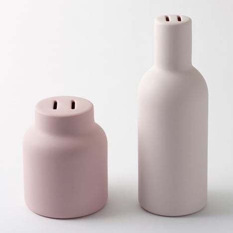
| Clear Perfume Bottle by Nendo for 1% |
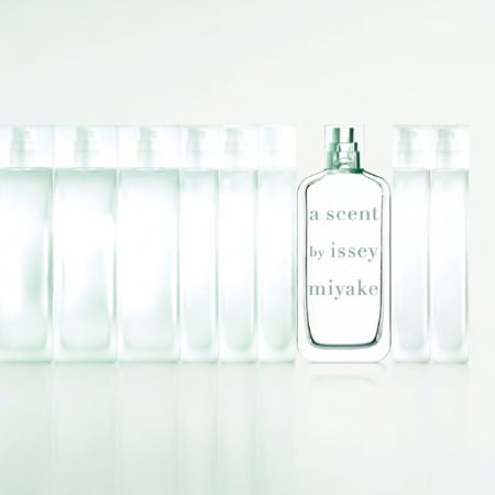
A Scent bottle by Arik Levy for Issey Miyake |
More stories on Nendo on Dezeen |