Penleigh and Essendon Junior Boys School by McBride Charles Ryan
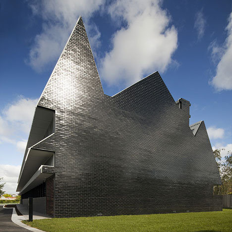
This shimmering silhouette in the shape of three overlapping houses is in fact a junior school for boys in a Melbourne suburb.

The two-storey school building is faced in glossy black tiles and was designed by Australian architects McBride Charles Ryan.

Inside the extruded silhouette the school provides six classrooms, breakout spaces, a meeting room and a staff room.

Classrooms on the first floor have curved ceilings that wrap into the pitched roofs above, while walls in ground floor classrooms have rounded edges.

A long timber bench lines the corridor that links ground floor rooms.

Similar buildings from the Dezeen archive include a hotel that looks like a pile of houses and a furniture showroom that looks like stacked barns.

Photography is by John Gollings.

Here are some more details from the architects:
Penleigh and Essendon Grammar
School – Junior Boys Building
Brief + Design:
Penleigh and Essendon Junior Boys School began in an Italianate mansion on windy hill, opposite the Essendon Footy Club. This building is exceptional in a residential area where Federation housing dominates.

Slowly the school has accumulated much of the property in the block bounded by Nicholson, Raleigh, Napier & Fletcher Streets. Many of the ‘houses’ are now occupied by the school. This new project, a two storey year 5 & 6 block with 3 classrooms above and below, is an important addition to the school and public interface to Nicholson Street.

We wanted this building to acknowledge and exploit its unusual urban condition. All wanted this building to be a unique acknowledgment of an important threshold stage in the boy’s school life. All wanted more than just good accommodation, and we wanted a building of the imagination.

Click above for larger image
This proposal takes just the silhouette of a Federation Home, it is up-scaled, extruded and sliced. The front of the building might be described perhaps as a haunted house, the centre (the extrusion) is vaguely a Shinto Shrine, the rear (which interfaces with the schools ovals), if you squint - The Big Top.

Click above for larger image
The planning is arranged so as to provide northern courtyards to the ground floor classrooms, upstairs the corridor is switched to reduce overlooking to the adjacent neighbour. The ground floor Grade 5 classrooms have rich deep colours and an earthy ambience. The first floor is ethereal. With more than a nod to Utzons Bagsvaerd Church the complex silhouette is smoothed to a cloudlike shape. The extruded chimney a source of light and a means of naturally ventilating the classroom space.

Click above for larger image
Principal Architects: Rob McBride, Debbie-Lyn Ryan
Project team: Benedikt Josef, Amelia Borg, Natasha Maben.