Volksbank Gifhorn by Stephan Braunfels Architekten
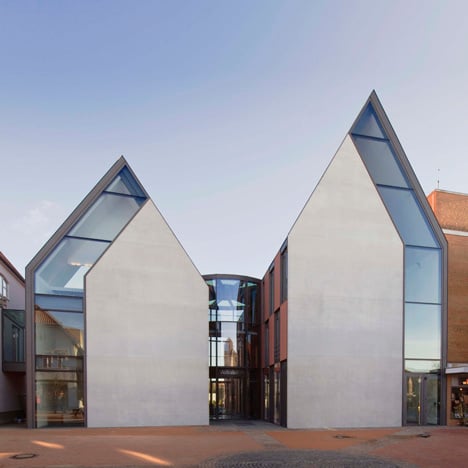
The subtly different proportions of two concrete gables fronting a bank building in northern Germany create the illusion that one side is fatter than the other.

Strips of glazing outline the outer edge of both gables, so that even though one is taller the two elevations still appear to mirror one another from certain angles.

Berlin studio Stephan Braunfels Architekten designed the four-storey building for financial company Volksbank.

A glazed rotunda separates the two gabled wings and accommodates the entrance lobby.

The building’s rear elevation features the same gabled facades as the front, although one projects further than the other to frame an open courtyard.

You can see a few more unusual banks here, including one with protruding layers of colour.

Photography is by Olaf Mahlstedt.

Here a few more details about the project, plus a description in German:
Design for an financial service center for the Volksbank in Gifhorn
1st Prize in a competition for the realization

Historische Gebäudetypologie Der Gifhorner Fachwerkhäuser Wird Mit Minimalistischer Formensprache Moderner Architektur Weiterentwickelt

Die historisch gewachsene Struktur der Gifhorner Altstadt war geprägt durch zumeist schmale, tiefe und daher giebelständige Fachwerkhäuser, zwischen denen kleine Gassen die Verbindung zwischen öffentlichem Stadtraum und privat genutztem Landschaftsraum bildeten.

In den letzten beiden Jahrhunderten wurden viele dieser sogenannten Ackerbürgerhäuser zu bürgerlichen Stadthäusern mit traufständigen Walmdächern umgeformt.

Der Neubau für die Volksbank in Gifhorn nimmt die Struktur des historischen Stadtgrundrisses mit den ursprünglich giebelständigen und durch schmale Gassen getrennten „Ackerbürgerhäusern“ wieder auf.

Die minimalistische Architektursprache reduziert die historische Gebäudeform jedoch radikal auf seine wesentlichen Elemente Giebel, Dachhaut und Gasse.

Das Gebäudeensemble gliedert sich in zwei Riegel, die im spitzen Winkel aufeinander zulaufen.

Zwischen ihnen öffnet sich eine Gasse, in deren Zentrum sich eine gläserne Rotunde - der „Marktplatz“ der Volksbank befindet.

Die helle und 24h geöffnete Rotunde dient als Gelenk zwischen öffentlichen Stadtraum, Gebäudeinnenraum und privatem Landschaftsraum und verbindet die flexibel teilbaren Geschäftsräume und Büros der beiden Gebäuderiegel miteinander.

Im Kontrast zu den weitgehend geschlossenen – in hervorragendem Sichtbeton gegossenen -Giebelwänden öffnet sich die mit Ton-farbenen Elementen verkleidete Gebäudehülle der dazwischen liegenden Längswände und Dachflächen zum Innenhof hin mit raumhohen Verglasungen - gleich einem Vorhang.

Der spannungsreiche Wechsel des Gefüges verglaster Fassaden und kubischer, geschlossener Baukörper und deren kecke Durchdringung bringt eine dynamische Architektur hervor, die durch die Asymmetrie der gestaffelten Bauglieder in ihrer dramatischen Gestik noch gesteigert wird - ein Kontrapunkt zur eher monotonen Nachkriegsmoderne der Umgebung.

Location: Steinweg 51, D - 38518 Gifhorn

Client: Volksbank eG Braunschweig Wolfsburg
Planning and Construction Period: 2008 - 2010 [LP 1-9 HOAI]
GSF / GV: 3,900 m² / 14,000 m³
Construction Costs: 10 million euros