Hair Typography by Monique Goossens
Amsterdam designer Monique Goossens has made a typeface with strands of human hair.
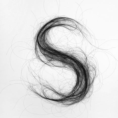
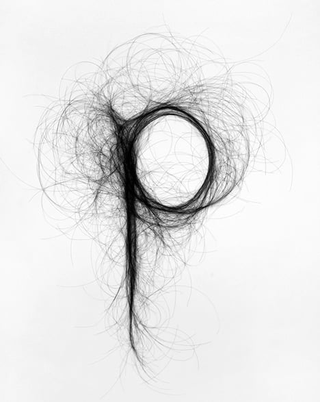
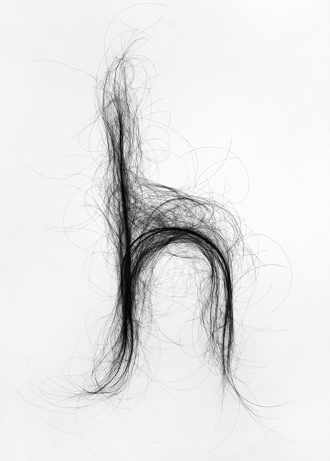
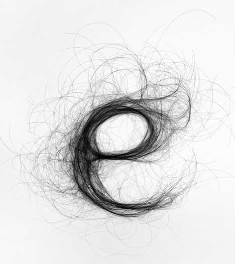
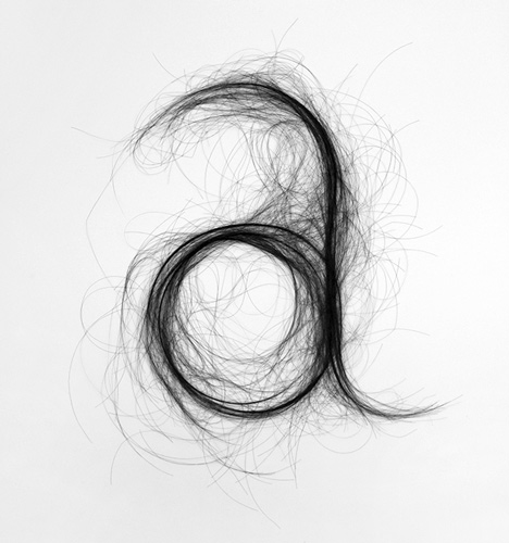
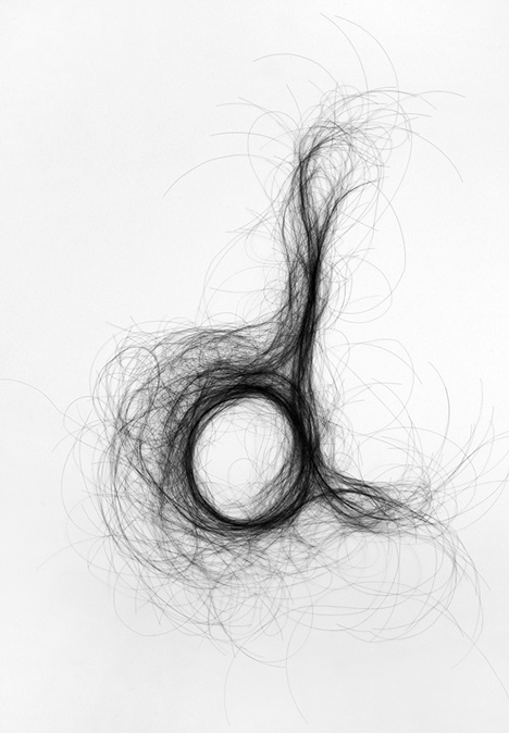
Goossens' Hair Typography is crafted by arranging bunches of hairs into the shapes of single letters. Each character has a dense centre and becomes increasingly sparse towards the edges.
"The shapes of the letters are created by forming the hairs into a legible character," said Goossens. "The ends of the hairs create an organised chaos - an energetic play of lines, which form a haze around the shape."
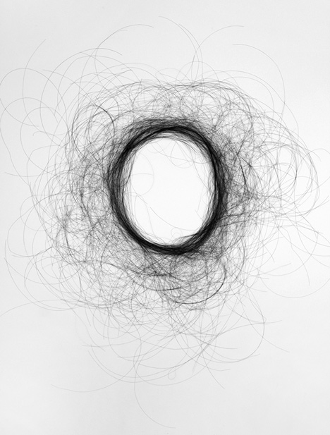
The script letters have fluid strokes and the designer compares the individual filaments to fine pen lines. Each letter has interwoven curling lines and can be made in a variety of weights.
Once the letters are formed, Goossens photographs the characters for reproduction. The designer told Dezeen that she hopes the font will be used for magazine or book covers, and individual commissions can be made directly from the designer.
Goossens studied interior design at Academie Artemis in Amsterdam, and photography and design at Design Academy Eindhoven. She currently teaches Interior Design and Visual Communication at Academie Artemis.
Other objects made of hair on Dezeen include a hairbrush, a lamp and a range of spectacle frames.
In other graphic design news, British graphic designer Peter Saville was named winner of this year's London Design Medal and announced he is working on a new identity for Kanye West.
See more stories about design with hair »
See more typography design »
See more graphic design »
Images are courtesy of the designer.
Here's a full project description from Goossens:
Hair Typography
The hair letters consist of hundreds of hairs and give the impression of being fine pen drawings. The basic shape of the letters are created by forming the hairs into a legible character, during which I follow the natural characteristics of the hairs: curly, rounded corners, springiness.
To a great extent, it is the dynamic of the hairs which determines the shape of the letters. The ends of the hairs create an organized chaos, an energetic play of lines which forms a haze around the letter’s basic shape.
About Monique Goossens
Designer Monique Goossens studied at Academie Artemis in Amsterdam, graduating cum laude in Interior Design Styling in 2006. During her studies, she developed an interest in the relationship between design and photography which she went on to explore in depth during further study at the Design Academy in Eindhoven.
Monique Goossens' work includes elements of both design and autonomous art. It often takes the form of staged images in which she challenges established concepts of function and material. In consequence, shifts occur at elementary level and result in a degree of estrangement. A refined appreciation of materials enhances this process, leading to beautiful and unexpected discoveries. Photographs of these scenes become the definitive works.
Monique's work is playful, humorous, surprising. Her graphic work follows a similar process as she collates photographs into books and develops letter types using a range of materials.
Monique currently teaches Interior Prognoses at Academie Artemis.