Nendo designs brand identity for skincare based on Chinese medicine
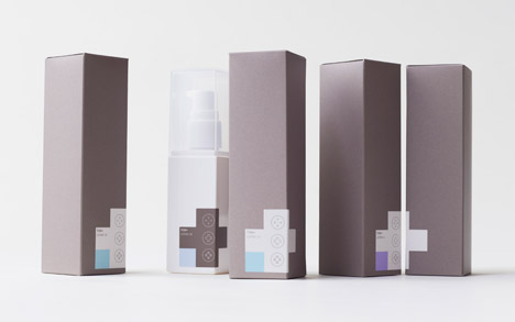
Japanese studio Nendo used grey and white crosses for the packaging of this line of skincare products based on the practices of Chinese medicine.
Oki Sato's design studio was tasked with designing a branding concept for TCM+, a new skincare brand launching in Asia that allows customers to combine different products – a principle based on the practices of traditional Chinese medicine, which uses various combinations of herbs, mineral and animal products to create treatments.
"Traditional Chinese medicine, for which TCM stands, is well-established in Greater China, and so a natural skincare product line concept drawing from this tradition's principles was sought," said Nendo.
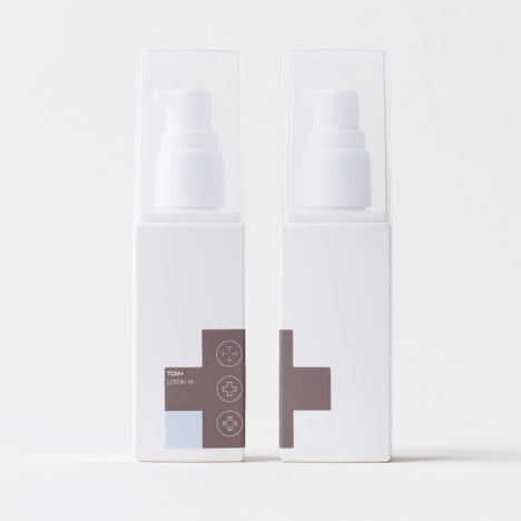
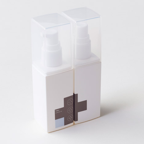
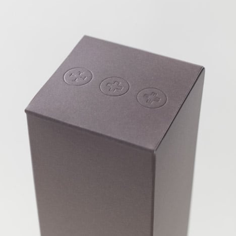
To highlight this relationship, the minimal packaging design was based around the image of the cross – an internationally recognised symbol of healthcare. Crosses also form the company logo, made out of the letters T, C and M.
"The name of the brand, TCM+, is a reference to the process of putting together various cosmetics with traditional Chinese medicinal properties, while the logo appears as a + through placing in sequence the letters T, C and M," said the studio.
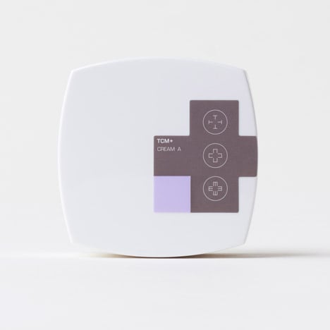
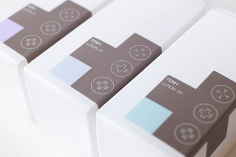
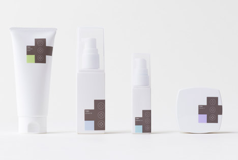
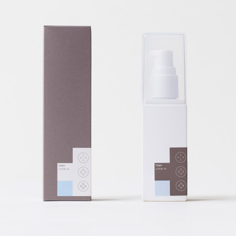
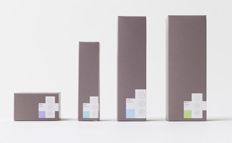
Each bottle, tube and pot in the range is packaged in either dark grey or white, adorned with a cross in the contrasting shade and a coloured square to indicate the type of product and what it can be mixed with.
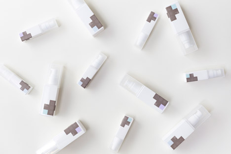
Products are also coded using an alphabetical system, with names including Cream A and Lotion M. Many of the crosses wrap around corners of the packaging, and can be matched with another product to form a whole symbol when lined up on a shelf.
"Traditional Chinese medicine relies on the selective mixture of hundreds of natural remedies, with the advantage that formulas can be customised with respect to the exact ingredients used, their relative quantities and timing of application, depending on the physical condition of the person," said Nendo.
"Similarly, for example, essences can be of several types, such as whitening, moisturising or anti-ageing," it added. "Instead of being supplied as premixed products, the idea was for the end-user to freely customise the mix of ingredients and relative quantities according to their body's needs, the time of the day, or season."
Dezeen Book of Interviews: Nendo founder Oki Sato features in our new book, which is on sale now
Nendo, whose output varies from shop interiors to furniture and accessories, often opts for a minimal graphic style when working on branding projects. Past designs include packaging for coffee-flavoured beer made up of bean-shaped stickers and a collection of stackable bottles for a cosmetics brand.
TCM+ will launch in Hong Kong, before being rolled out elsewhere in Asia.
Photography is by Akihiro Yoshida.