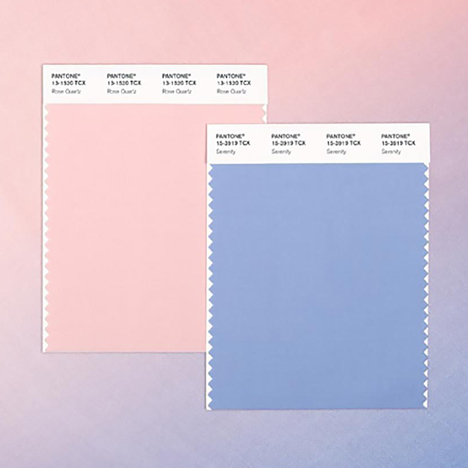
Pantone reveals first two-tone colour of the year with Rose Quartz and Serenity
Colour company Pantone has unveiled a mix of pastel pink and blue shades as its Colour of the Year 2016.
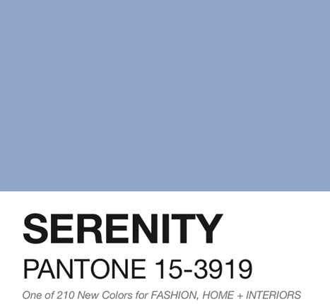
Rose Quartz, described as "a warmer embracing rose tone" and Serenity, which is a "cooler tranquil blue" were apparently chosen to reflect consumers seeking soothing colours.
"As consumers seek mindfulness and wellbeing as an antidote to modern-day stresses, welcoming colours that psychologically fulfil our yearning for reassurance and security are becoming more prominent," the company said.
The pairing of the pink and blue pastels marks the first time Pantone has chosen a blend of colours for its annual prediction, which is unveiled at the end of each year and to foreshadow coming trends.
"Rose Quartz, a persuasive yet gentle tone that conveys compassion and a sense of composure," said executive director Leatrice Eiseman.
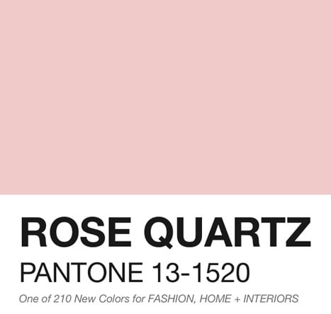
"Like a serene sunset, flushed cheek or budding flower, Rose Quartz reminds us to reflect on our surroundings during the busy but lighthearted spring and summer months," she added.
According to Eiseman, Serenity conveys a similarly relaxing effect, reminiscent of "the blue sky above us".
"Serenity comforts with a calming effect, bringing a feeling of respite even in turbulent times," said Eiseman. "A transcendent blue, Serenity provides us with a naturally connected sense of space."
Previous colours of the year have tended towards the bolder end of the spectrum, with the brownish-red Marsala as colour of the year for 2015, and the purply pink Radiant Orchid announced for 2014.
Emerald was 2013's colour, and 2012 saw Pantone announce the bright orange Tangerine Tango.
The company has partnered with graffiti artists Victor Quinonez, Werc and Man One to use the Rose Quartz and Serenity colour pairing in a series of works that will be shown in Miami, Venice Beach and New York.