Queer x Design highlights 50 years of LGBTQ+ graphic design
Keeping a record of LGBTQ+ design makes political change increasingly possible says Andrew Campbell, the author of Queer x Design. He has picked five examples of LGBTQ+ graphic design from the past 50 years for Dezeen.
Written by Los Angeles-based art historian Andrew Campbell, Queer x Design is a collection of graphic design documenting the past 50 years of LGBTQ+ life and activism since the birth of the gay rights liberation movement in 1969.
"Simply, queer design is anything created and designed by LGBTQ+ people that addresses LGBTQ+ life," Campbell told Dezeen.
"It may seem a flat-footed and obvious definition, but I think it allows for openness around one of the tenants common to LGBTQ+ communities at their best, which is that they are inclusive and heterogeneous."
The book focuses on the the signs, symbols, banners, posters and logos used by LGBTQ+ activist groups in the US following the birth of the gay rights liberation movement.
"Queer people and people of colour have been fighting for decades against the over-policing of their communities, often making their plea visible in the arena of design and graphic art," said Campbell.
"So much early LGBTQ+ design reveals an awareness of juridical authority. Understanding this makes political change ever more possible in the present if we keep in mind that we have been building political power together for decades."
Campbell wrote the book after finding there was no literature specifically on the design of the LGBTQ+ movements in the US.
"Sure, there are plenty of books that reproduce photographs and ephemera found in archives, but nothing which considered this ephemera as design," he explained.
"Usually, with canonical histories of design there's a pretty strong allergy to connecting design with a politics of identity and with the subjectivity of the designer."
He argues that looking at design through a queer lens allows for a deeper understanding of the queer community and its lived experiences.
"Addressing this topic with a complex understanding of the way that identities/subjectivities underpin designs that themselves participate in the formation of subjects, essentially allows for another way in," Campbell stated.
"Through historicised identities that have contributed a great deal to our sense of who we are as a community."
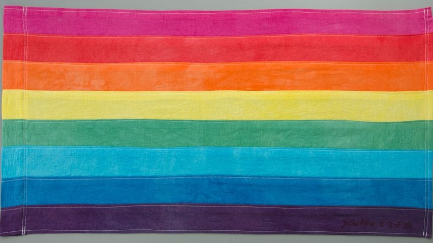
The book features a plethora of work such as Gilbert Baker's rainbow flag and it's contemporary update by Daniel Quasar, the posters of political group ACT UP and artist collective Gran Fury created in the height of the AIDS crisis, the original t-shirt design of the radical lesbian activist group Lavender Menace and the world's first ever queer video game created by CM Ralph, amongst others.
Below Campbell picks five pieces of design from queer activist history:
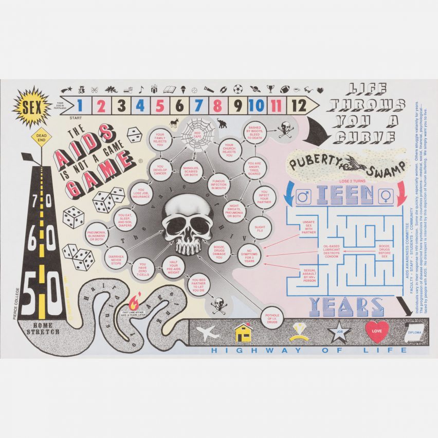
AIDS is Not a Game Game poster by Robert Birch
I chose to pick this from the genre of AIDS education design. The AIDS is Not a Game Game poster by Robert Birch is a board-game where seroconversion is a possibility at every turn.
Birch created the poster as part of an HIV/AIDS awareness campaign for Pierce College; and so it represents a kind of localised, playful design that remains under explored in our (still only very sketchy) history of LGBTQ+ design.
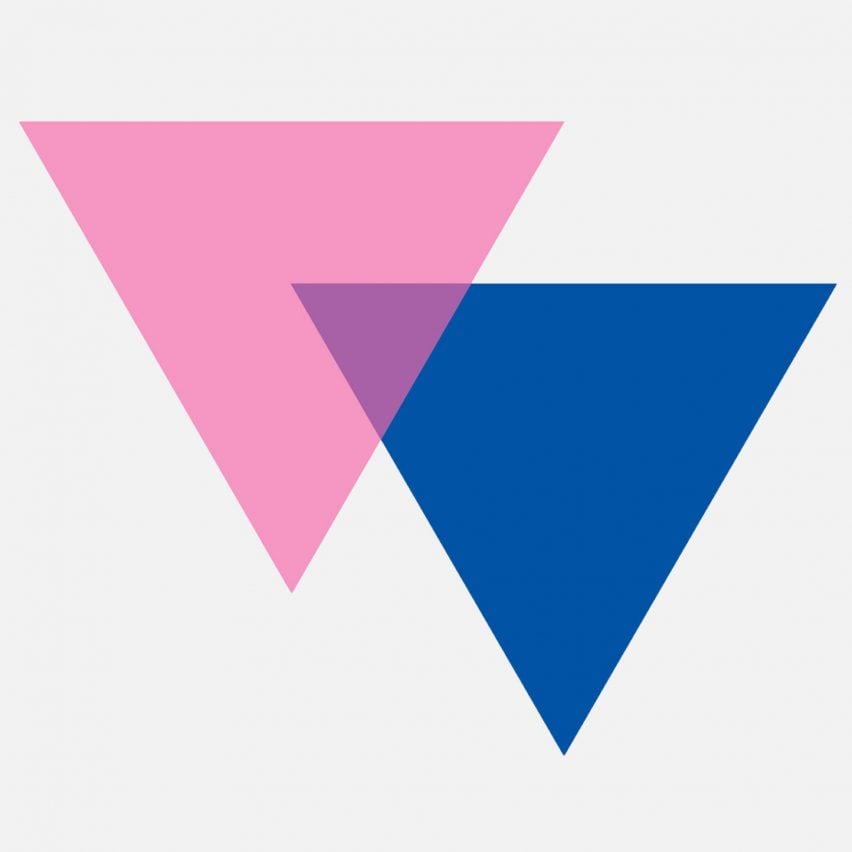
Biangles by Liz Nania
The biangles were designed by Liz Nania as she was c0-organising the first national bisexual contingent for the 1987 March on Washington. To me they are a powerful expression of the cleverness of LGBTQ+ design.
The design takes the triangle as a starting point. The pink triangle was used by the Nazis during world war two to mark male homosexuals. Lesbians were categorised with a black triangle with other "asocials" such as sex workers and "nonconformists".
Nania overlapped pink and blue triangles, each representative of a pole of the normative gender binary. The space of their overlap is a deep purple, made from the combination of pink and blue. This overlap communicates an inclusivity in terms of the potentially adored –playing with powerful LGBTQ+ symbology. Later, it became the foundation for a striped flag, using the same colours, created by Michael Page.
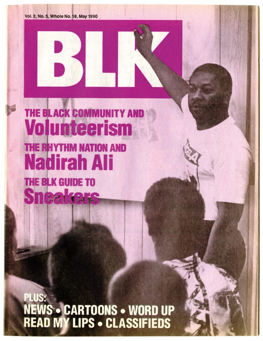
BLK Magazine by Alan Bell
BLK magazine ran from 1988-1994 and was a bastion of writing about black LGBTQ+ communities. Founded by graphic designer Alan Bell, the magazine got its start circulating among the members of an all-black safer sex party known as Black Jacks. National LGBTQ+ media at the time largely represented the concerns of white LGBTQ+ people, and Bell identified a need to speak to and amongst the communities he was a part of.
I love this because it speaks to the world making efforts of many LGBTQ+ designers, who identify a need of some kind in their communities and respond.
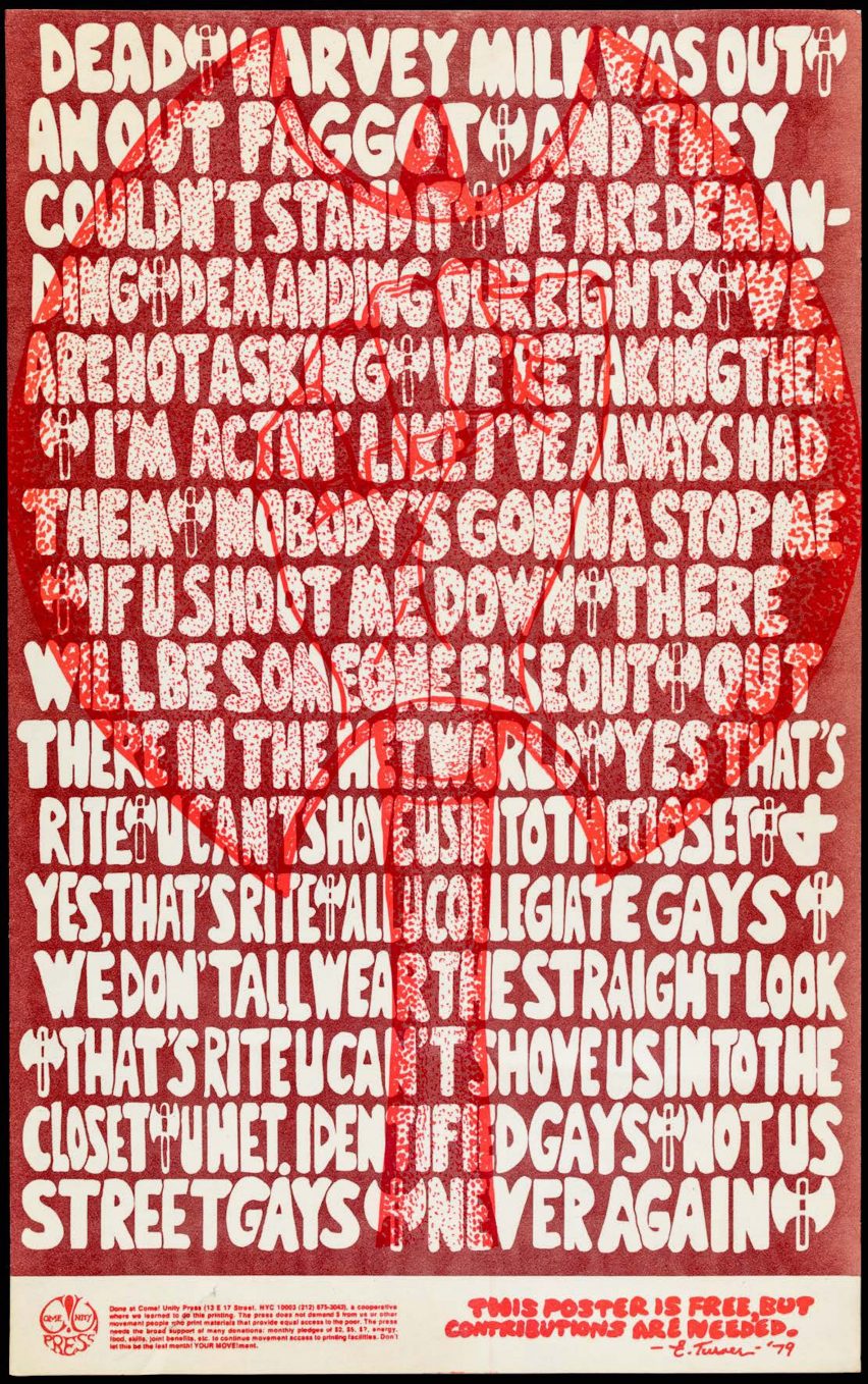
Come!Unity press poster
The "urban intentional community", of Come!Unity Press is one of the great untold stories in leftist US graphic history. In addition to republishing political and philosophical tracts, the members of Come!Unity Press supported a variety of leftist causes--from gay liberation to anti-war protest movements.
These two posters (one in English, one in Spanish--showing the collective's dedication to making their messages accessible in polyglot New York) were created after the first openly gay city supervisor of San Francisco, Harvey Milk, was shot in cold blood along with the mayor George Moscone. The murderer was eventually acquitted, and gay people rioted in response.
These posters show solidarity with Come!Unity Press's West Coast siblings-in-the-struggle, and uses the double-headed axe/labyris and the clenched fist as visual signifiers of their ferocity.
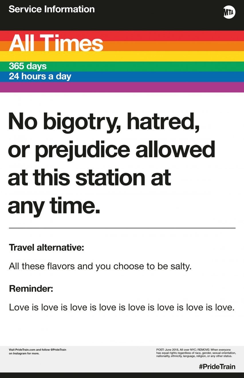
PrideTrain
In June 2017 MTA service advisories started to appear in New York City subways. Usually indicating changed routes and other commuter headaches, the posters were not made by the transit authority, but rather a group of activists and designers.
Although it's not a term used much anymore, this "culture jamming" aesthetic is a way to suffuse the public with the political and make a claim for the existence and value of LGBTQ+ people.
Using the iconic rainbow, the original posters spoke with a sassy cultural awareness. Now in its third year of existence, the PrideTrain team has expanded their mission, and are more overtly social justice oriented in their messaging, highlighting historical figures and events, holding space and celebrating all sectors of LGBTQ+ communities.