Formula One reveals new visual identity by Wieden+Kennedy
Formula One's branding has been overhauled for the first time in over two decades, in a bid to widen the sport's fanbase.
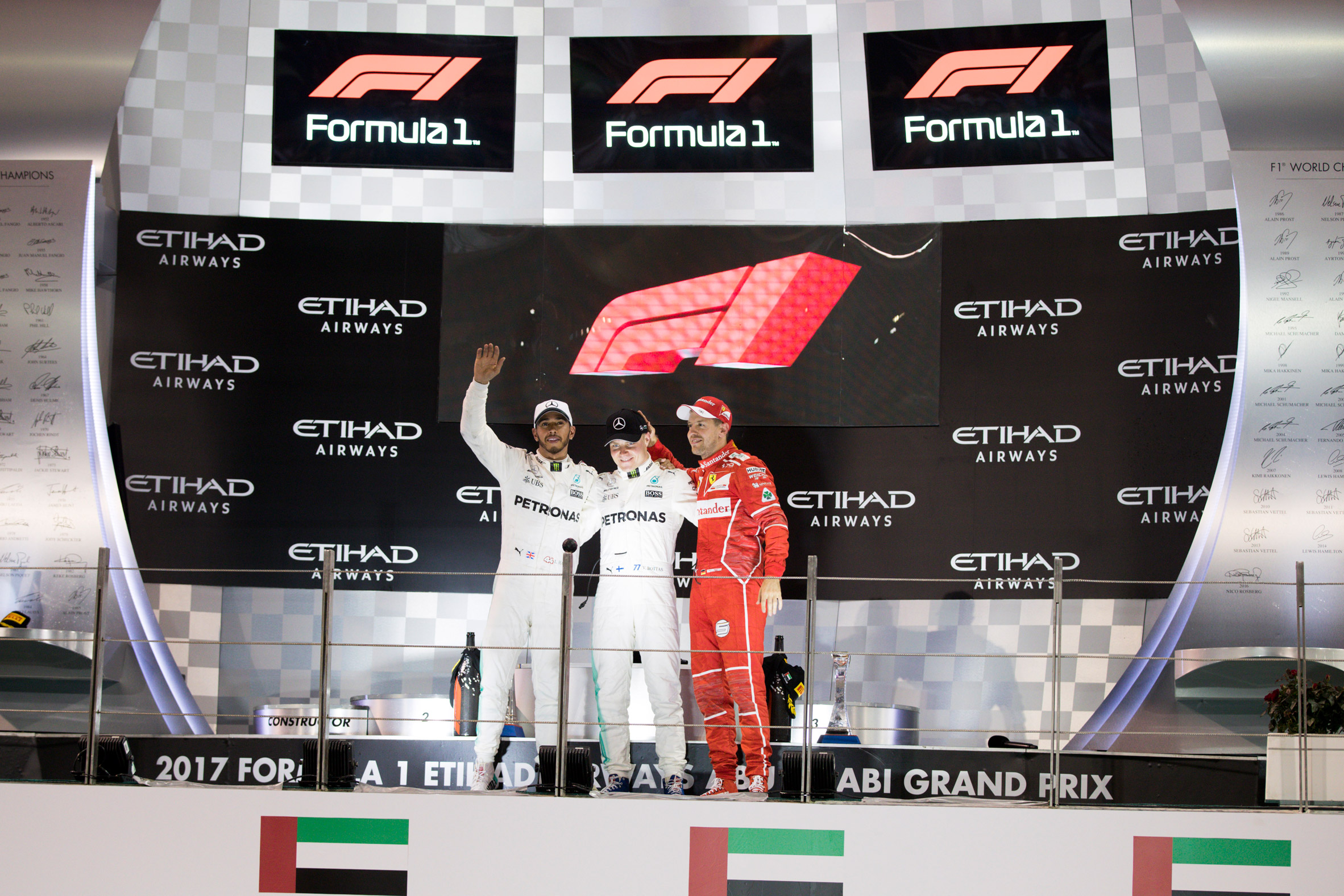
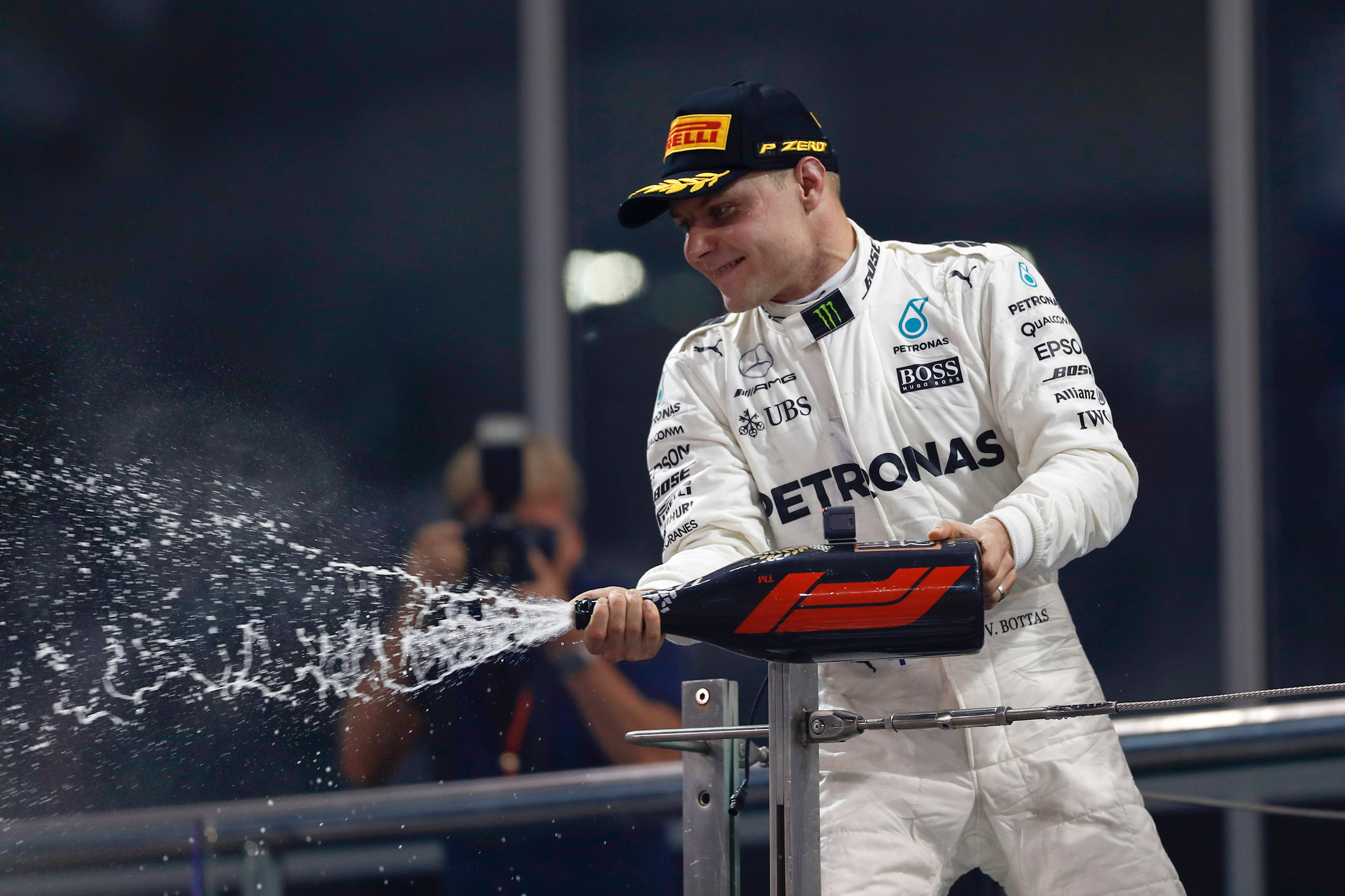
Designed by Wieden+Kennedy, the new visual identity was unveiled at the 2017 Grand Prix season in Abu Dhabi on Sunday.

Composed of three red lines forming an F and a 1, the logo – described by the team as "modern-retro" – is designed to emulate the shape and movement of a racecar and the bends of a racetrack.
The updated emblem will replace its 23-year-old predecessor, originally created by design studio Carter Wong in 1994.
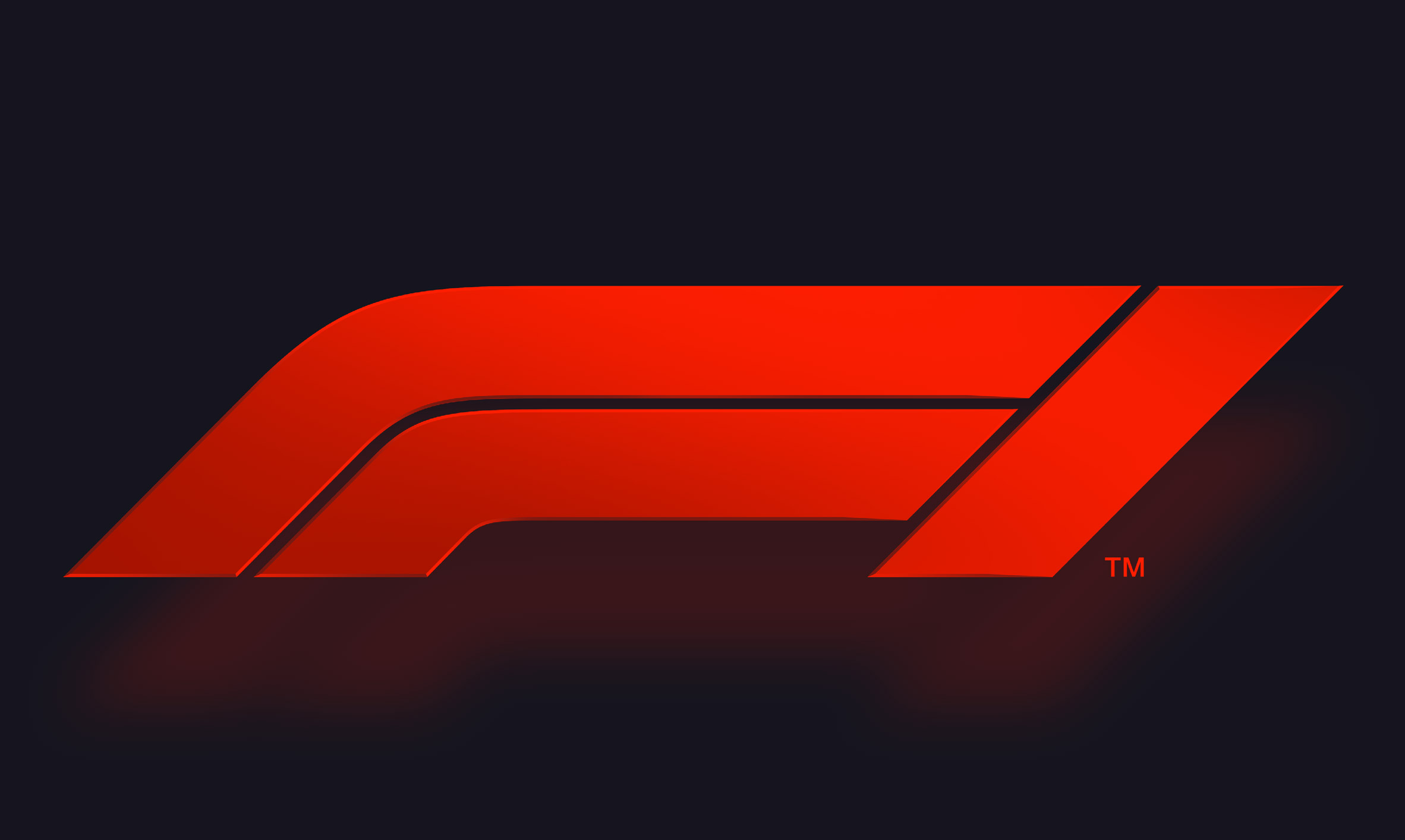
"The new mark aims to embody the core forces of Formula 1 racing: speed, attack, and control; while its sleek, sharp interlocking components celebrate the technical prowess of Formula 1 engineering teams," said Richard Turley, who headed up the team at Widen+Kennedy.
"Its aesthetic is aspirational and leans into the future, but extends naturally from a rich heritage of motorsport graphics."
By rebranding, Formula One hopes to reach out to a broader fanbase, making the sport more open and inclusive and establishing itself as a global media and entertainment brand.
The whole rebranding process was based on research carried out by agency Flamingo, which surveyed Formula One fans around the world.
The study found that people engaged most with the personality-driven side of the sport, rather than the technical and business-driven aspects.
"When we talked to fans about what made Formula One amazing, what we heard was people loved the real, exhilarating, unpredictable and incomprehensibly fast elements of the sport," said Ellie Norman, Formula One's marketing director.
"It was about racing, but many felt those days were behind us and that the sport has become almost impenetrable for fans, particularly new ones. What we say and do now is so important for our future, but it must always be driven by our fans. They come first."
Plans for Formula One's redesign have been in the works since US media conglomerate Liberty Media acquired the brand in January 2017.
In a bid to make the racing events more fan-based, attracting both old and new fans, Liberty has already implemented live events and new "FanZones" at Grand Prix weekends.
Wieden+Kennedy originates from Portland, Oregon. Co-founder Dan Wieden is responsible for Nike's infamous Just Do It slogan – a tagline he based on the last words of a convict facing a firing squad.
Earlier this year, the agency's Amsterdam team transformed the Royal Dutch Football Association's lion logo into a roaring lioness, to represent the national women's squad.