
Erik Spiekermann enlists students to create digital fonts from unfinished Bauhaus designs
Adobe is releasing five fonts based on designs by prolific Bauhaus figures, which have been revived by German typographer Erik Spiekermann and a group of students.
The typeface designs were "lost to history" after the school's sudden closure in 1933.
But with the school set to celebrate its centenary next year, Spiekermann decided it was time to finally share them with the public. So, working with Adobe and the Bauhaus Dessau Foundation, he enlisted five typography design students from around the world to complete the unfinished designs.
Adobe is releasing five fonts based on designs by Bauhaus masters
One of the world's most important art and design schools, the Bauhaus was founded by Walter Gropius in Weimar, Germany, in 1919. It was in operation for just 14 years before it was shut down by the National Socialist Party, as part of the Nazi regime.
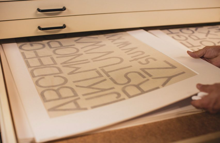
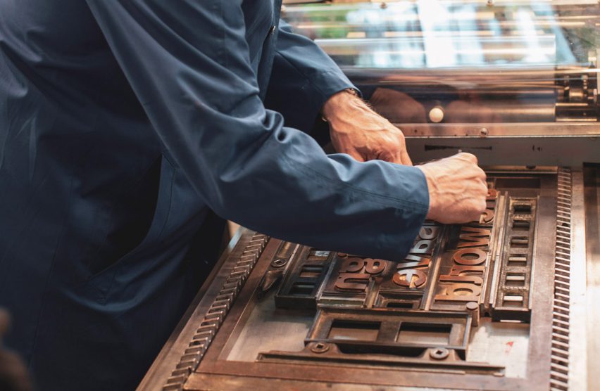
Spiekermann and the students sourced hand-drawn letter fragments, typography sketches and posters from the Bauhaus archive as the starting point for the fonts. They then imported these into graphic-design program Adobe Illustrator, and worked to fill in the gaps.
Two of the fonts have already been made available to download by Adobe, of designs by Joost Schmidt and Xanti Schawinsky.
The other three fonts are due to be released in the coming months, and will feature the work of Carl Marx, Reinhold Rossig and Alfred Arnolt.
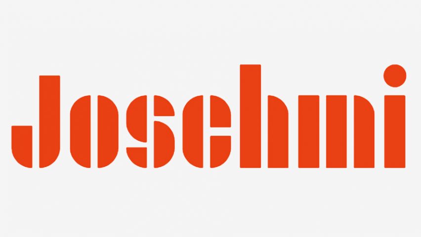
Joschmi is the design by Bauhaus calligraphy teacher Joost Schmidt, who "shaped the graphic design style we identify with the Bauhaus today". This was revived by Flavia Zimbardi, a student at the Cooper Union in New York.
The new sans-serif type is made up of chunky, bold blocks with curved edges. Most of its characters are vertically dissected down the centre.
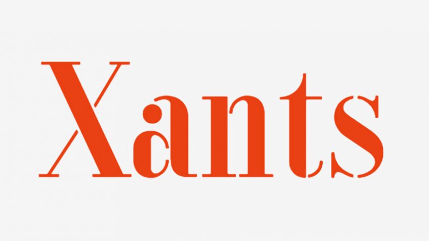
Xants is a recreation of a type designed by Xanti Schawinsky, who taught classes in set design at the Bauhaus, by ÉCAL student Luca Pellegrini.
Schawinsky – a painter, photographer, architect and graphic designer – designed the serif type using both thick and thin lines, and added circles to embellish some of the lowercase letters.
The project saw all five students travel to the Bauhaus school building in Dessau, Germany. As well working with digital tools, they were given "historical type exercises" created by Bauhaus masters.
"Designing on a computer is a different tool than drawing on a piece of graph paper with a circle and set square. But that's the whole point," said Spiekermann.
The aim was to instil in them the same mentality adopted by Bauhaus students – to push "emotional" creation aside and take a more mechanical approach.
Spiekermann hopes the revived fonts will "inspire a new generation of designers".
The Bauhaus fonts form part of Adobe's Hidden Treasures series, which also includes digital versions of the brushes of 19th century artist Edvard Munch, for people to use in their own designs.
Their release comes six months before the Bauhaus celebrates 100 years since its founding. Other famous Bauhaus staff and alumni include Marianne Brandt, Wassily Kandinsky and Ludwig Mies van der Rohe.