Pentagram models US Library of Congress logo on bookends
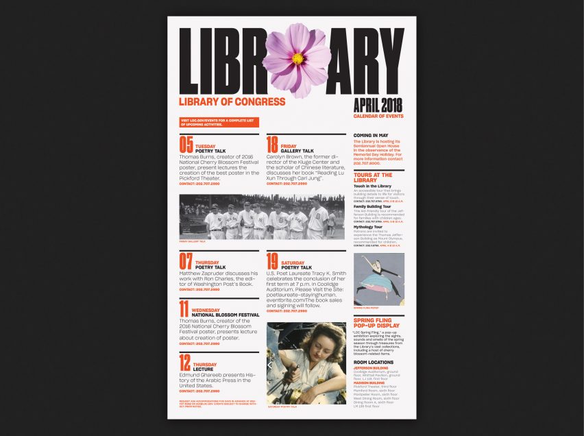
Pentagram's New York office has updated the visual identity for America's Library of Congress in Washington DC, with a shape-shifting logo that resembles stacks of books and bookends on a shelf.
The design agency created a new look for the Library of Congress, which is the country's oldest, federal cultural institution and commonly celebrated as the world's largest library.
It boasts a huge collection of books, recordings, photographs, newspapers, maps, manuscripts, audio recordings, films and fine art, in 470 languages.
While the archives are officially intended to serve Congress and the federal government, the resources are also accessible to the public – though the institution felt that this is not always apparent.
Its leaders therefore enlisted Pentagram to update the library's identity, aiming to show more people that the material is at their disposal.
"The Library of Congress wanted to help Americans and people all over the world understand their vast collections," Pentagram principal and project leader Paula Scher told Dezeen.
"Most Americans don't think they can use the library, or think it's filled with government documents and law books," she continued. "The reality is it has an immense collection of movies, artists, collection, sports ephemera and statistics, recorded music, type faces, really anything you can think of."

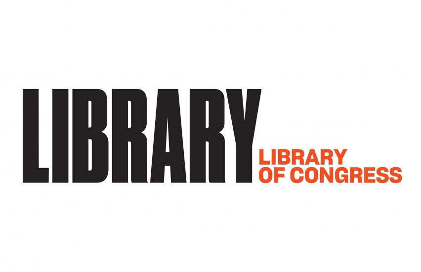
Pentgram's logo redesign separates "Library" – written in black Druk Condensed Super typeface – from the full name "Library of Congress", which is written in a smaller red Sharp Grotesk 20.
"'Library' is the big idea, and 'Library of Congress' is the facility," said Scher. "It is a deliberate distinction."
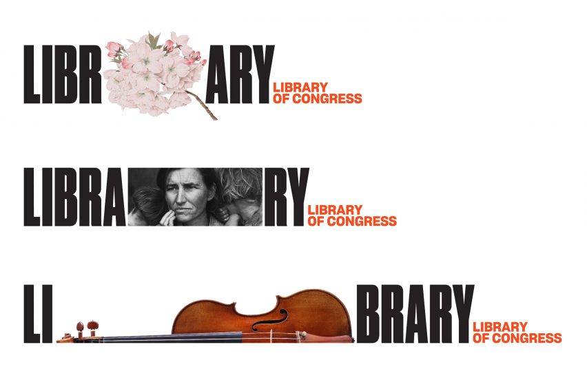
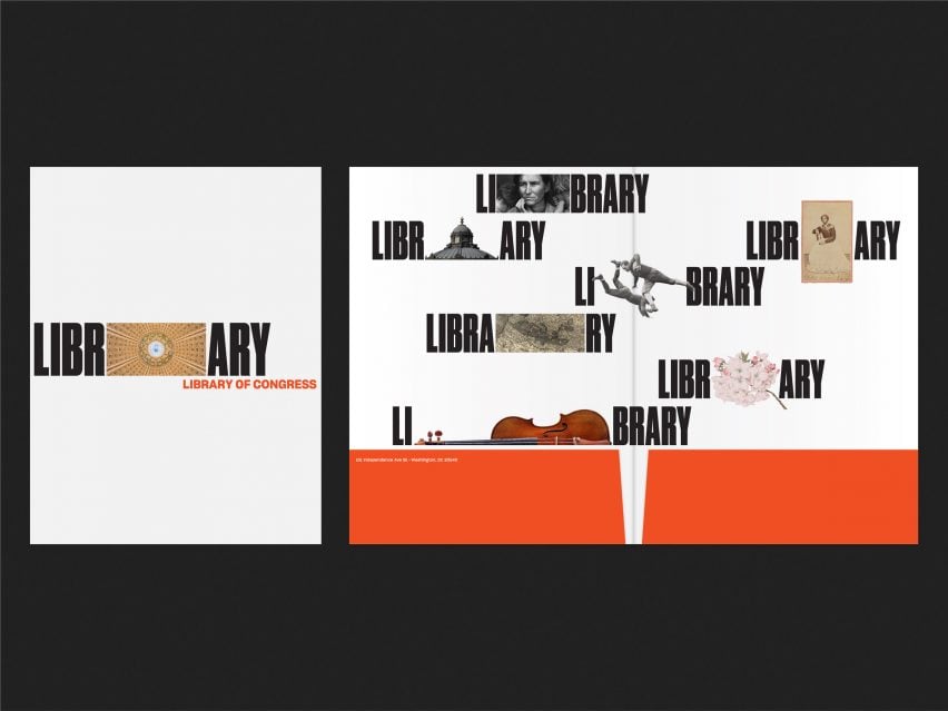
Envisioned as a "metaphor for a bookshelf or bookcase", the logo comes in a variety of configurations. These include placing the red text above and below the black title, or on either side. The bolder type can also be split into two parts, then placed on either side of images like a pair of bookends.
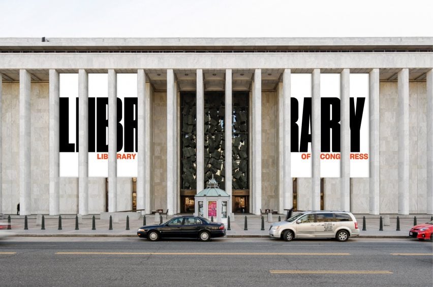
In a rendering, the logo adorns giant banners in between the columns along the facade of the James Madison Building – one of three main structures that houses the library.
Other visuals demonstrate how the branding can be combined with imagery of flowers, portraits, musical instruments and more.
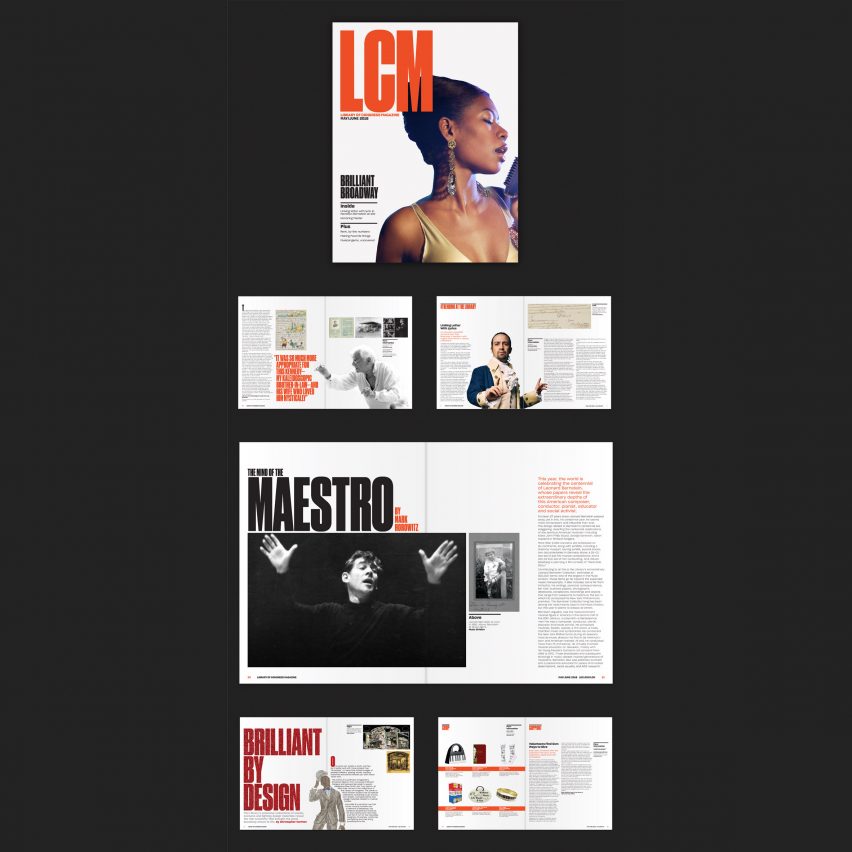
Various iterations will be implemented across the library's wide range of communication materials, such a books, the bimonthly LCM magazine, institutional brochures, newsletters, signage and exhibition graphics. A shape-shifting digital version of the logo will also be used online.
"The imagery can continually change shape," said Scher. "The new one is a dynamic identity existing digitally in motion, or statically in print."
Pentagram's dynamic design, which will be rolled out later this week, provides a strong contrast to its predecessor. Designed by New York branding and graphics firm Chermayeff & Geismar & Haviv, the old logo included a blue book shaped and patterned to look like the American flag.
"The existing logo looks governmental," Scher said. "It doesn't represent a broad swath of American culture in the collection nor does it make any reference to the contemporary digital landscape."
Pentagram's update has received some criticisms, but Scher argues that the new design provides the diversity necessary to bring the library up to date.
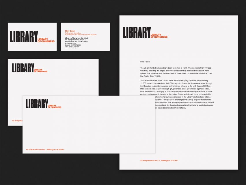
"The applications are part of an extensive identity system that comes with a manual, and addresses everything the library makes," she said. "The first logo either didn't have that, or it was abandoned."
"People often have attachments to logos and I am sure that the current library user feels a loss of something familiar," the designer continued. "But the new identity was designed for the future library user who currently thinks that they can't get in there, or that there are only law books, that the collection isn't digitised, or it's not for them, and those are a lot of people."
The US Library of Congress will launch the Pentagram-designed identity to coincide with the 2018 National Book Festival on 1 September 2018, and gradually roll it out across all mediums.
Pentagram was established in 1972 and is now one of the best-known graphic design agencies in the world. In addition to the New York office that worked on this redesign, the company operates several more globally, including San Francisco, Berlin and London.
It also has a location in Austin, Texas, which recently rebranded a Nashville art museum with a 1930s-influenced logo.