
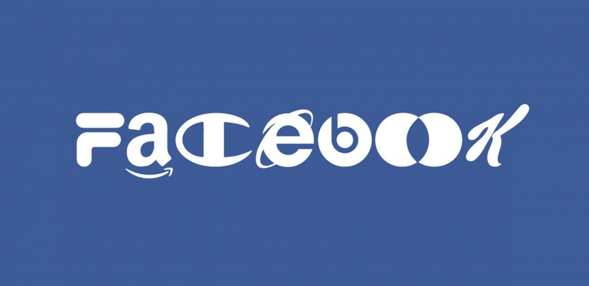
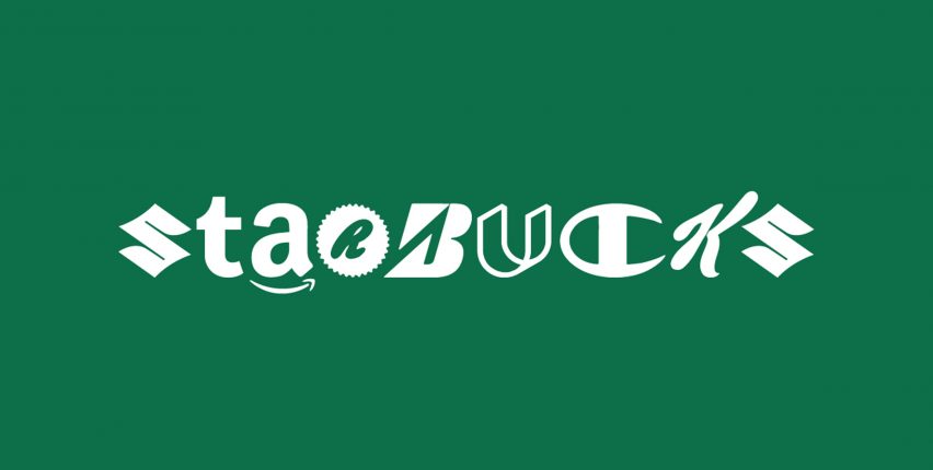
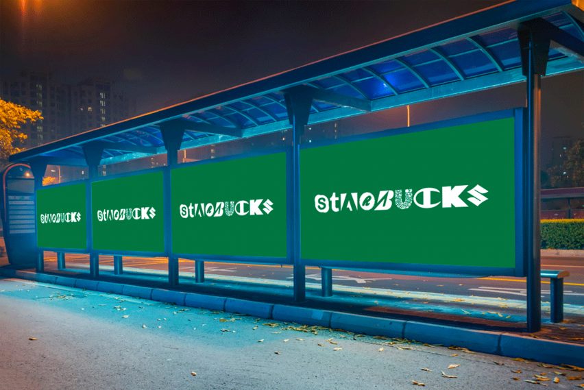
Brand New Roman is a typeface made from brand logos
Digital studio Hello Velocity has created a typeface using the trademarks of popular brands including Netflix, Amazon and Facebook.
Brand New Roman comprises a 52-letter font that is a spoof of the widely used Times New Roman typeface.
New York-based Hello Velocity cut up logos from some of the world's biggest companies to create a series of one-letter emblems to stand for each letter in the alphabet, both in uppercase and lowercase.
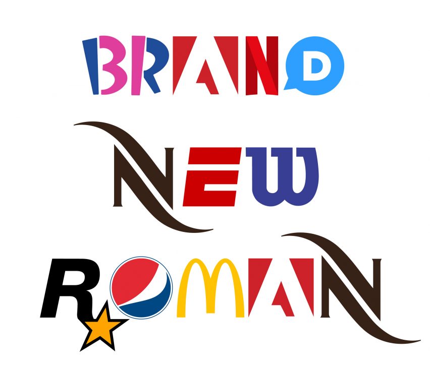
According to the studio, the font was intended as a comical take on the global power and influence of these brands.
"This stage of capitalism is pretty weird," said creative director Lukas Bentel. "Seems like a good time to spoof it!"
"At this point, brands are inescapably ubiquitous and attention-hungry," he continued.
"What's interesting about Brand New Roman is that when you smash so many of these brands together, they start to lose their powerful brand connotations in fascinating ways. The sheer density overrides all the extra brand identity associations each symbol usually carries."
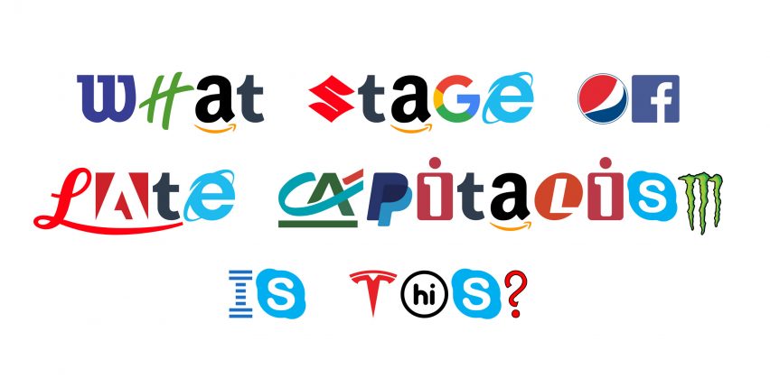
When designing the font, the design team tried to only use certain logos that act, or can act, as standalone branding elements – avoiding extracting one letter from a logo that is normally composed of multiple characters.
They trialled numerous trademarks to find the set that worked best with each other, and that would make the font as easy to read as possible.
They also tried to restrict each letter to the logos that they considered to be the most recognisable and current. However they had to make a few exceptions.
"We broke these rules a few times when it became almost impossible to satisfy each of them. For example, I challenge you to think of a company that uses the letter I as a standalone legible logo," explained Bentel.
"We searched far and wide and could not find any recognisable, legible logo! We opted to pull the [capital] I from the classic IBM logo, and the [lowercase] I from Lenovo's predecessor iomega," he added.
Other brands featured include fast-food company McDonald's, American candy brand Reece, electric car company Tesla and tech giant Google.
Hello Velocity also added an extra creative spin with ligatures for the letter O. A single O is provided by with the Opera web browser logo, but when typed twice it is replaced by the two overlapping red and yellow circles of the Mastercard logo.
Four Os are replaced by the emblem for German car manufacturer Audi, and when five Os are typed the multi-ringed Olympics trademark appears.
"In the end, I think that Brand New Roman is pretty aesthetically compelling which makes sense giving all the time, money and design that has gone into crafting each of these logos for the purposes of standing out," said Bentel. "With Brand New Roman we are making them work together."
Bentel told Dezeen the studio has always been interested in experimenting with, critiquing, and satirising economic systems and the commercial landscape, particularly on the web.
It has previously created satirical startups like BiteLabs, which claims to grow meat from celebrity tissue samples and use it to make artisanal salami, as well as crowdfunding campaigns such as McMass, which combines church with McDonald's.
The studio are now currently working on a sliding-scale pricing tool called Gradient, which adjusts web-store prices depending on customers' incomes, to create greater equity and accessibility in purchasing.
"This thread of experimenting with the systems of money and capitalism runs loosely through our thought processes most of the time, and Brand New Roman – while obviously relatively light-hearted – comes from a similar place," said Bentel.
In a similar mocking manner, BuzzFeed designer Mark Davis created a freely available font version of Donald Trump's distinctive handwriting, emphasising the haphazard nature of the US president's scrawl.