Matteo Pacella and Philippine Hamen design blue classical furniture
Matteo Pacella and Philippine Hamen looked to ancient Greco-Roman architecture and traditional children's building blocks for this collection of classical furniture.
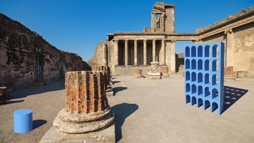
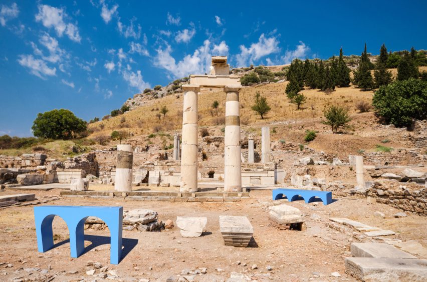
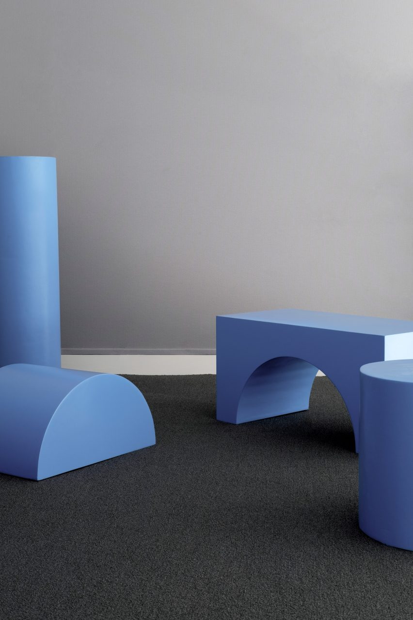
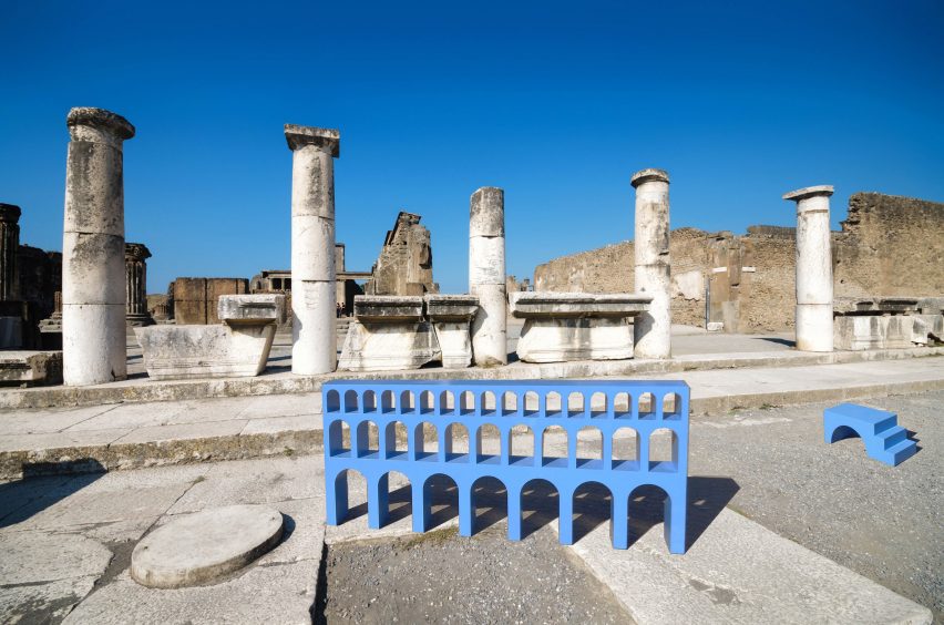
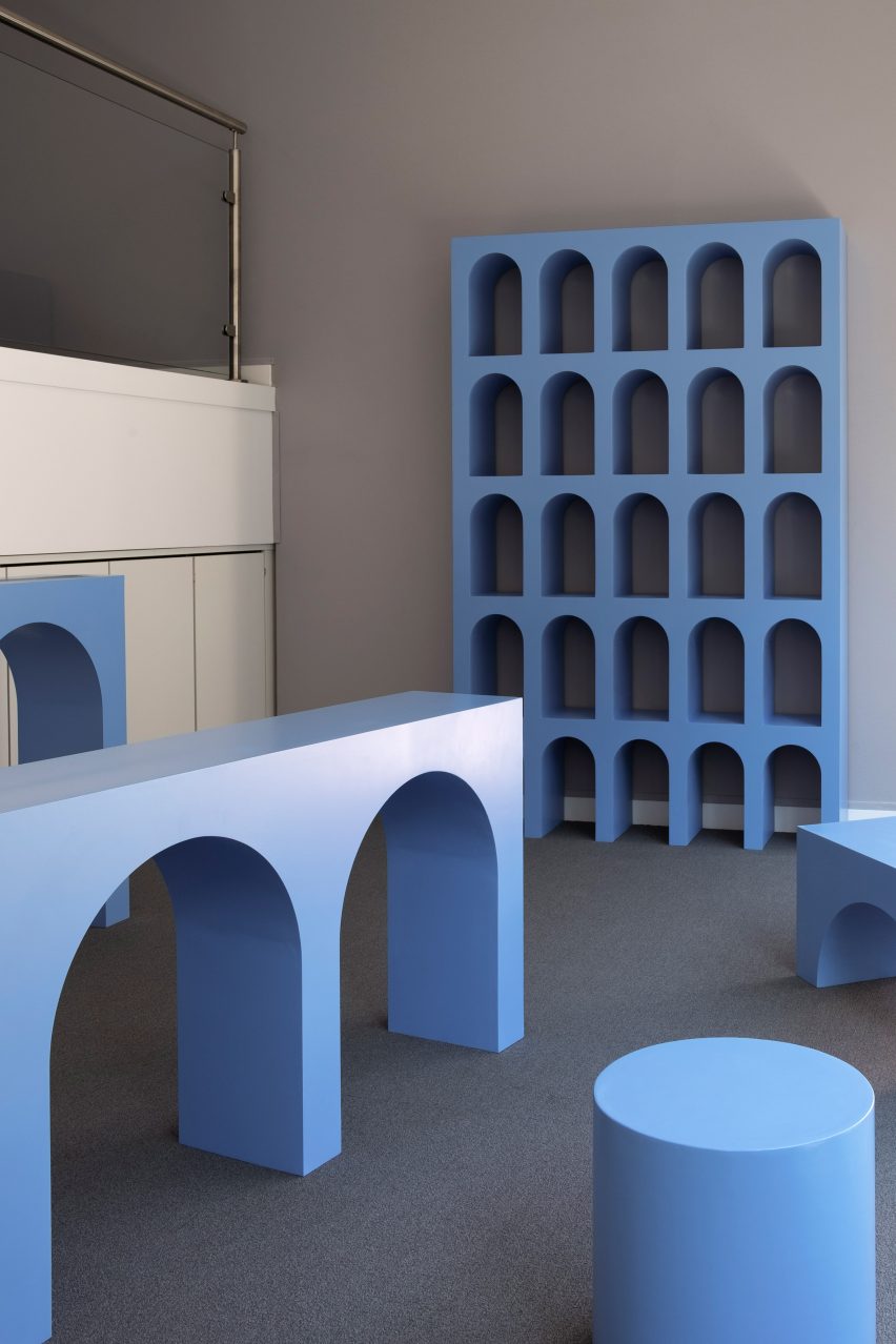
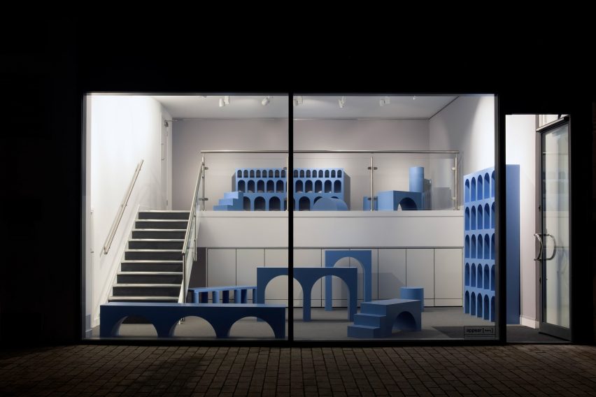
The 12 piece collection, called La città è mobile! (The city is mobile), is made up of a range of "practical yet poetic" benches, stools, steps, tables, consoles and bookshelves.
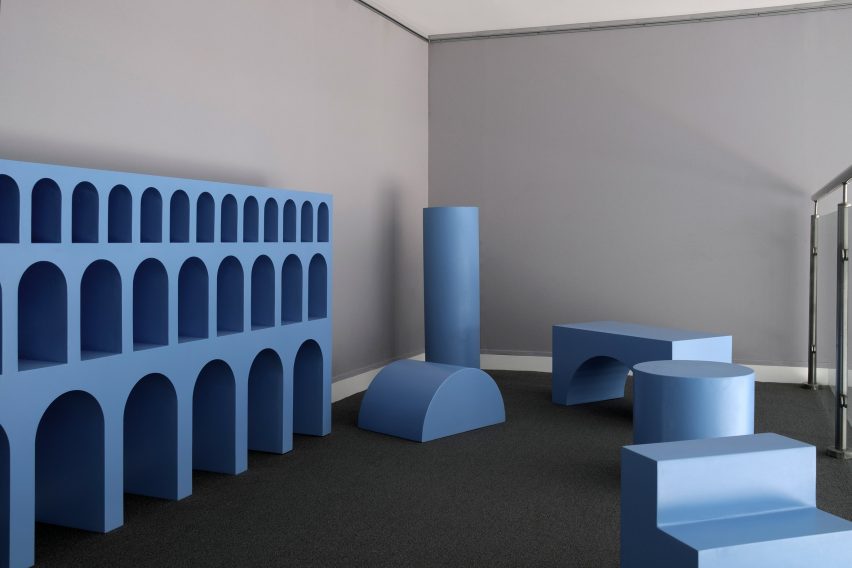
Constructed from MDF and finished in blue-pigmented resin, each piece took its design cues from the archetypal forms found in classical architecture, such as grand fluted columns and curved archways.
Milan-born Pacella and Paris-born Hamen also found inspiration in the traditional wooden building blocks that children play with, and how they relate to the basic structures found in antiquity.
Pacella and Hamen based the furniture proportions on the "golden ratio" – a mathematical rule derived from ancient Greece which exists when a line is divided into two parts, and the length of the larger part – a, divided by the smaller part –b, is equal to the sum of a plus b, divided by a.
The golden ratio is often used in the field of design to achieve aesthetic beauty through accurate proportion and symmetry.
The spacing between the columns in the furniture was also determined by the intercolumniation system invented by the first-century BC Roman architect Vitruvius, where the spacing between columns in a colonnade is measured at the bottom of their shafts.
While these structural references are in line with classical architecture, the designers chose to colour the furniture with sky blue synthetic resin in order to provide an anachronistic contrast, placing the collection "fuori tempo", meaning "out of time".
Inspired by the work of Italian architect Aldo Rossi, whose bold forms draw on the aesthetic of classical structures, the two designers also used the archetypal forms of classical architecture to measure the effect that they still have on us.
"Do we find their familiar and rational presence comforting, almost maternal, or to the other end, do they haunt our dreams like in De Chirico's paintings?" they asked.
"What is certain is that we cannot stay indifferent to them, because over thousands of years, they have deeply permeated our collective psyche, defined our cultural identity, shaped our perception of beauty," the duo continued.
"These archetypal forms have been stylised here to their minimal expression, like in Italian fascist architecture but also, on another scale, like objects to which we relate much more instantly: the wooden building blocks."
For the duo, traditional children's wooden building blocks are a prime example of architectural archetypes being repurposed into mathematical objects and volumes that can be assembled with one another.
"They reveal the semiotic translation by which the cylinder becomes a column, the triangle a roof and the arch, a bridge," the designers explained.
"Here, the columns, the step, the bridge and the ottoman assemble just like building blocks. Their combinational value illustrates that classical architecture is also a game: from isolated fragments, it is a whole city that can be reconstituted," they added.
La città è mobile! was presented at this year's London Design Festival, which took place from 15 to 23 September. The design duo are now focusing their efforts on a second show for 2019, which will see the architectural structure of the groin vault, or cross vault, applied to furniture.
Italian designer Gian Paolo Venier also looked to classical architecture when designing his series of pleated, concrete tableware, inspired by an image on a postcard of the 12th-century Toghrul tower, situated near Tehran, Iran.
Interior photography is by Rachel E Joy Stanley.