Red Antler creates "no-nonsense" Judy kits for emergency situations
Creative agency Red Antler has designed a series of pragmatic emergency kits filled with first aid items, whistles and long-lasting food supplies.
Called Judy, the "no-nonsense" ready kits are designed to provide families with the supplies they need to ensure they are prepared for any emergency situations.
The aim was to not only offer an organised emergency kit, but to create a visually appealing product that people would want to see in their homes.
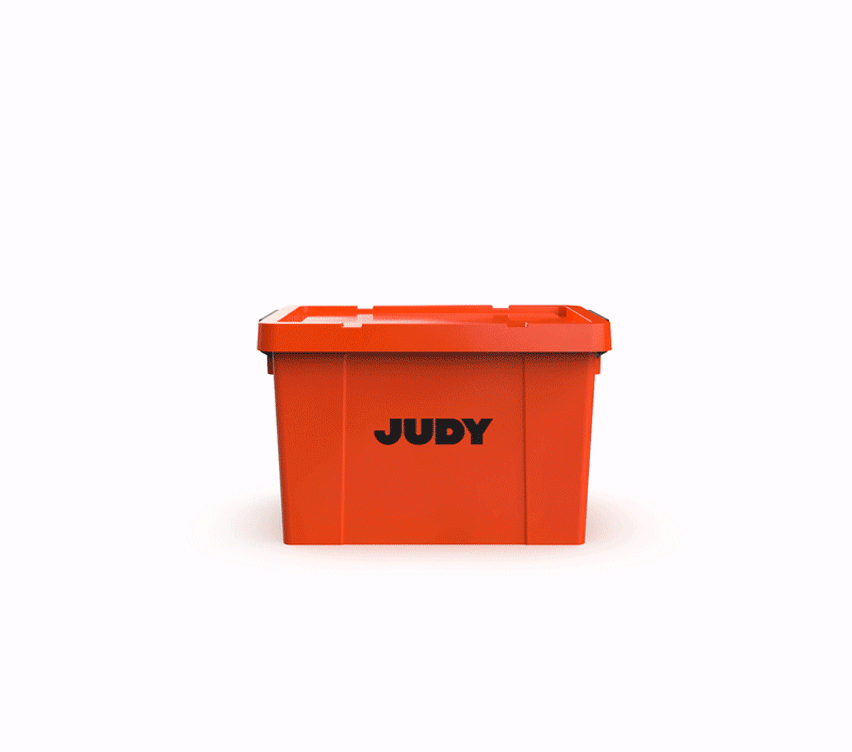
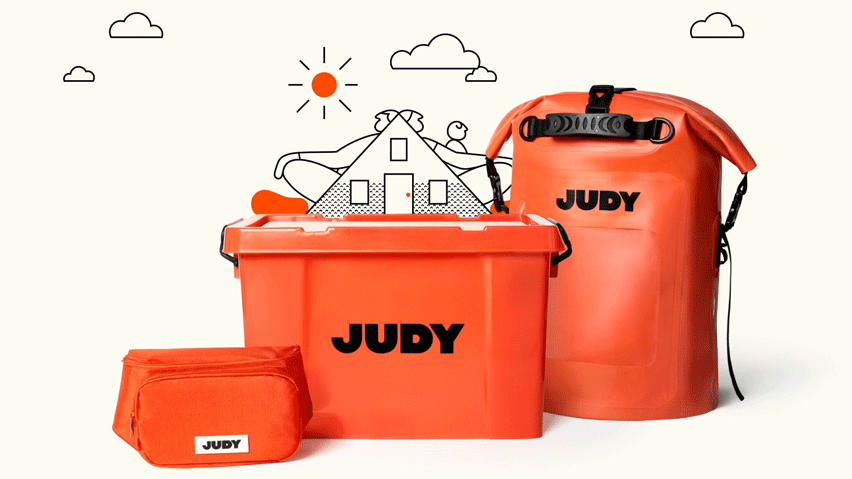
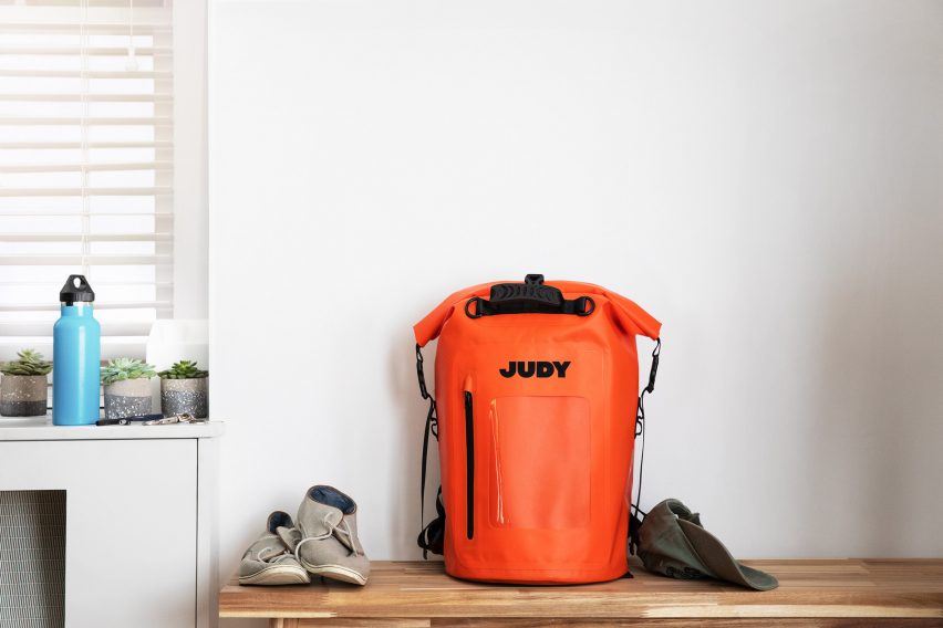
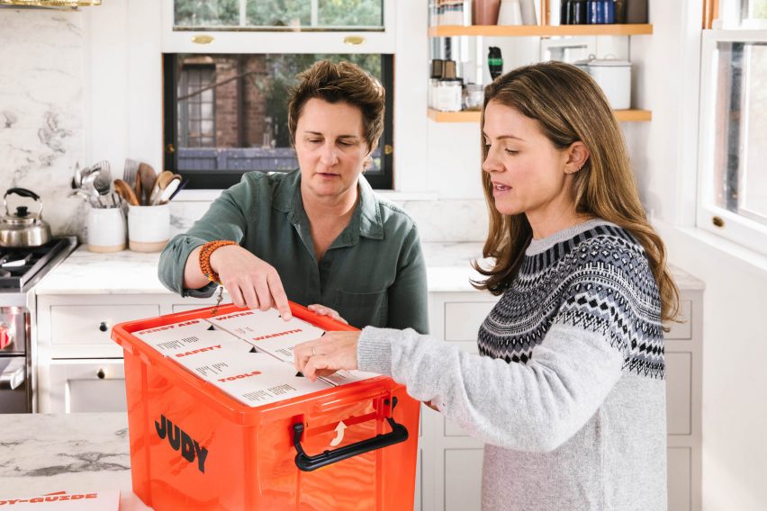
The kits come in four versions – a starter kit for one person in the form of a bumbag, two different-sized backpacks for two or four people, or a plastic box for four people.
Each pack includes a series of multifunctional essentials, such as duct tape, batteries, a phone charger, a torch and a first aid kit.
Other items include a biohazard bag, a dust mask, gloves and emergency drinking water and food with a five-year shelf life.
Design team leader Jenna Navitsky worked with Judy founder Simon Huck to create a brand identity that was straightforward and utilitarian without compromising on character.
They approached each element of the project, including the name, visual identity, industrial design and photography, from a "use-case point of view".
Instead of opting for the recognised safety colour of red, they chose a similar shade dubbed "alert orange" that would be attention grabbing but not alarming.
They paired this with the "comforting" name of Judy and simple, textbook-inspired illustrations to make an intimidating idea more reassuring.
"Simon wanted a maternal name from early on," said Navitsky. "Something that was nurturing, and confident, but also familiar and comforting."
"With 'Judy' we knew we had a brand that would take the lead and felt trustworthy," she continued. "'Judy' was a champion of common sense."

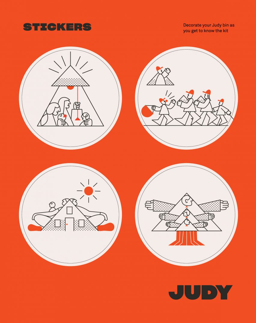
The letter J in Judy morphs to become an upward-facing arrow, resembling both a house and an umbrella, designed to convey a sense of shelter and guidance.
This arrow motif was extended throughout the rest of the branding in the illustrative work by James Graham, which features people in triangular tents and houses.
Navitsky and her team worked with Graham to create this "mid-century pamphlet style" visual identity to act like a textbook – educational, endearing and entertaining.
The agency also took design cues from space agency NASA and the medical sphere, aiming to create the right balance between level-headedness and optimism, realism and hopefulness.
The team listened to disaster-related podcasts and read survival literature while developing the project to position themselves in the right mindset.
"Throughout the design and branding process, Red Antler's aim was to be sensitive to the reality of disasters, while also creating a sense of urgency without fear-mongering," said the team.
"Judy is filling a whitespace in the preparedness category, and through elevated design, we worked to create something more approachable, enjoyable and memorable."
As Navitsky explained, one of the main focuses for the Judy kits was to avoid making them "overly designed", in order for them to be as functional as possible while still being visually appealing.
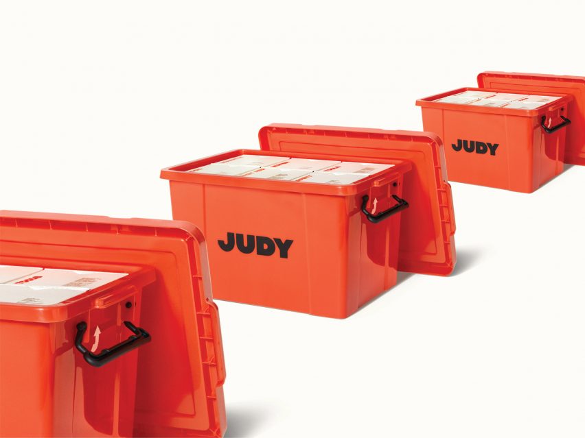
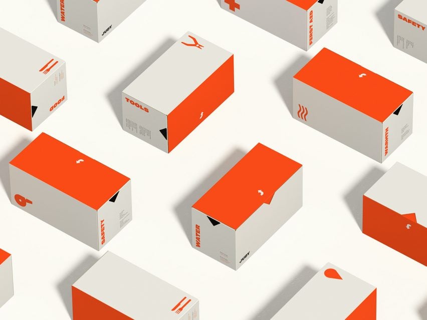
The designers categorised the supplies included in the different kits into six modular containers: tools, warmth, food, water, safety and essentials.
Each container is labelled to enable the user to see what's inside regardless of how the box is packed.
"In the survival and preparedness space, there is an astonishing lack of design sensibility," said Navitsky. "Most emergency kits are backpacks with supplies thrown in them and lack any sense of organisation, rendering them inefficient when disaster strikes."
"For Judy to be successful, we knew that the organisational structure would be a critical design component," she added. "We needed to be clear and concise about what was in the kit, where it was located and how to get it."

In a similar disaster-focused project, Seoul-based design studio SWNA created a clock that doubles up as an emergency kit filled with tools such as a torch, a blanket and a whistle.
The studio wanted to create an emergency equipment set that would blend in with regular home furnishings.