
Pentagram "future-proofs" Thames & Hudson with latest rebrand
Pentagram has designed a fresh visual identity for publishing house Thames & Hudson that is "part modernisation and part restoration".
Design agency Pentagram was tasked with creating new branding for the British publisher that would establish it as a "forward-thinking" global company while still honouring its 70 year-long history.
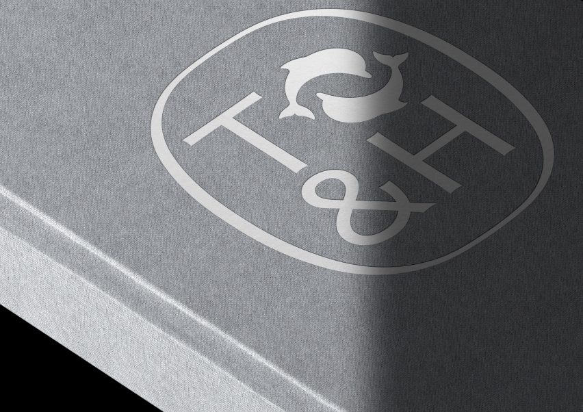
After researching how the Thames & Hudson logo had been reworked in previous iterations, the designers created a new wordmark and a modernised version of its original cartouche from when it was founded in 1949.
This initial branding was informed by two dolphins swimming east to west respectively, to reflect the company's heritage – as it takes its name from the primary rivers in London, the Thames, and New York, the Hudson.
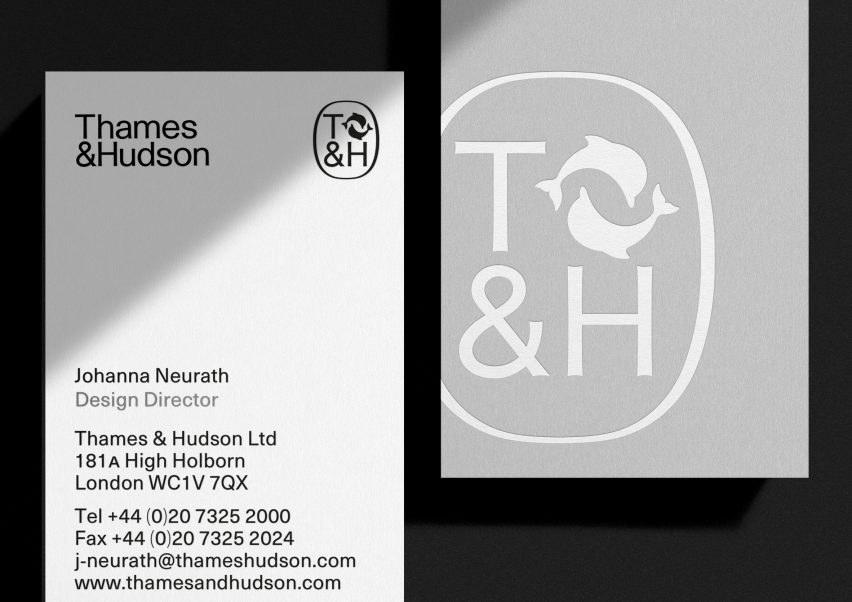
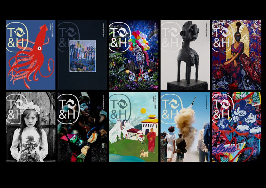
The redesigned cartouche encases a T&H monogram that has been printed in a bespoke logotype typography, accompanied by the publisher's existing dolphin emblem, which sits at the top right-hand corner.
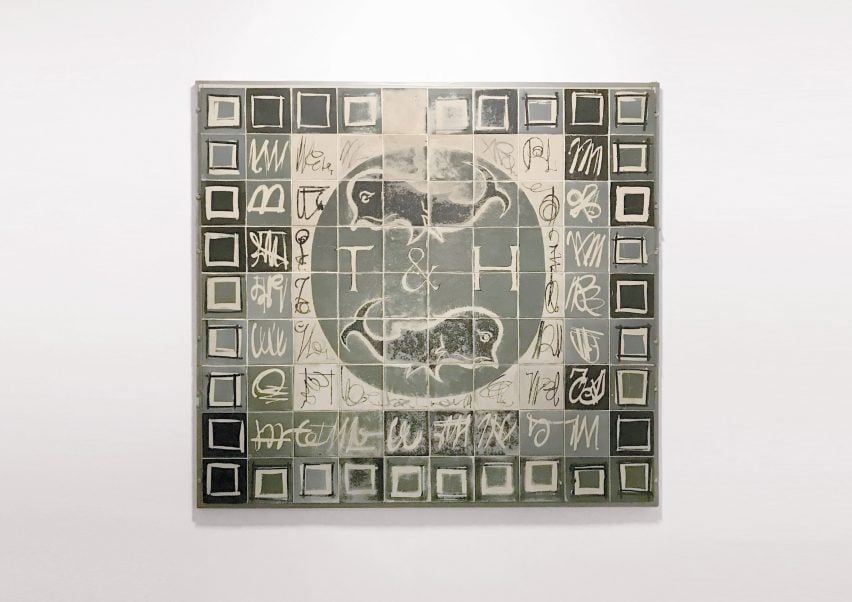
Pentagram opted for a "neutral yet sophisticated" colour palette of icy greens and blues and warmer grey tones, inspired by an original mosaic at the Thames & Hudson office in London.
"This new identity is part modernisation and part restoration of the brand", said Harry Pearce, partner at Pentagram.
"We recreated the cartouche to allow these elements to appear together in a single mark once more," he continued.
"The new modernist, sans wordmark has a suggestion of the artisanal nature of bookmaking through the subtle detailing of its letterforms," the designer added.
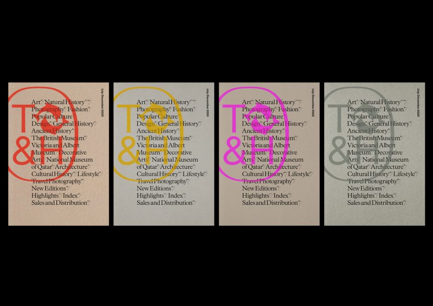
Thames & Hudson also wanted Pentagram to create a visual identity that could work across a various platforms both in print and digital, including different sized applications from thin book spines to wide banners.
Three sizes of the dolphins symbol were created to ensure consistency across different spine sizes. The emblem is always centre-aligned and sits on a nine millimetre baseline to give a uniform look when the books are placed together on a shelf.
"As the most complete visual shorthand of the brand, the cartouche can be used alone or in place of the logotype and symbol," the designers explained.
The cartouche is featured on sales and marketing materials, on the website masthead, on social media, on the title pages of books and embossed on hardcover binding cases.
Thames & Hudson's updated branding coincides with the relaunch of its World of Art book collection, which was begun in 1958 and now comprises over 300 titles covering topics such as art and fashion as well as children's stories.
"The World of Art relaunch presented us with a perfect opportunity to review our visual identity," said Thames & Hudson CEO Sophy Thompson.
"Taking stock of our rich heritage alongside our diverse publishing programme, Pentagram led us to a solution that not only future-proofs our visual manifestation in the digital world but also reinforces our position as a forward-thinking publisher with a significant global presence," she added.

Pentagram has been responsible for bringing other companies into the 21st century with rebrands, including Yahoo.
The design agency swapped out the capital letters of the logo's previous iterations for lower case letters and italicised the exclamation mark to present a "bold and confident" identity.
Other companies that received branding overhauls from Pentagram include Mastercard, workplace messaging system Slack and Battersea Dogs & Cats Home.