Malika Favre's Kama Sutra typeface shows sex as a "deeply pleasurable and sometimes funny act"
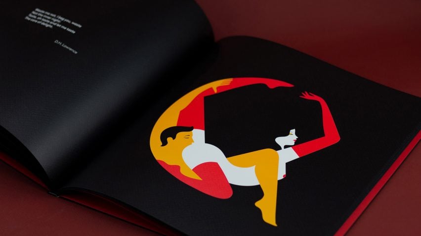
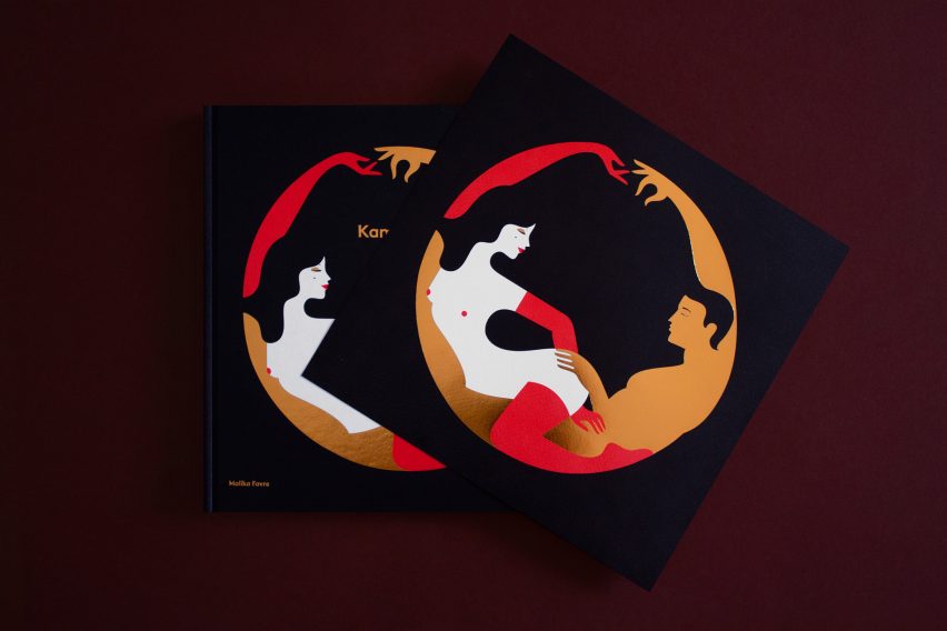
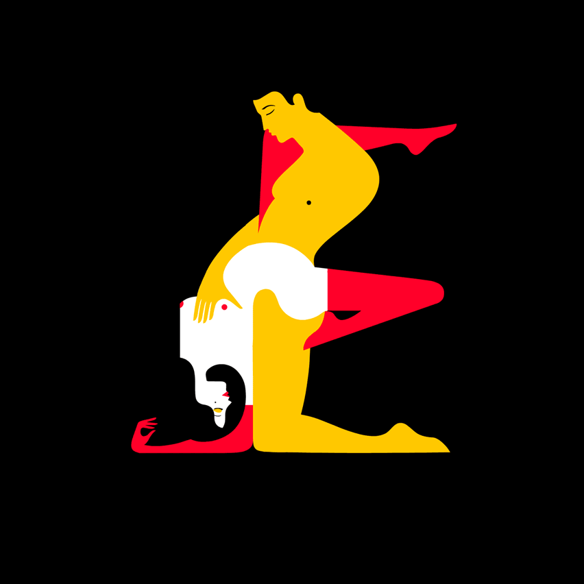
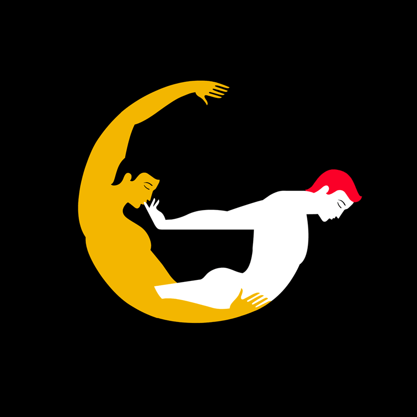
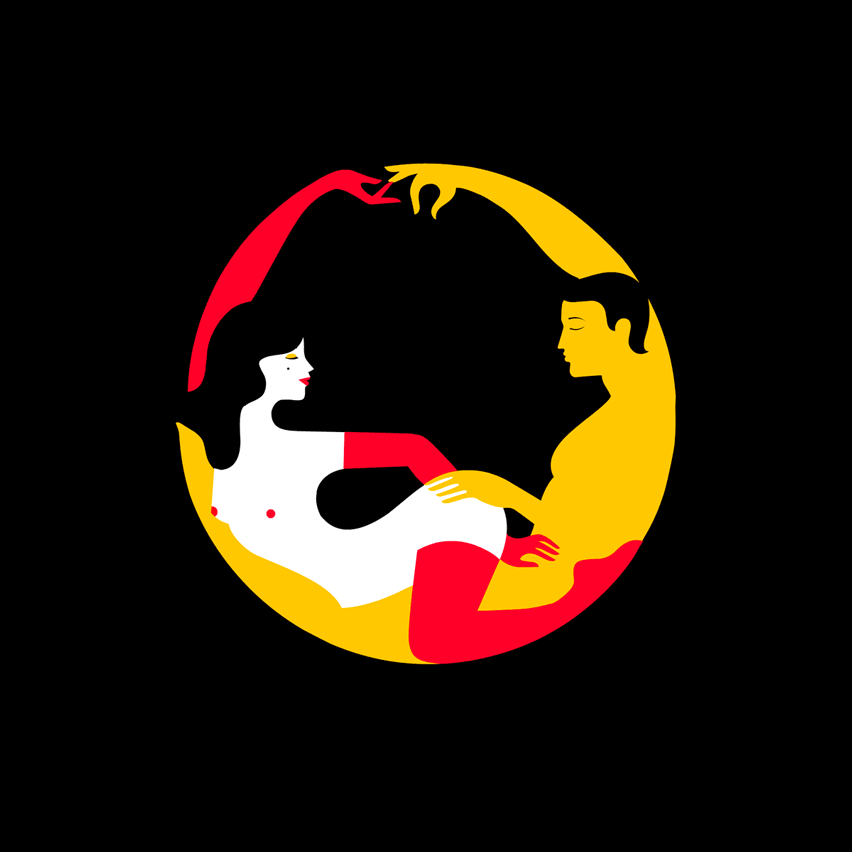
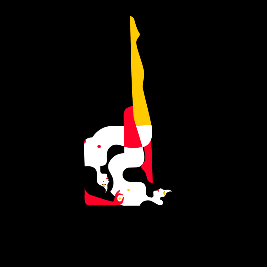
Naked bodies pretzeled together into different sex positions form the letters of the alphabet in the Kama Sutra A-Z coffee table book by French illustrator Malika Favre.
Couples are pictured in ecstatically contorted constellations, each drawn in Favre's characteristic, minimal style using only four colours.
Each letter is paired with an erotic verse or text, from classics by Emily Dickinson and Shakespeare to modern works by Michael Faudet and American poet Stephanie Burt.
"I wanted to show how relevant and timeless erotic poetry is as a whole and bring different voices into it," Favre told Dezeen. "I wanted the final selection to be a mix of eras, genders, sexual orientations and tones."
The alphabet itself was first designed for Penguin's reissue of the Kama Sutra – a Sanskrit text that gained notoriety for advocating adventurous sex positions but is actually more like an ancient self-help manual to love and courtship.
After illustrating the letters that spell out the book's name, Favre went on to finish the alphabet for an exhibition at Somerset House.
"The whole project was quite challenging for me as I was carefully trying to walk that line between sensuality and vulgarity," she remembered.
Favre based her designs on the iconic Futura typeface. It features clean, geometric shapes, created by German typographer Paul Renner in the 1920s, which made it one of the most widely-used fonts of the century.
"I have always been a big fan of this bold and unapologetic font," Favre said. "Its visual balance acted as a very strong backbone for my work and left enough space for interpretation without losing the understanding of the letter itself."
"Having consistency throughout the letters was very important to me, so working within the constraints of an existing font made sense from a design standpoint," she continued. "Also, I love giving myself ground rules before breaking out of them."
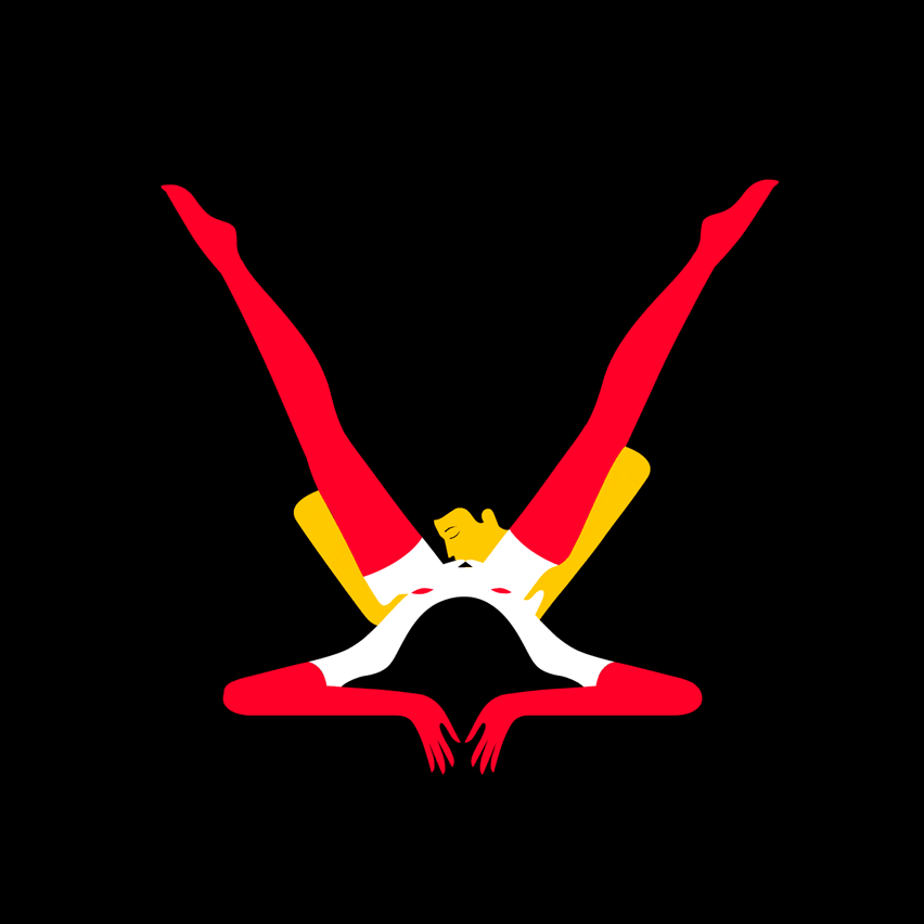
From there, she playfully moulded bodies together to fit the different letters and illustrate a range of power dynamics and preferences.
The figures are offset against an entirely matte black background. One member of the couple is depicted with bright white skin and red gloves and stockings, while the other is theatrically clad in yellow gold leaf.
"I remember first picking the palette very instinctively and then looking up the meaning of the colours in Hinduism to make sure it worked both on a visual and symbolic level," Favre said.
"Yellow represents learning while red is the colour of sensuality and purity so the fit was absolutely perfect."
The idea of including poetry to complement the letters came to Favre after reading the work of Mexican American writer Sandra Cisneros, which reaffirmed to her that erotica doesn't have to be kitschy or cringey.
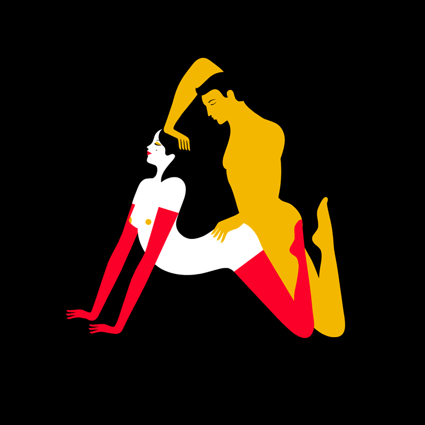
In the final book, verses from Cisnero's poem Beatrice accompany the letter S, which Favre describes as "one of the naughtiest". It reads: "Kiss me. I am an odd geometry of elbows and skin, a lopsided symmetry of sin and virtue".
This matches the letter S, and the rotational symmetry of its curves, formed by a woman's swooping legs on top and a man's kneeling stance on the bottom.
"The poem itself has to echo the letter, whether it was the shape of it, its underlying story or the action. It just had to feel right," she said
"Everybody wanted to help, too, [the publisher] Counter-Print, my assistant Lea, close friends, my partner of course – I had suggestions coming from all sides, which goes to show that erotica is as universal as it is approachable," she continued.
"I hope that this book will proudly sit on people's shelves and coffee tables, be shared and enjoyed privately or publicly and that it will maybe help a few people to look at sex as what it is: a beautiful, highly enjoyable, deeply pleasurable and sometimes funny act."

Favre has previously designed an alphabet using the naked female form topped with a cartoon bunny face, in her work for London studio Airside.
Earlier this year, Filipino graphic designer Julius Raymund Advincula released a typeface made entirely from the folds and creases of his own body.