Marie Boulanger explores how typography perpetuates gender stereotypes
Type designer Marie Boulanger has written a book about how typography is a "dangerous tool" for reinforcing gendered stereotypes and bias in design.
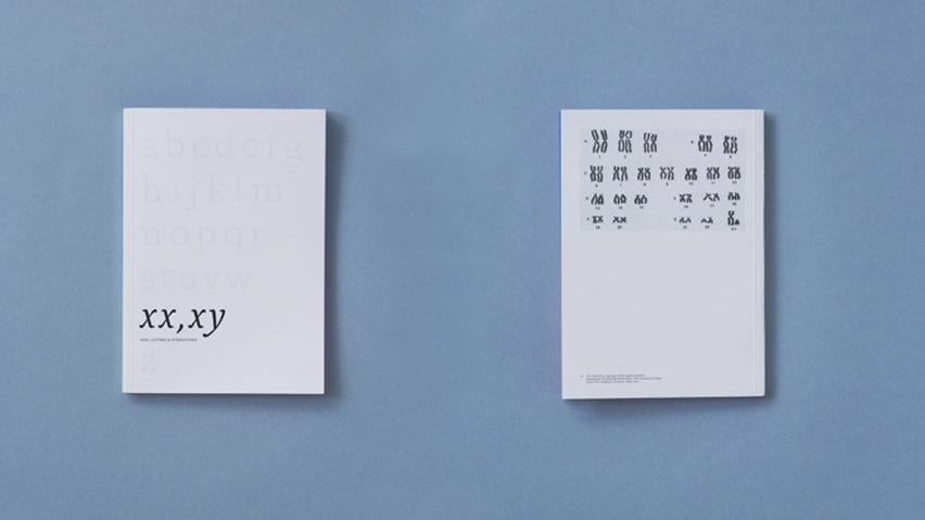
Called XX, XY: Sex, Letters and Stereotypes, the book unpacks how fonts can be assigned masculine or feminine associations that are used to reinforce the binary when designing products and packaging.
"Type is used as a dangerous tool to cement layers of stereotypes conveyed through every component of design such as type, colour and layout when it shouldn't be," said Boulanger.
"Through association, letters become signs which are instantly perceived as male or female. This takes the focus out of the formal qualities of typefaces," she added. "When used like this, type is a very powerful tool and I want to show that it's up to us to know and do better."
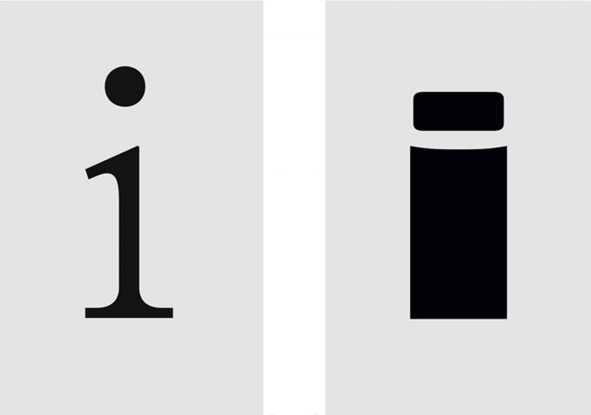
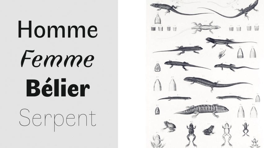
London-based Boulanger examines typeface anatomy, a term given to the "body parts" of letterforms, and explains how and why we attribute masculine or feminine qualities to fonts.
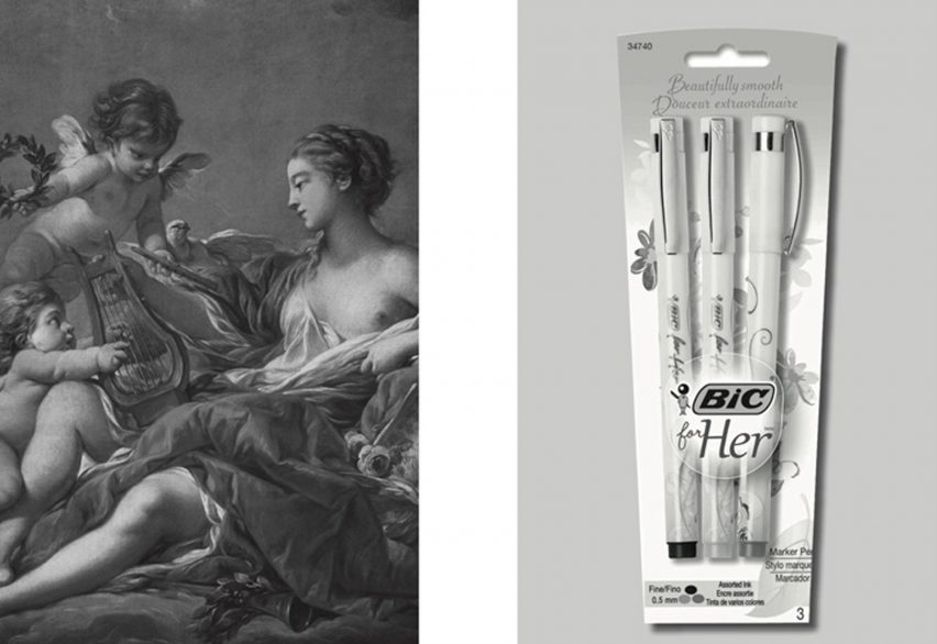
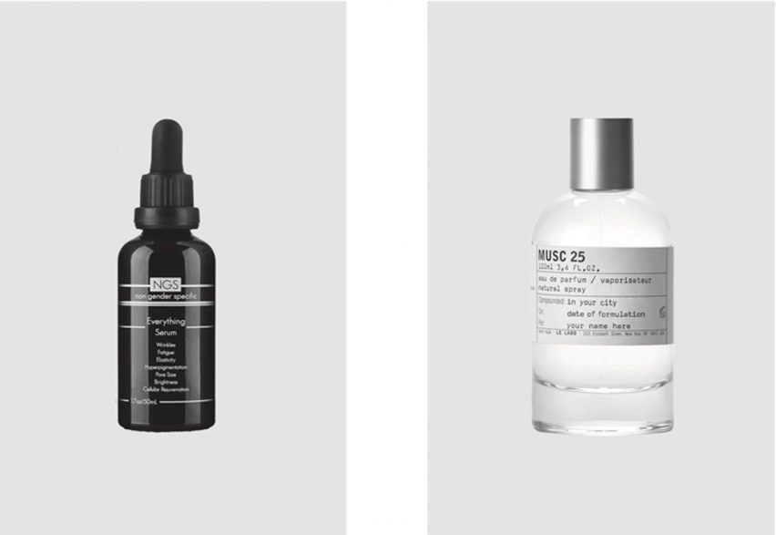
The designer highlights how bold and confident lettering is often associated with masculinity, while delicate and ornamental typography tends to be deemed feminine.
XX, XY unpacks how masculine and feminine associations have been formed over time, and explains that it is important to challenge these biases in the design industry to work towards a more equitable world.
Boulanger argues that gendering typefaces lead to products marketed to people in a way that enforces stereotypes.
"There is a very deep link to marketing," explained the designer.
"Classifying things into categories is a gateway to more sales, especially for products targeted at women," she continued. "Women are responsible for a huge majority of consumer purchases."
The designer titled her project in reference to the XY-sex determination system, which uses XX and XY to classify sex chromosomes.
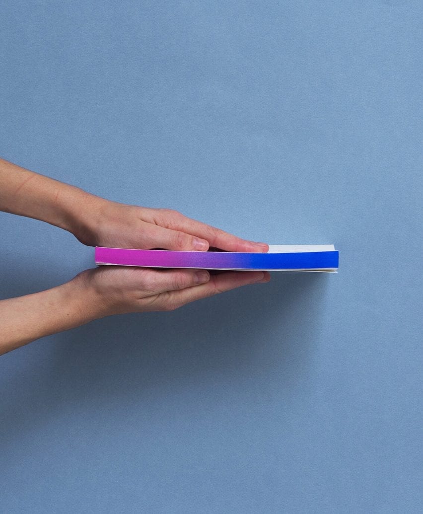
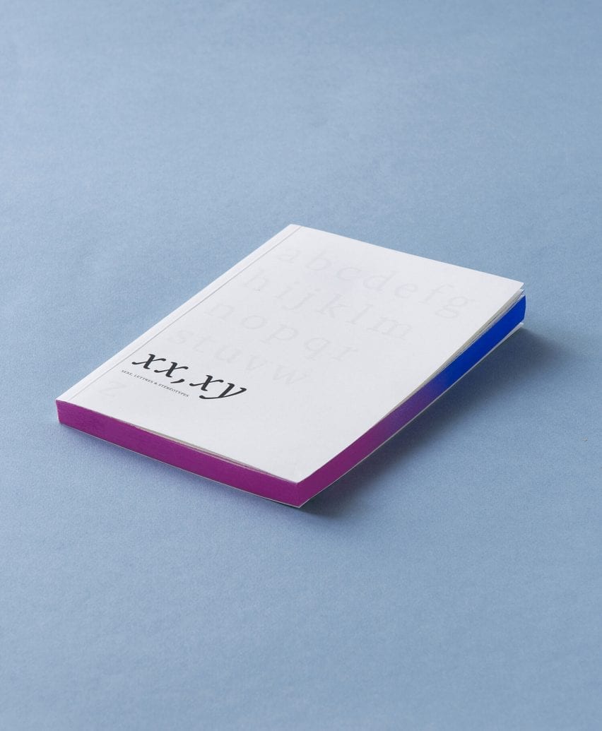
The book's cover displays a greyed-out alphabet with the letters XX and XY highlighted in black. A pink-to-blue gradient has been sprayed along its edges, blurring the two colours.
"The name came to me instantly, alongside the cover design," Boulanger told Dezeen. "It elegantly carries the main premise of the whole argument. We treat and describe letters like human beings."
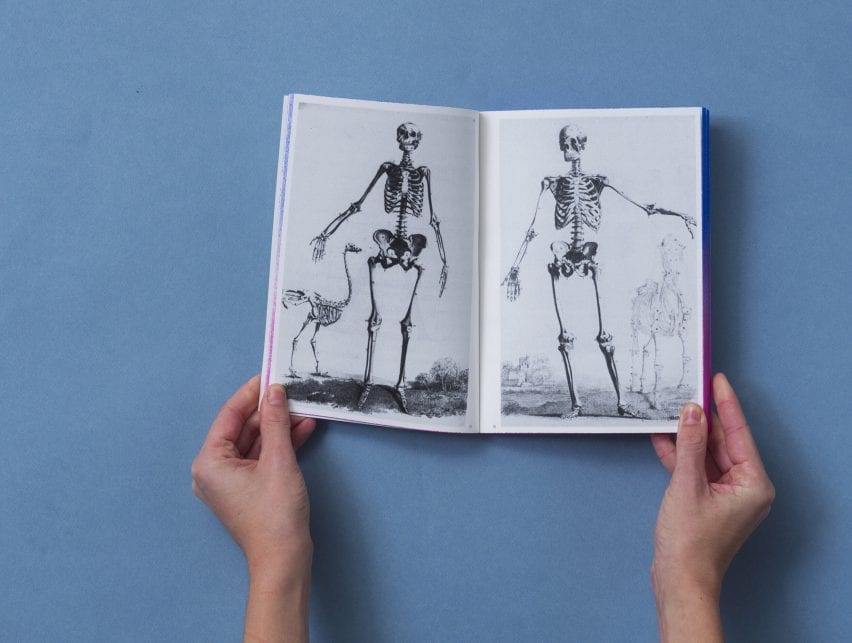
Boulanger's book is illustrated with a mix of imagery borrowed from art history and current typographic work.
The designer created the book in an attempt to make her research on how we automatically cast gendered judgement on letterforms accessible to a varied audience.
With the dimensions and weight of an average paperback novel, the book is designed to be something that can be read while travelling or left on a bedside table.
Currently only published in French, the designer hopes that her project will soon be distributed in English, primarily for the purpose of education.
"Education has always been the main driving force behind this project," said Boulanger. "I hope students use this book to realise that we can all shape what's next. We can find better ways of designing and speaking about our design work."
Other recent typographic projects include a typeface designed for a bowel cancer charity that looks like intestines. Another typeface, Periods for Periods, was created to protest period poverty and is made solely out of full stops.
The images are courtesy of Marie Boulanger.