Citroën returns to original logo to create "symbol of progress" for electric era
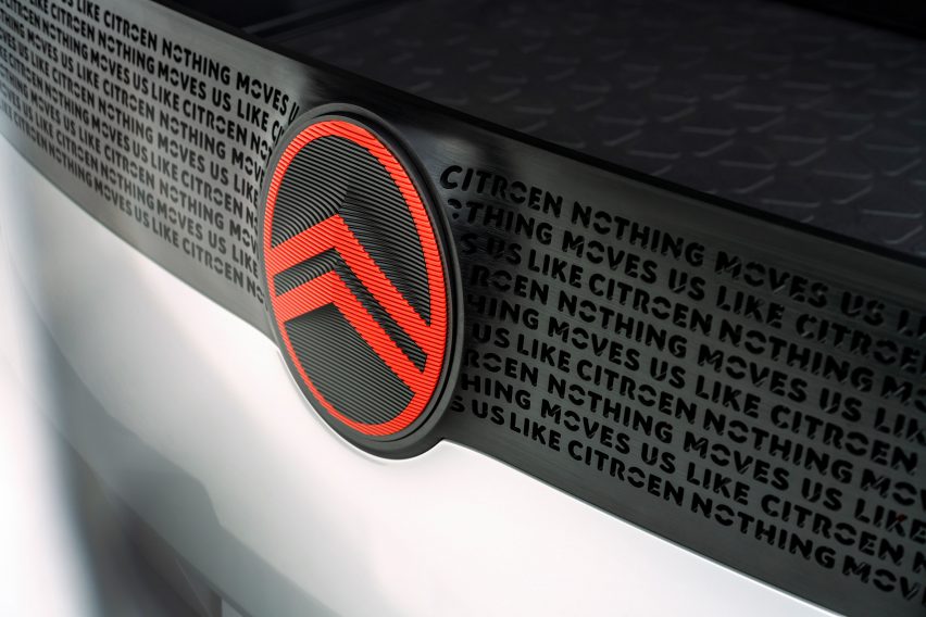
French car manufacturer Citroën has unveiled a new logo that recalls the brand's original 1919 logo, to mark the start of a "dynamic era" and its mission to make electric vehicles more accessible.
The new logo, which was created by the Citroën design team and global brand design agency Stellantis Design Studio, sees the return of the oval to enclose the automaker's deux chevrons – two upside-down V's that recall chevron herringbone patterns.
The chevrons have also been refreshed to be thicker and "more prominent" than in the original while the oval has been softened and stretched.

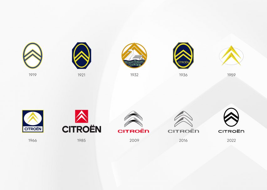
According to Citroën, these changes pay homage to the brand's first logo adopted by founder André Citroën while making it feel familiar yet "modern and contemporary".
"As we embark on probably the most exciting chapter in our illustrious 103-year history, the time is right for Citroën to adopt a modern and contemporary new look," said Citroën chief executive officer Vincent Cobée.
"Our new identity is an elegant symbol of progress as we move our customers physically and emotionally by ensuring their entire experience – particularly going electric – is more affordable, comfortable and enjoyable whatever their wants and needs," added Cobée.

The logo, which is the tenth major redesign for the brand, will be first used on a conceptual Citroën family vehicle at the end of September, before being rolled out to all Citroën models from mid-2023 onwards.
It replaces the company's previous two larger shaded chevrons logo, which was last updated in 2016.
Although the logo is a return to the past, the brand claims that it signifies its switch in focus to electric vehicles, such as its Ami One Concept electric vehicle, designed to be an alternative to both shared bikes and cars.
"By embracing our roots and reinterpreting our identity in a modern way, we are sending a clear message to everyone that while we’re staying true to our brand DNA, things are changing dramatically at Citroën," said head of Citroën marketing and communication Laurent Barria.

Citroën is not the only car manufacturer to modify its logo for the electric era. In the battle to convince consumers to switch to battery-powered cars, several companies have rebranded.
These include American automotive company General Motors, which made its first substantial logo change in more than half a century as part of its shift towards an electric future. Similarly, German manufacturer Volkswagen launched a line of fully electric cars with the announcement of an revised logo.
Other car manufacturers that have recently unveiled updated logos include British luxury carmaker Aston Martin, which enlisted legendary designer Peter Saville to redesign its winged emblem.
Meanwhile, Swedish car manufacturer Volvo revealed a flat version of its longstanding Iron Mark logo in a long list of car manufacturers that have returned to flat logos.