
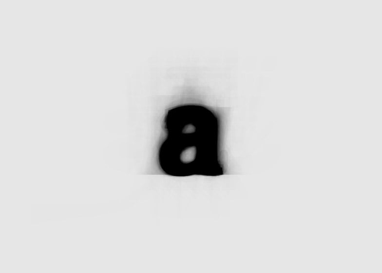
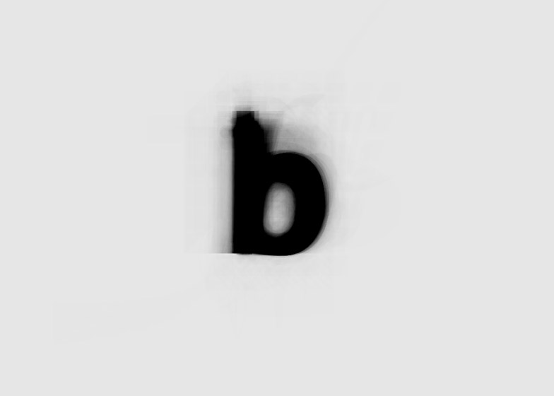
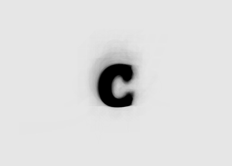
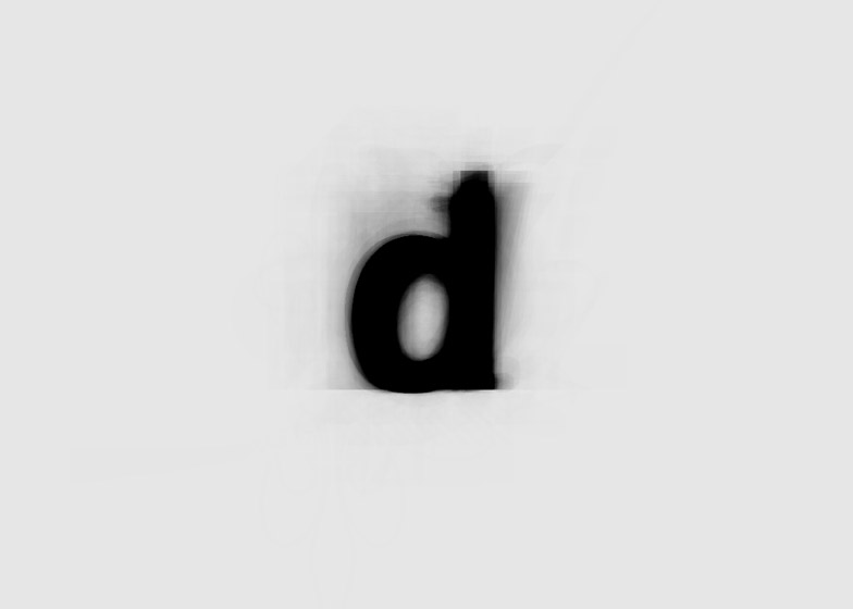
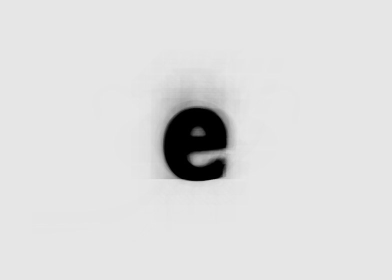
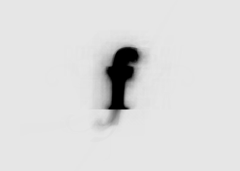
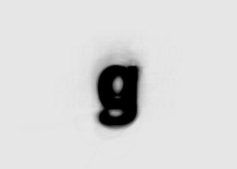
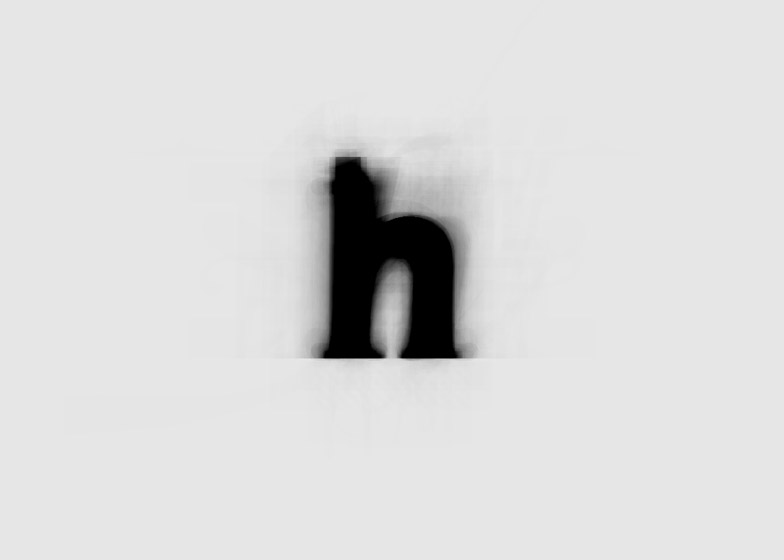
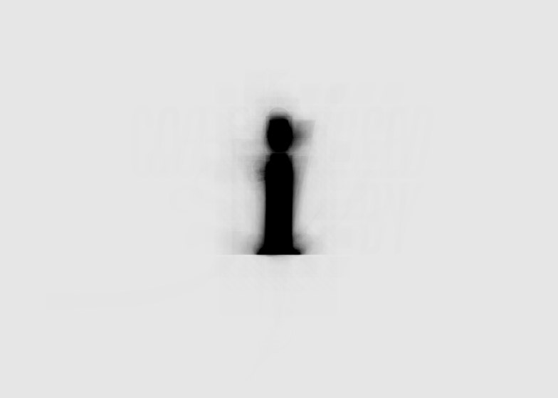
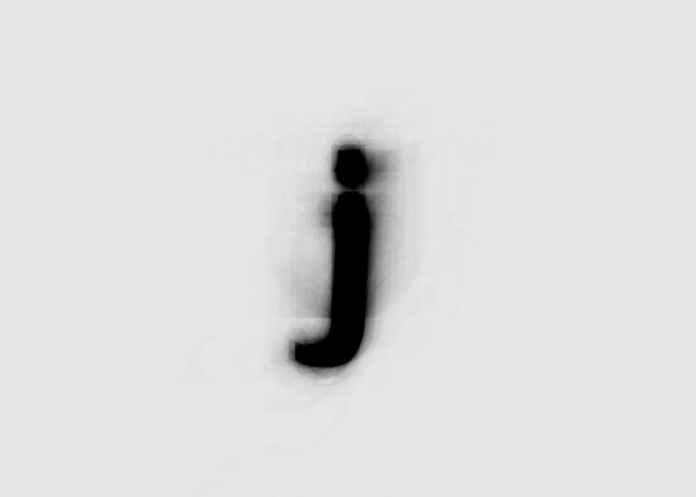
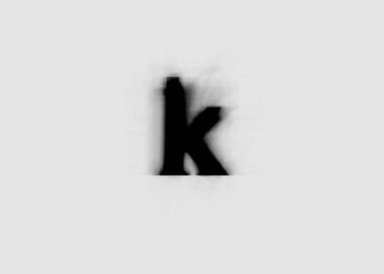
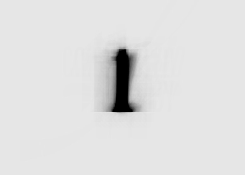
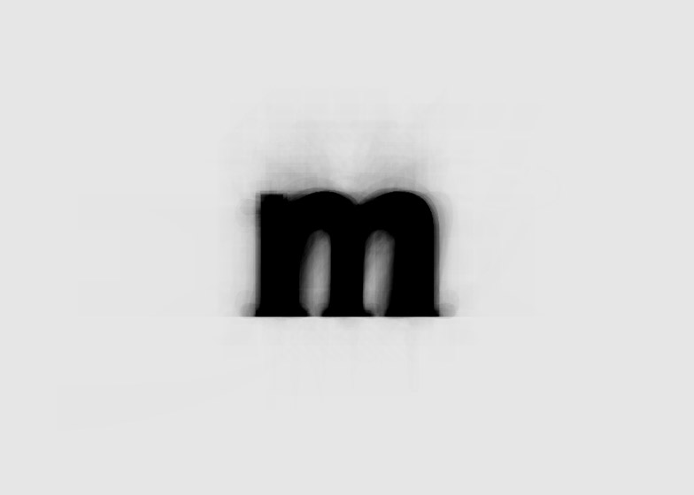
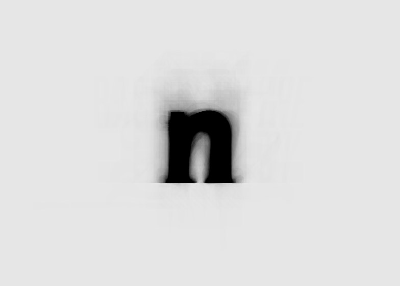
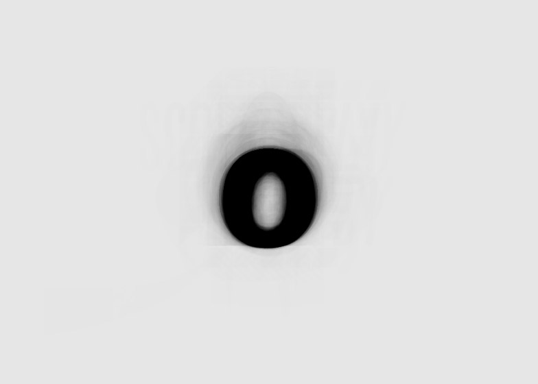
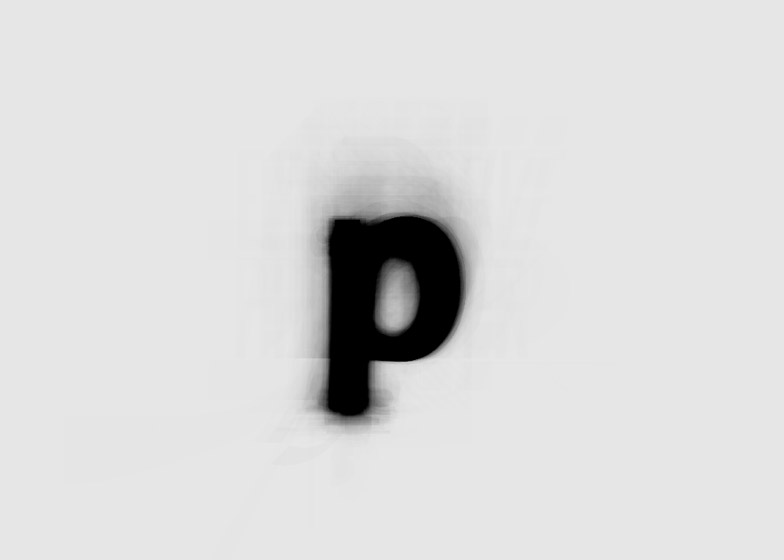
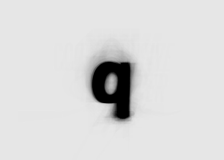
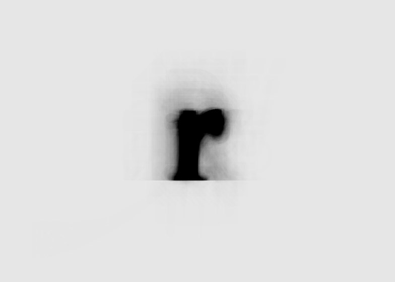
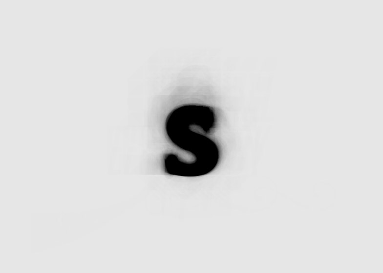
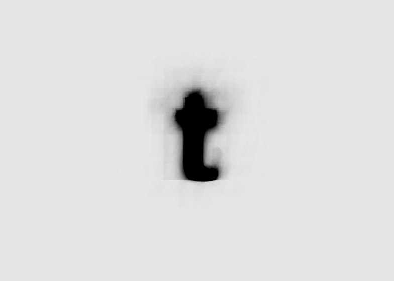
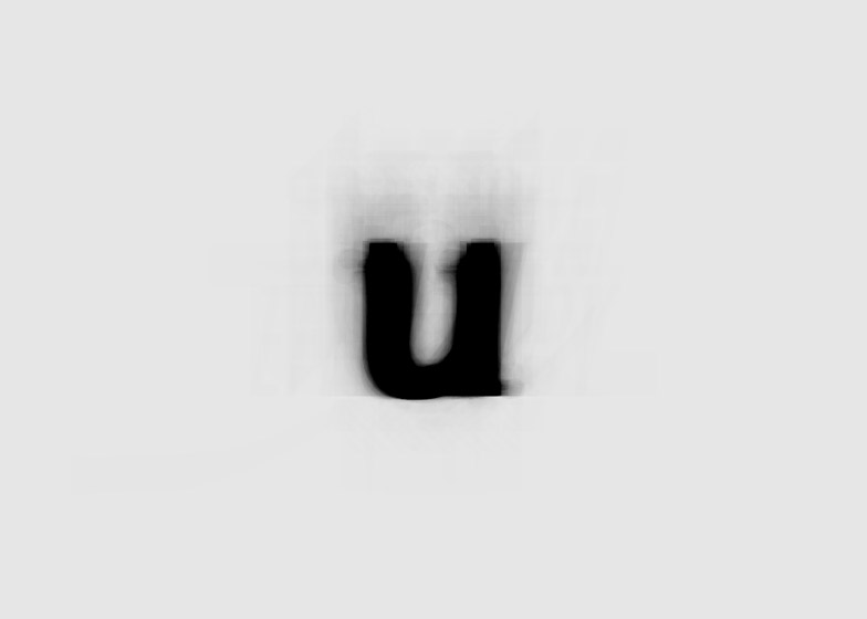
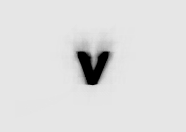
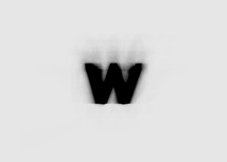
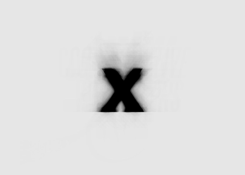
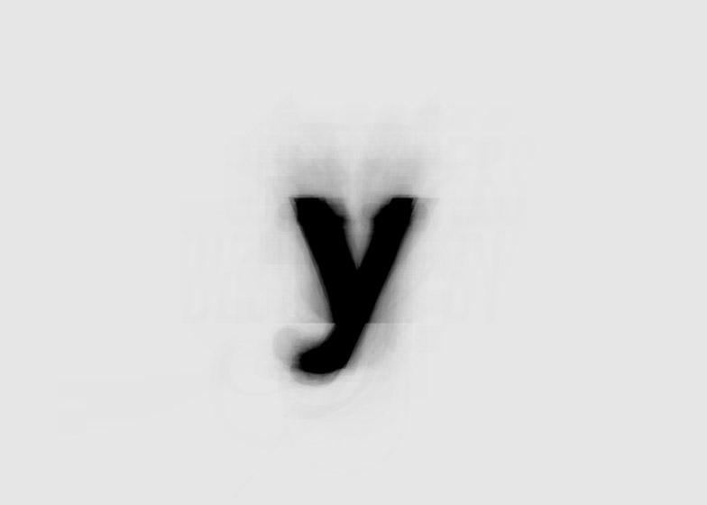
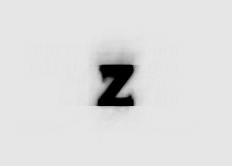
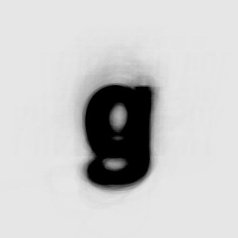
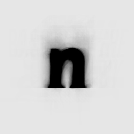
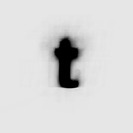
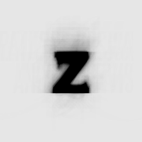
New York artist and designer Moritz Resl has compiled a new "ghostly" typeface by overlaying each letter of the alphabet from over 900 existing font families (+ slideshow).

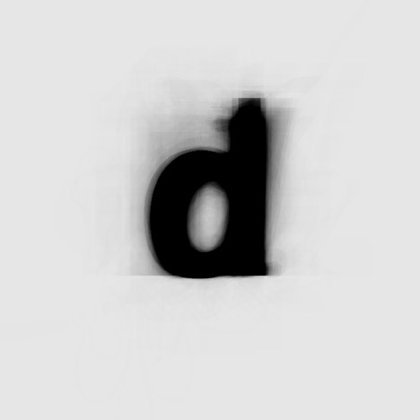
Moritz Resl's project, The Average Font, combined every individual letter of the alphabet from more than 900 typefaces that were installed on his computer system.
He wrote a simple software application that scanned his digital type library and then deposited the versions of every character from a to z into the exact same spot. These were placed with a low opacity, providing an overlapping effect.
"I wanted to somehow grasp the 'essence' of my typefaces and what they had in common," Resl told Dezeen. "I didn't exclude the ugly ones."
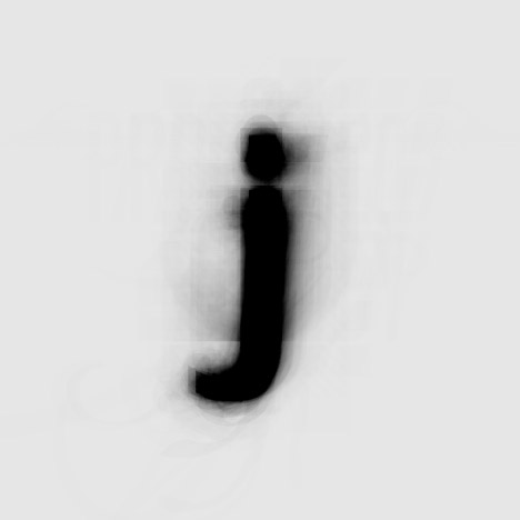
"The visual result is a kind of sum of all overlapping parts," he continued. "I'm quite happy with the results from a visual point of view. The characters' shapes have once been described as 'ghostly' and the project as typographic poetry – I think that's quite accurate. To me, it's a piece of art hanging on walls rather than an actual font."
Because typography is a daily consideration for Resl, his idea for The Average Font surfaced organically. "In my work as an artist and designer, I have to deal with typography almost on a daily basis," he explained. "The urge to explore this matter in one way or the other came quite naturally."
Although Resl concedes this particular typeface will probably be too blurry for general use outside of the project, the designer is working on another font based on a similar process – but admits "some compromises" will need to be made in order for it to work.
There could be other potential uses for blending font families together with this merging technique, and the designer intends to experiment further.
"There are a lot of possibilities," Resl said. "It would be interesting to try a version with only serif fonts and only non serifs. In addition, [typographer and designer] Erik Spiekermann suggested to me on Twitter to exclusively try regular cuts. The good thing is I can create a new version at any point in time, my collection of fonts is constantly growing with no end in sight."