The interior of this former council-owned house in north London has been given a modern makeover by local studio Archmongers to create brighter spaces with colourful accents (+ slideshow).


Archmongers, which previously remodelled a 1960s terraced house elsewhere in the city, were tasked with refurbishing a property in a typical 1970s block, to create a modern home for a couple.

"The flat was in a very neglected condition and pretty unfit for habitation when it was purchased," Johan Hybschmann from Archmongers told Dezeen.
"The spaces were fitted with worn, unappealing materials and were laid out as a series of small-disconnected rooms. The project began with a complete strip-out and demolition."

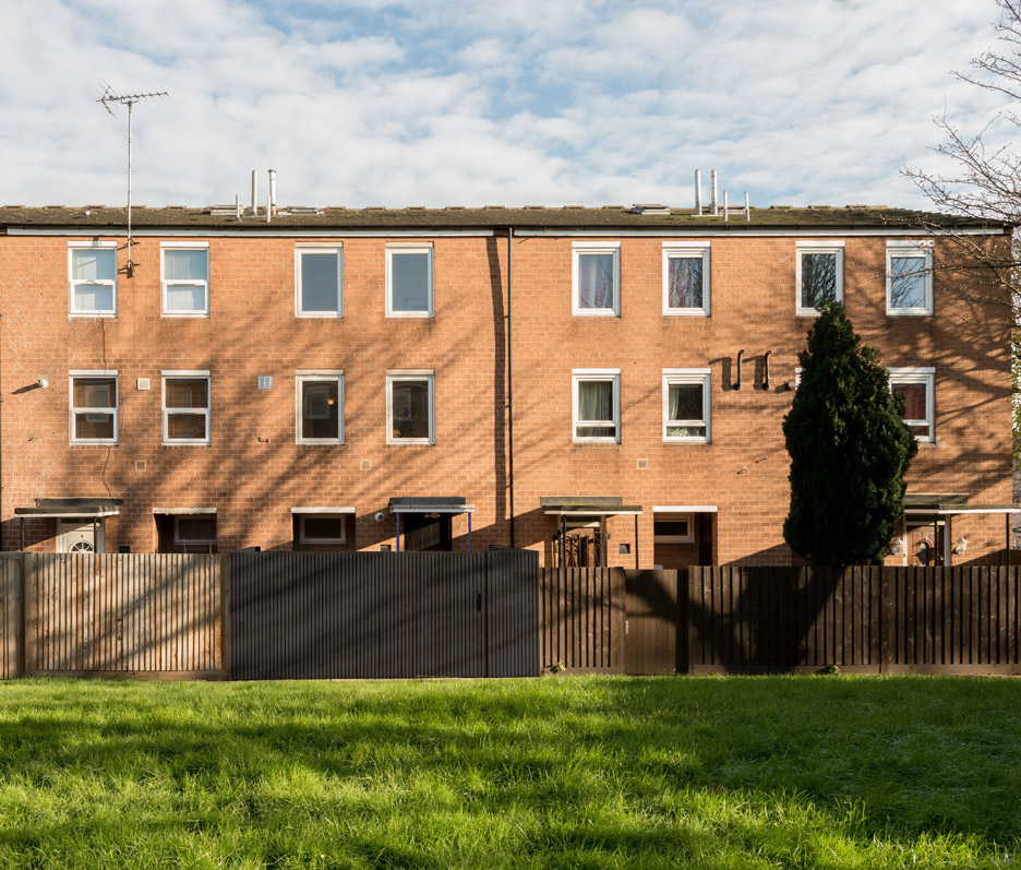
Minimal interventions were made to the house's exterior to comply with planning restrictions relating to the leasehold agreement.
New windows, a front door, and a black-stained fence and porch give the property a more contemporary appearance without disrupting the building's overall aesthetic.

"With this type of building, for us the project was really about seeing the potential of the interior spaces in contrast with the plain and ugly exterior," Hybschmann added.
"The only significant change was the new fencing, which is designed to give a backdrop against which to grow a green garden room."

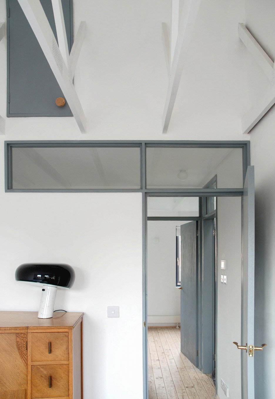
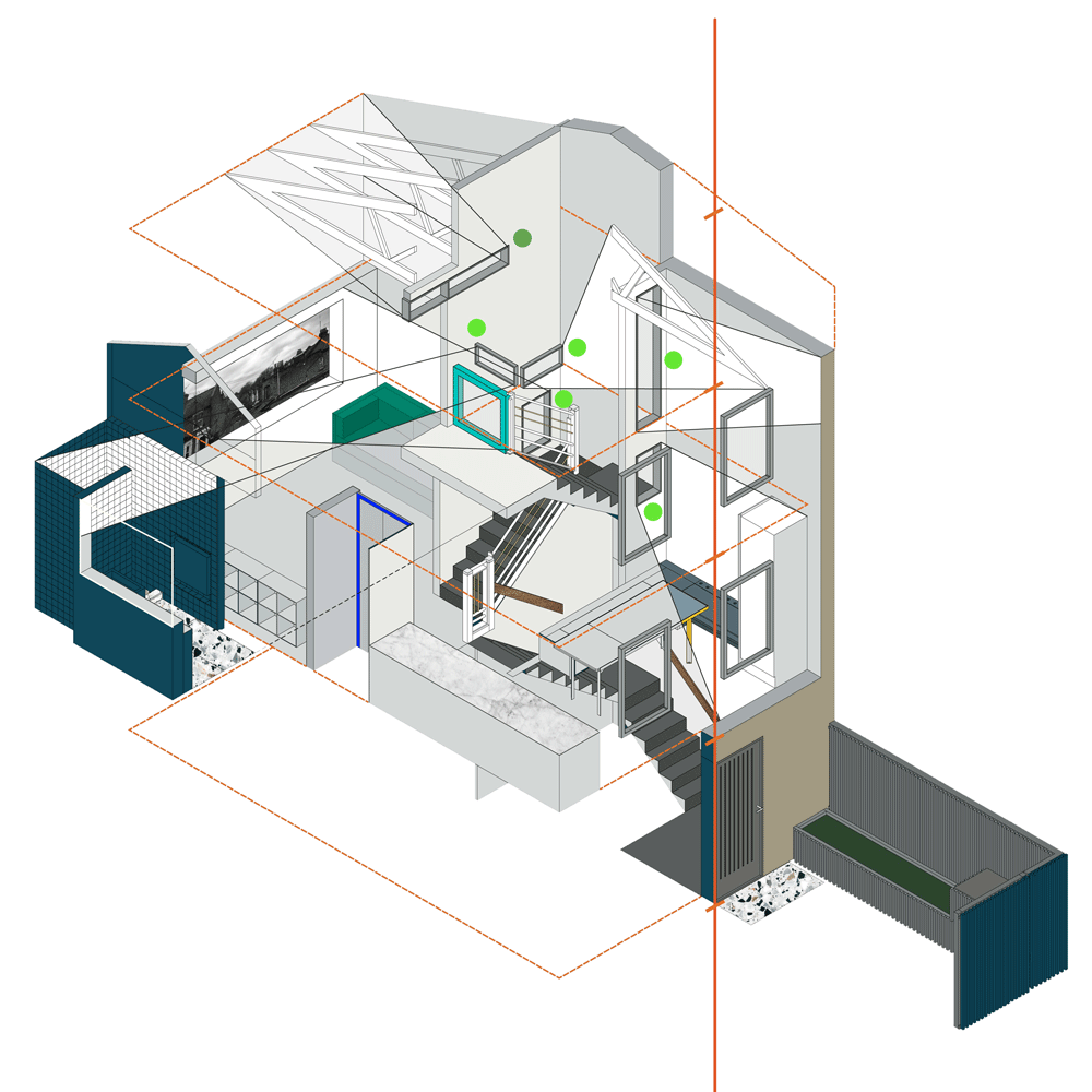
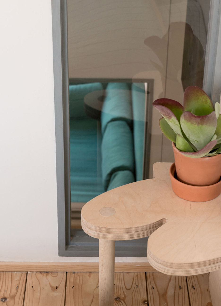
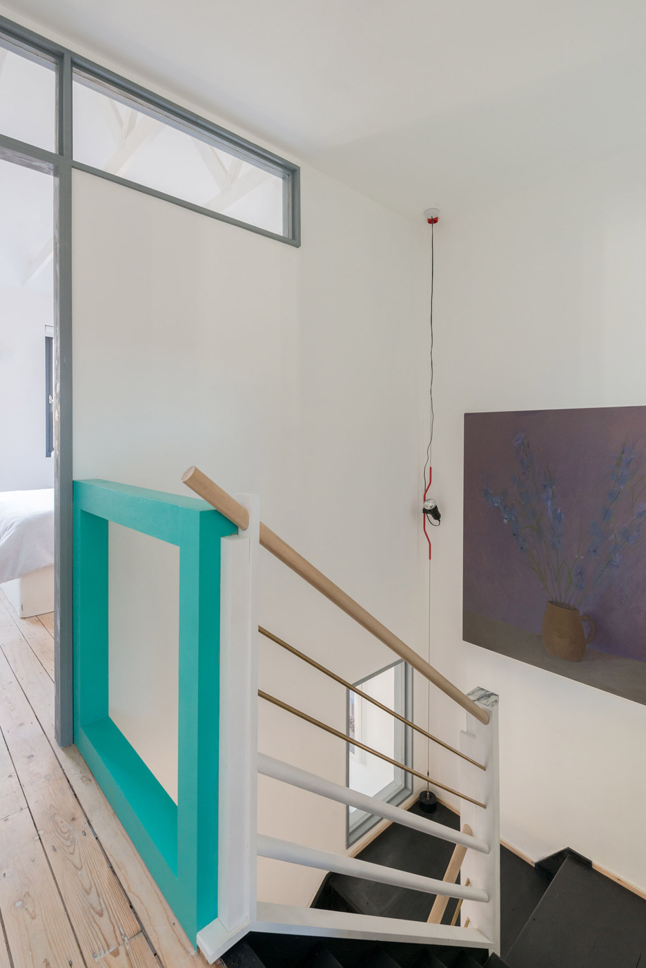
Inside, existing openings were enlarged to improve visual connections between rooms and let more daylight in. The architects gave the project the title Peek House in reference to "this notion of gaining glimpses through this altered internal landscape".
The wooden stair is stripped back and stained with black dye to create a bold contrast with the white walls. A vivid turquoise frame lining the top-floor landing injects some colour into the otherwise monochrome space.

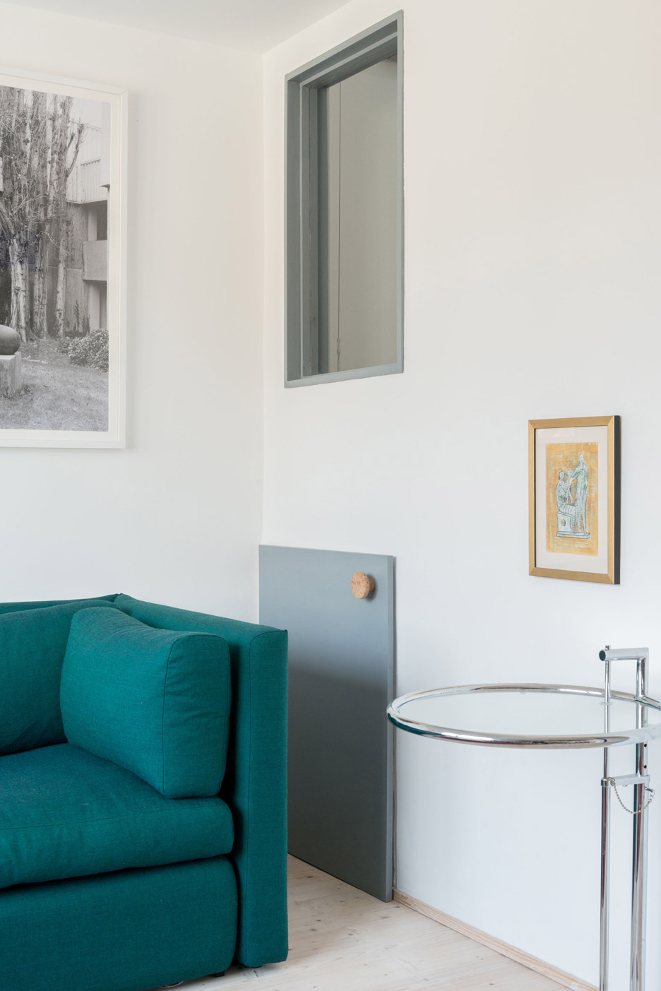
"The areas of colour are designed to work in contrast to the light interior," Hybschmann explained. "The highlighted elements can also be seen through the interior windows as reference points."

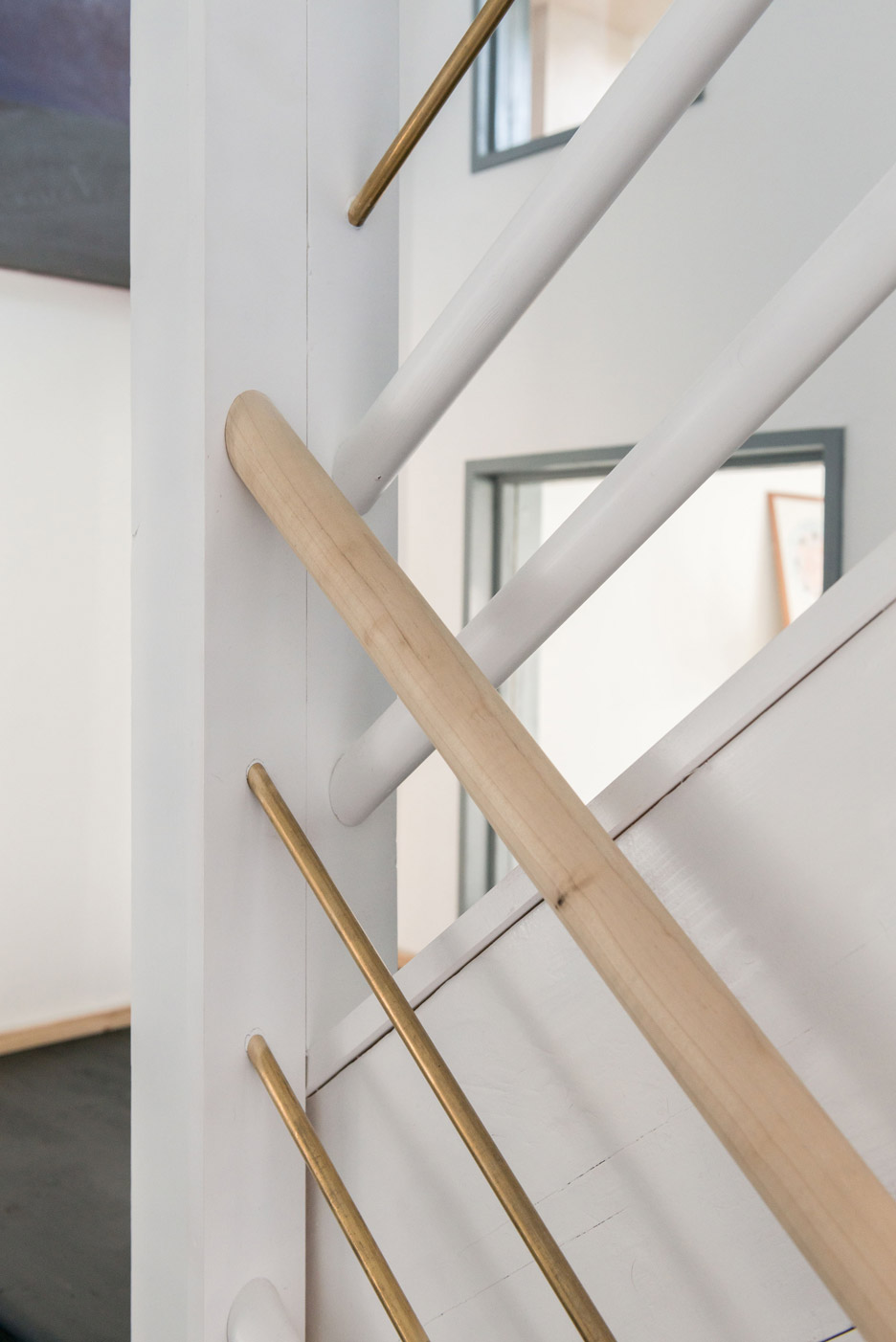
A bespoke handrail, and banisters made from thick hardwood dowels and brass rods, add a warmer tone to the circulation areas, while marble finials introduce a subtle textural detail.

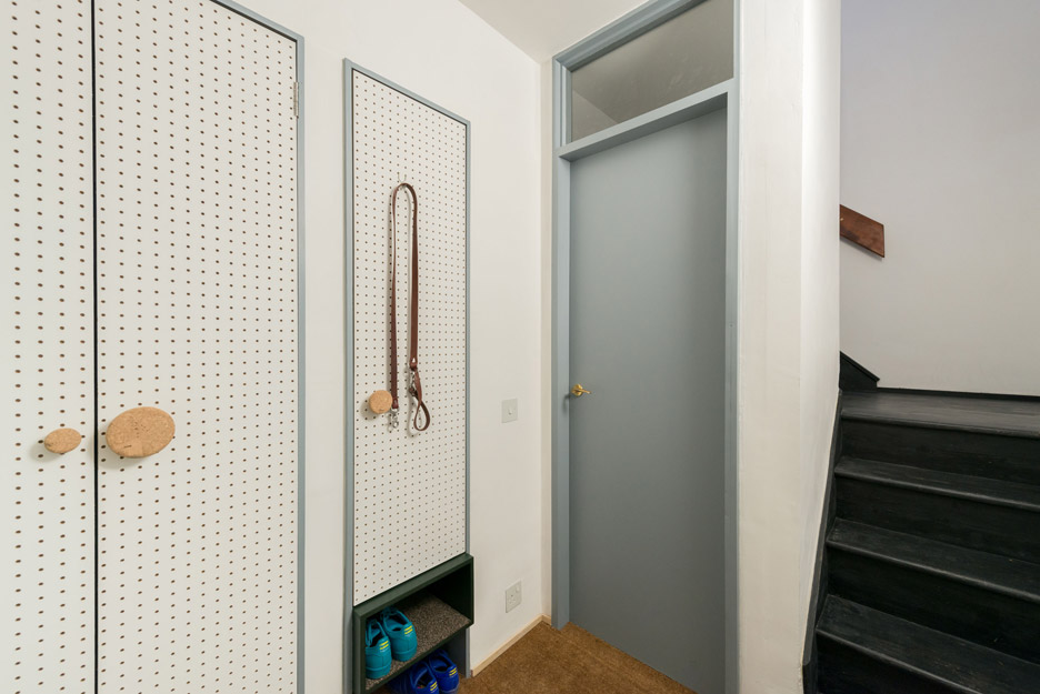
At the base of the stairs is an entrance hallway with coir matting on the floor and pegboard panels covering the doors of storage areas.
The door to a washroom next to the stairs is painted in a shade of grey also used for other doors, window frames and storage spaces.
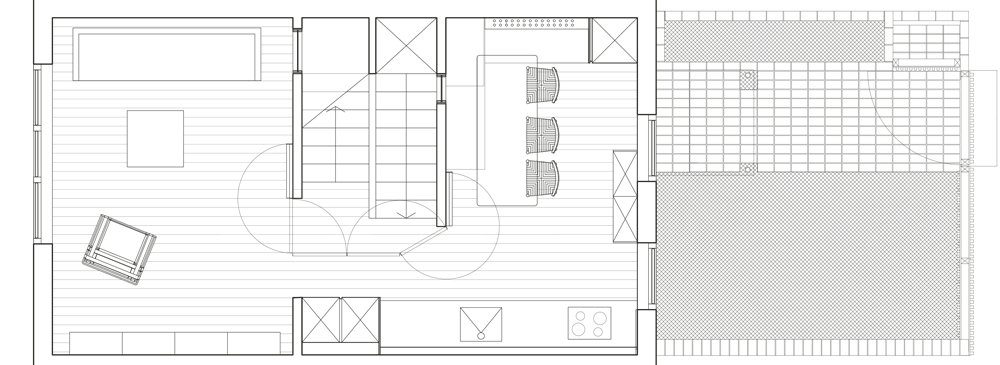
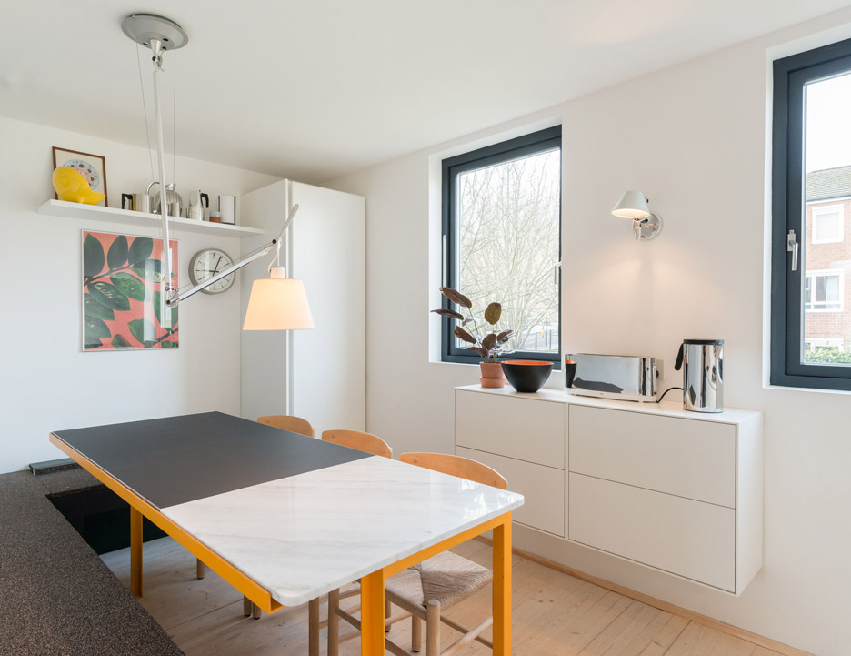
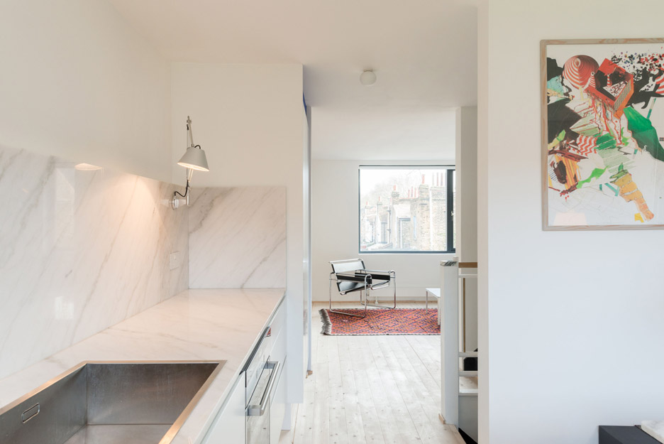
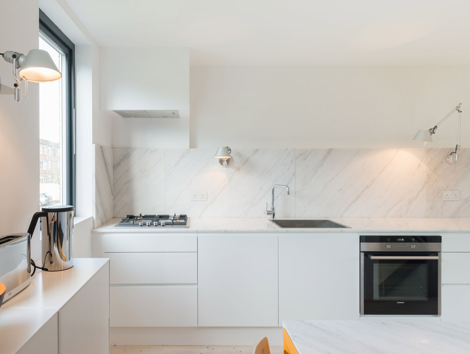
On the first floor, a pale wooden floor reaches from the living room on one side of the staircase to the kitchen and dining area on the other. A white marble worktop and splashback extend along the kitchen wall, and the dining room incorporates a built-in corner bench topped with a layer of rubber.
The dining table's steel frame is painted yolk-yellow to add another hit of vibrant colour and an ultra-blue shade is applied around the tall kitchen units opposite the stairs.
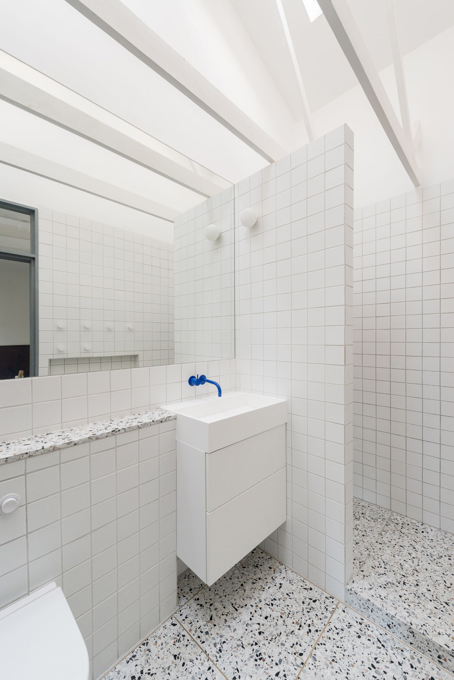
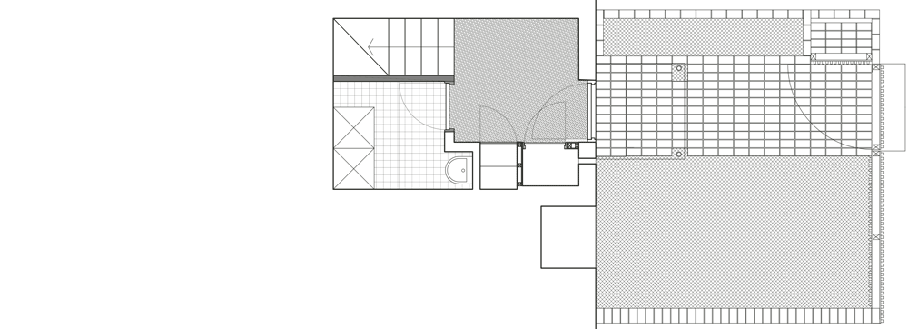
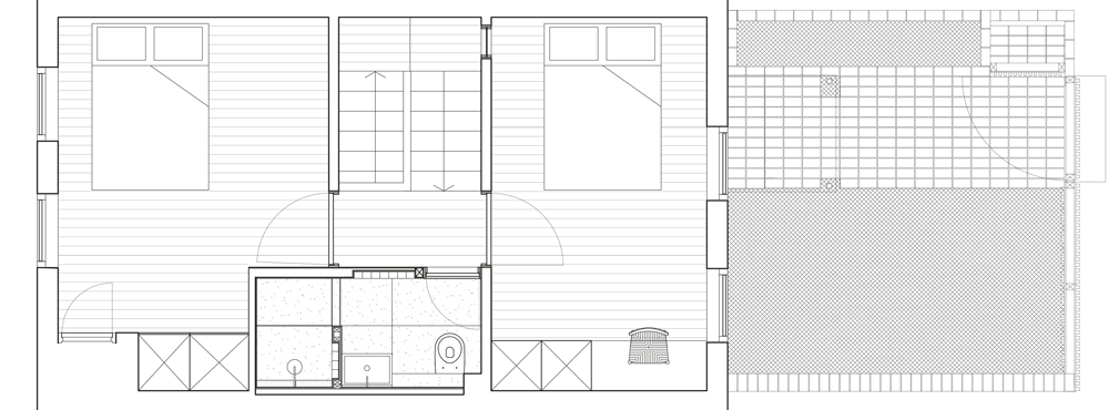
On the upper floor, ceilings were removed to expose the rafters and help create a spacious feel within the two bedrooms and small bathroom.

The bathroom is flooded with natural light from a skylight. The predominantly white surfaces of the tiles and Corian sink contrast with a speckled marble terrazzo floor.
Photography is by French & Tye.