Nokia Pure font by Dalton Maag
London designers Dalton Maag have created a font for mobile phone brand Nokia to work in any language.

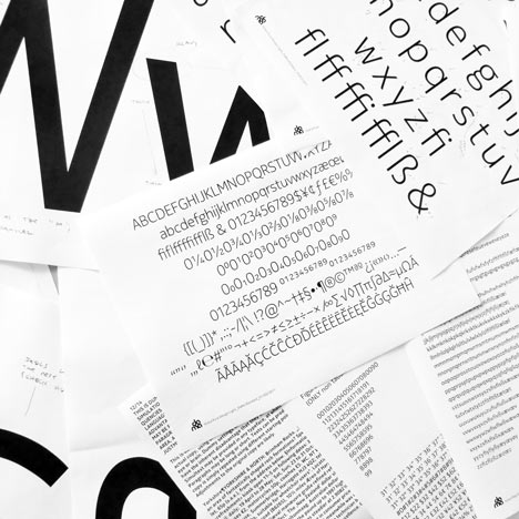
Called Nokia Pure, it's been designed to accommodate languages using Latin, Greek, Cyrillic, Arabic and Hebrew alphabets, plus Devanagari and Thai, with more languages including Chinese to follow.

It was created primarily for digital screens but also transfers to print for use across all Nokia's communications.

The project was recently announced as winner of the graphics category in the Design Museum's Designs of the Year Awards. See all the winning projects in our earlier story.

See more stories about typography on Dezeen »
Here's some more information from Dalton Maag:
When Nokia decided that it was time to replace their font as part of their global rebrand, they came to Dalton Maag.

Nokia is a world leader in the mobile phone industry, but its market share has recently been diminished by tough competition in the smartphone market. Sales of traditional, simple telephones, with limited media capacity are shrinking as users demand a complete communications platform from their mobile device.

In order to reestablish itself as the premier manufacturer of stylish and highly-functional handsets, Nokia is simultaneously launching a brand new generation of mobile phones and upgrading its visual identity, which has been an important part of the company's brand for nearly twenty years.

Nokia's existing font family was dominating its visual identity with its strong personality. This made it a difficult typeface to work with in a wider brand perspective, even though its condensed character width allowed for a good character count, and its high contrast meant it was easy to convert to pixels on older devices. It was felt that the design now looked dated and no longer reflected the design ethos of the company.

Dalton Maag first became involved in the rebranding process when Nokia decided that it needed a new typographic direction for its communications. This would be combined with the launch of its new generation of mobile phones. It was the need for a new font family that united Nokia's various departments, each with their own specific requirements, in a common approach to a shared problem.

Dalton Maag was asked by Nokia to design a font family primarily for use in digital media (mobile devices and the web), which would also be versatile enough to be the cornerstone for all of Nokia's communications worldwide. The new font family had to reflect the traditions of Finnish design: simplicity, clarity, functionality and beauty of form – in short, Pure.

It needed to support languages using the Latin, Greek, Cyrillic, Arabic and Hebrew alphabets, as well as the Devanagari and Thai scripts in a first phase introduction. More languages, including Chinese, would follow in the future. Various weights would be required, and specific Display versions for use at larger sizes. The Text fonts also needed to be fully hinted to give the best possible screen display on handheld devices.

During the initial phase, Ron Carpenter and Bruno Maag of Dalton Maag worked closely with the Nokia team, helping to establish the correct typographic expression by providing several potential design concepts. Discussions at regular meetings about the overall look and feel, but also the details of individual characters, delivered the distilled design of the new Nokia font family as it is now – Pure. Throughout this initial phase we supplied all parties with functioning beta fonts, allowing Nokia's design team to implement the ideas in real life scenarios and from that make informed decisions on the choice of concept design.

The first part of the project was a user interface (UI) font family consisting of Light, Regular, and Bold weights, featuring a fully hinted Dalton Maag Standard character set. These UI fonts, now named Nokia Pure Text, were also designed to function perfectly in print at body copy sizes, making them suitable for Nokia's own internal communication needs and other small-size print copy.

A set of distinct Display weights, derived from the Text design, with tighter spacing and small changes in contrast, were needed for titling and other larger-sized branding environments. Covering the same Light, Regular, and Bold as the Text fonts, the Display font family also features Thin and ExtraBold weights.

As soon as the original design concepts were established, we began work in parallel to expand the fonts to the various script systems that Nokia needed for effective communication. Dalton Maag's design and engineering teams made sure that each incremental font upgrade was released in a controlled fashion to ensure that everyone involved was in possession of the latest version.

We successfully guided the client through this important stage in their business's development by helping to define a new visual language that spans different media and scripts. The result is a distinctive and sustainable typographically-driven brand, where the client can rely on our highly-skilled design and engineering team to help and support them in the future.