
Amsterdam-based architects Merkx + Girod have designed new postal stores for Dutch logistics company TNT.

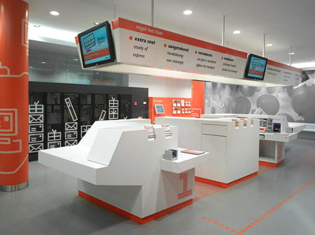
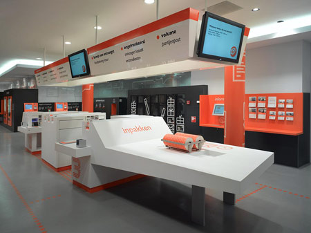
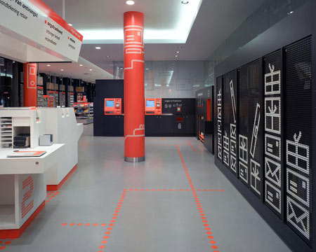
Employees at the new postal stores work at Corian service desks in the centre of the shop, rather than behind counters as in traditional post offices. Logistics that would normally be hidden away are visible to customers.

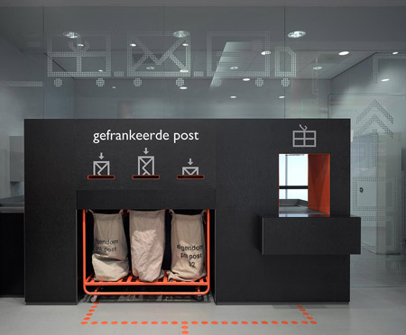
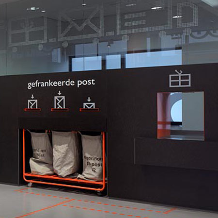
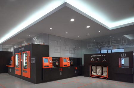
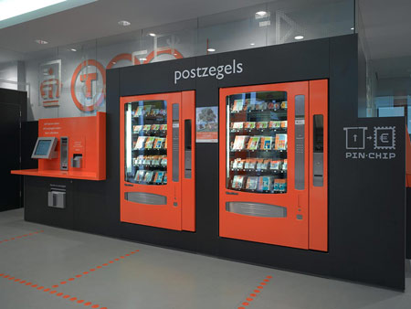
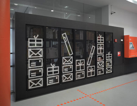
The stores also incorporate self-service machines in black units around the edge where customes can weigh, stamp and post their own mail. Customers can also design their own stamps and send digital postcards.

“We designed the new shops on the basis of the concept self service where possible and full service where needed,” explains Bas Berck of Merkx + Girod. “TNT employees are active inside the store, no longer behind large counters but operating from centrally placed full service desks. DIY machines are integrated in the black surroundings.”

Photographs by Roos Aldershoff
Graphics by Atelier Rene Knip

See more work by Merkx + Girod in our earlier story about the bookstore they designed inside a former Dominican church.


–
Posted by Rose Etherington


June 10th, 2008 at 8:23 pm
No comment.
June 10th, 2008 at 11:25 pm
Great idea conceptually… but how will moving the mail clerks from behind a desk to a open desk in the middle of the floor do anything? Given they will seem less intimidating and more open/friendly, but will that make the actual clerk any less friendly or intimidating?
June 10th, 2008 at 11:50 pm
Who cares how functional it is, it’s awesome!
June 11th, 2008 at 12:09 am
Workman like job with nice graphics. Can’t comment on function obviously. The only thing I wonder about is ceiling treatment and lighting. Light over the task is good but from the pictures I wonder about the ceiling. I am sure it integrates better than it looks.
June 11th, 2008 at 6:56 am
i like those mailing graphics being used on the black unit.
June 11th, 2008 at 8:34 am
This already looks dated. Perhaps there are subtleties I’m not able to see, but it’s pretty ugly to me. Not the best follow-up to their awesome bookstore project.
June 11th, 2008 at 9:10 am
The PTT (former dutch post office) did have a much stronger identity.
It’s to easy designed. De concept is nice, but the design says nothing.
This does surprise me for Merkx+Girod. Graphics are too old fashioned.
Next time, put some effort in it!
June 11th, 2008 at 9:25 am
Edward
I applaud your charity, but there can be no excuse for light rafts.
June 11th, 2008 at 9:55 am
dutch people have no taste
June 11th, 2008 at 11:37 am
Hmmm, if design would only be about taste, wouldn’t that be borring?
June 11th, 2008 at 1:41 pm
looks cheap and yesterday
June 12th, 2008 at 6:09 am
Where’s Teddy?
June 13th, 2008 at 1:55 am
i like this kid graphic conception – reminds me of legoland
i wonder if the postal clerks will look like popples
September 17th, 2008 at 6:51 am
generation x postal store
September 26th, 2008 at 10:28 am
anyone can tell me ‘what font does merkx+girod used?’