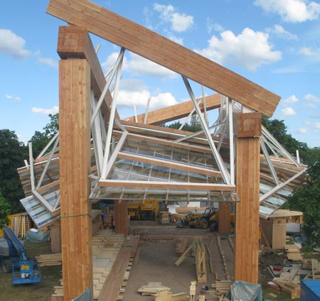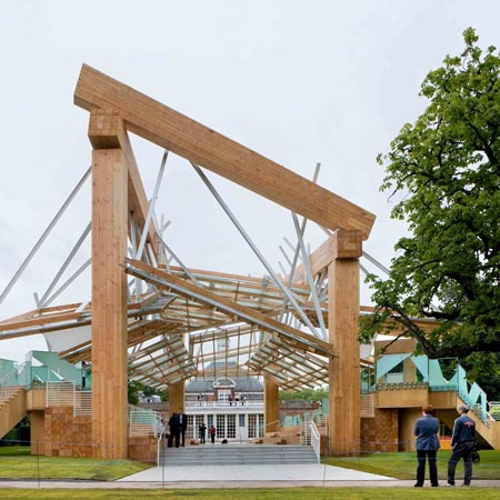
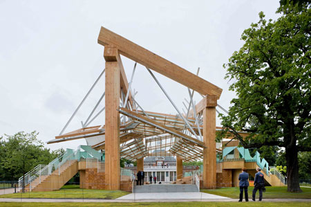
Serpentine Gallery Pavilion 2008 by Frank Gehry
The Serpentine Gallery in London has published a few photos of the Serpentine Gallery Pavilion 2008, designed by Frank Gehry.
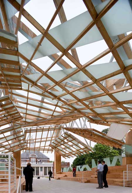
The temporary pavilion opened yesterday (Sunday) and remains open to the public until October 19.
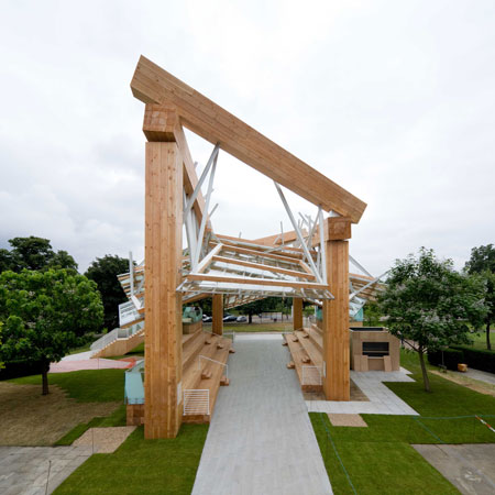
The photos here are by Iwan Baan and are copyright © 2008 Gehry Partners LLP.
See model shots of the pavilion plus the Serpentine Gallery's press release including a statement by Gehry - plus a whole load of comments from Dezeen readers - in our earlier story.