Vivaldi Tower interior by Merkx + Girod
Architects Merkx + Girod have sent us these images of the interior they designed for Foster + Partners' Vivaldi Tower near Amsterdam in the Netherlands.
The 24-storey building, for financial services company Ernst & Young, includes a restaurant and bar, auditorium, meeting rooms, library, newsroom and fitness facilities plus offices, video conference rooms and an executive boardroom.
See our previous story for more about Vivaldi Tower.
Photography: Roos Aldershoff
The following information is from Merkx + Girod:
--
Ernst & Young Amsterdam
Interior design for the new office building of Ernst&Young designed by Foster Architects, located at the Zuidas in Amsterdam.
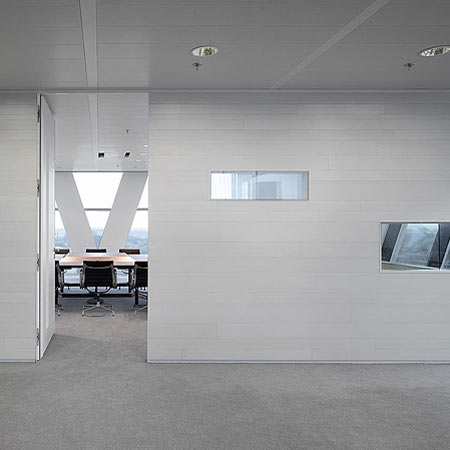
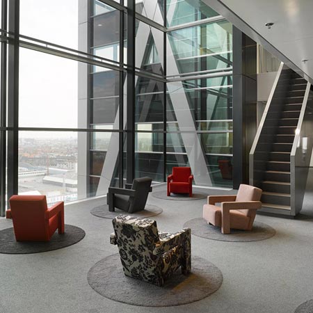
The architecture of the 26.000 square metre, 22 storey-high building is very clear and straightforward in reaction to which Merkx + Girod designed a ‘softer’ layer for the entire interior.
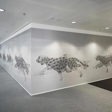
Special attention was hereby given to the spatial relations and qualities of the different areas and the use of materials, colour, three dimensionality, decoration and graphics.
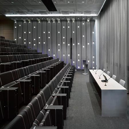
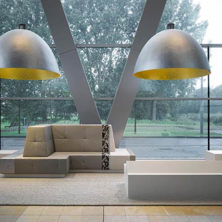
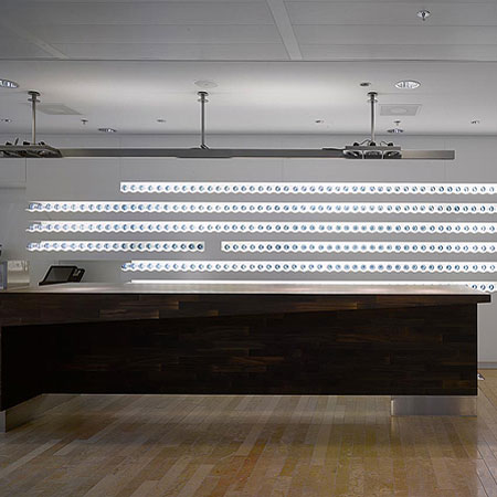
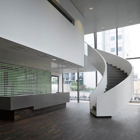
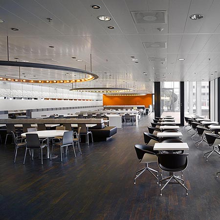
The ground floor and first floor area contain the entrance and lobby, informal ‘living room’ with coffee bar and lounge, self service restaurant, bar, auditorium, general meeting rooms, library, newsroom and fitness facilities.
Floors 3-20 contain the employees and partner offices as well as corridors, general areas, pantries and communal meeting spaces.
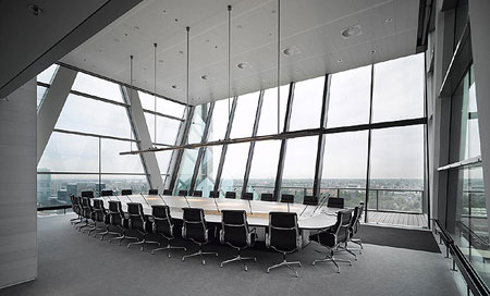
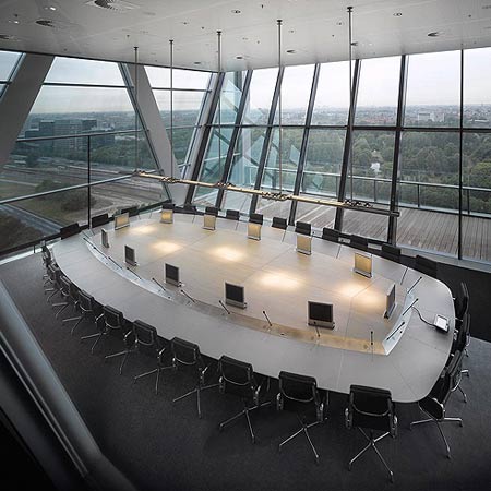
The 21st floor houses staff meeting rooms, video conference rooms and the executive boardroom.
Architecture and interior have become one in which ‘business meets pleasure’, Ernst meets Young!

Project: Office design Ernst & Young Amsterdam
Client: Ernst & Young Amsterdam
Location: Zuidas Amsterdam
Realisation: April 2008
Area: 26.000 m2

Project team: Evelyne Merkx, Patrice Girod, Det van Oers, Jan Willem Wijker, Klaas Cammelbeeck, Raymond Leentvaar, Iris Derks, Victor Veerman, Ramon Wijsman, Josje Kuiper, Patrick Bento, Roy Grob, Marlies Hoevers
Architecture: Foster & Partners.
In collaboration with: Irma Boom, Rene Knip