
Office for Metropolitan Architecture have won a competition to design a new city hall for Rotterdam in the Netherlands.

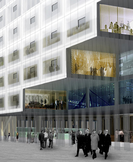
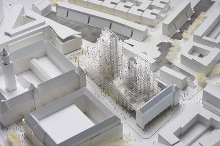
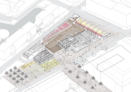
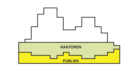
Called Rotterdam’s Stadskantoor, the project will include municipal functions, offices and apartments.

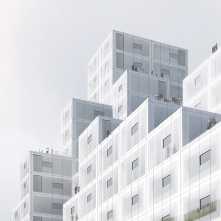
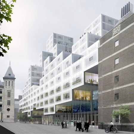
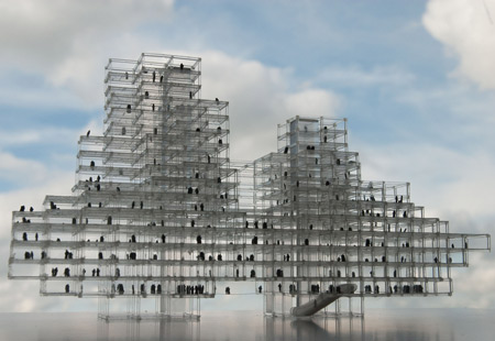
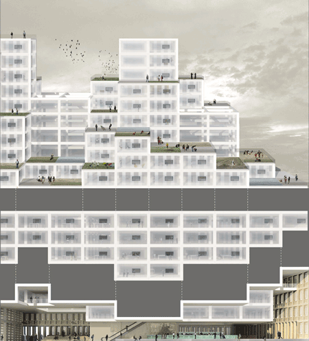
The building will be made up of smaller box-shaped cells.

Gardens for the apartments will be located on the higher roof terraces.

More about OMA on Dezeen in our special category.

Here’s some more information from OMA:
–
OMA wins competition for Rotterdam’s Stadskantoor
The Office for Metropolitan Architecture (OMA), in collaboration with Werner Sobek and engineers ABT, has won the competition for Rotterdam’s Stadskantoor, a new building for the city hall that will accommodate municipal services, offices, and residential units. The winner was announced this morning by city alderman Hamit Karakus.

The design, led by OMA partners Reinier de Graaf and Rem Koolhaas, was chosen from five submissions by Dutch architecture companies following a public consultation period and the deliberation of an expert jury, which commented: “OMA’s design was the perfect combination of innovation and suitability for the surrounding context.”
OMA conceived a modular building with repeated units gradually set back from the street as they rise into two irregular peaks. The building’s composition of smaller cells creates an impressive, complex form when viewed from Coolsingel, one of Rotterdam’s main arteries, and allows for subtlety and adaptability as the Stadskantoor abuts the adjacent municipal building from the 1950s, the Stadstimmerhuis.

The Stadskantoor’s innovative structural system generates maximum efficiency and versatility both in construction and in program: units can be added or even dismounted from the structure as demands on the building change over time, and can adapt to either office space or residential parameters as desired. Green terraces on higher levels provide the possibility of an apartment with a garden in the heart of urban Rotterdam.
The building’s concept of flexibility – together with a climate regulated by warm air stored in summer and released in winter, and vice versa, and the use of hi-tech translucent insulation in the building’s glass façade – allowed OMA to meet the design brief’s requirement of making the Stadskantoor the most sustainable building in the Netherlands.
Reinier de Graaf commented: “Rather than posing as the city’s next superlative, the design for the Stadskantoor is partly a building, partly an urban condition – a skyline in its own right. The design attempts to mediate between the adjacent town hall, post office and Stadstimmerhuis. Through an intentional ambiguity, the mass immerses itself in the city’s diverse architectural periods, absorbing the scales and styles of its immediate context.”


October 21st, 2009 at 12:26 pm
deja vu?
October 21st, 2009 at 12:34 pm
Nice.
The guys coming out of the building in the first and second picture, look like mafiosos
October 21st, 2009 at 1:10 pm
how rem got his groove back?
October 21st, 2009 at 1:23 pm
Enough with the boxes already!
October 21st, 2009 at 1:37 pm
Yes, mafiosos comming out of “box like cells”…
October 21st, 2009 at 1:42 pm
an interesting cloud-building… hope for the best!)
October 21st, 2009 at 1:43 pm
Tetris is quite popular at OMA.
October 21st, 2009 at 1:44 pm
The ubiquitous student storage container building is realised……
October 21st, 2009 at 2:07 pm
What’s happening with OMA recently?
October 21st, 2009 at 2:11 pm
OMA, at first sight it could be BIG as well
October 21st, 2009 at 2:28 pm
Is there a front door ?
October 21st, 2009 at 2:42 pm
please, Dezeen, could the “deja vus”-like comments just do not be published?
it’s now a boring competition to who would be the first to find the filiation with any existing project…
yes, everything has already been designed, you’d better just give up trying to point it out
what makes a difference now is maybe to be able to bring the right reference or the right scheme for the right project
if this is still built the way it has been designed, it’s gonna be pretty interesting to see how Werner Sobek is able to overhang that much with a single system of baby-Vierendeel
look forward the completion.
October 21st, 2009 at 2:52 pm
stunning new project from OMA – the NY tower leant down?…
the box idiosyncrats should learn how intelligent programming defines new urban realms
October 21st, 2009 at 3:48 pm
Seems too much like a contemporary version of the Habitat 67 to me. If this is truely a green building, think of all the materials that will need to go in to properly weatherproofing all those roof stepbacks.
October 21st, 2009 at 4:00 pm
Bra jobba Villy! Hilsen Rhinosweeper
October 21st, 2009 at 4:15 pm
Not boxes, PIXELS!
October 21st, 2009 at 4:53 pm
Oh well, I’ve always liked Metabolism. But given that a city hall is pretty much Koolhaas’ dream (maximum possibilities for surrealist collage) I think this is a bit underwhelming.
October 21st, 2009 at 5:15 pm
This is soooo what MVRDV already did. Come on!
October 21st, 2009 at 5:19 pm
This is being build right now… http://www.dezeen.com/2009/09/17/dnb-nor-headquarters-by-mvrdv/
October 21st, 2009 at 6:06 pm
Not PIXELS – voxels
October 21st, 2009 at 6:35 pm
OMA copying MVRDV copying OMA
October 21st, 2009 at 6:38 pm
I don’t see how this is “absorbing the scales and styles of its immediate context.” When have they ever cared? Nice object though.
October 21st, 2009 at 7:30 pm
…every building these days is “the most sustainible” building… you have probably realized that…
October 21st, 2009 at 8:34 pm
This is horrible ! Just plain horrible ! It looks like something straight out of LegoLand !
October 21st, 2009 at 8:39 pm
From a rational standpoint, the structures stepped configuration maintains the scale of the of the street and the open ground level assures a dignified and appropriate entry. The repetition of squares and depth and structure is meant to unite the new with the existing municipal building. The white facade is a bit unsettling but it results from the requirement for a sustainable design. As someone famous once said: “No need to invent a new architecture every Monday”
October 21st, 2009 at 11:00 pm
Finally we can spot something interesting from OMA, proving that Rem is still great!ciao ciao
October 22nd, 2009 at 1:29 am
ENOUGH CUBES, LOVE ME
BORE ME HATE ME
PATRICK: IF PIXELS, THAN DEFINITELY THE WRONG RESOLUTION
October 22nd, 2009 at 5:12 am
I think the office should bring back the oranges for breakfast as soon as possible…
October 22nd, 2009 at 6:25 am
it seems like a lot of the readers don’t like oma-boxes, zaha-curves or japanese minimalism… so, waht do you like?
i think, it is a great, but for the scale humble project.
October 22nd, 2009 at 8:59 am
this is beautiful! see how it connects to urban figure by continuing the existing axis, respect the facade line of the older building beside,respect the human scale by lifting the ground floor,merges gracefully to its environment..great job OMA!
October 22nd, 2009 at 9:22 am
@matt
Well, I have to defend my deja vu comment then.OMA designed another building for the same city using virtually the same toolbox: http://farm3.static.flickr.com/2636/3837580760_e2087ce1db_o.jpg – MVRDV designed the Sky Village: Ihttp://plusmood.com/wp-content/uploads/2008/11/sky-village-2.jpg and DNB Nor Headquarters: http://static.worldarchitecturenews.com/news_images/12390_1_dnb%20se1big.JPG and both OMA as MVRDV as others designed buildings with similar elements. It’s surprising to see this pixelated cloud concept become so dominant all of a sudden
October 22nd, 2009 at 9:26 am
(also: sad it’s taken 40 years and the ultimate advert-man to bring Metabolism back…)
October 22nd, 2009 at 10:31 am
I hope that those that cannot see the difference in quality between this design and MVRDV’s DNB headquarter (or BIG designs) still have some years in architecture school to finish. MVRDV’s design is a mess: it uses both pixelation (or small boxes), as erosion, as a glass atrium, as glass boxes on top, as a routing finished in glass. This design is more minimal in its approach and connects in scale to the building next to it, which results in a much more balanced building.
I am pleased to see back some of the old OMA style. I just wonder, while this looks so extremely clean, if Rem did away with vulgarity altogether: he used to incorporate everyday or construction materials in his designs. But maybe either he has become older and wiser or it will still be incorporated in the interior.
October 22nd, 2009 at 11:15 am
m. You are right. Main problem probably is that i still like all those huge designs, even if it isn’t fresh. I’m waiting also for realisation. These buildings are experience in real. Render isn’t enough for me.
October 22nd, 2009 at 11:28 am
more undercroft spaces = grime, pidgeons and darkness. As if cells will ever actually be moved, are there cranes like a cargo shipping terminal on the streets of rotterdam as well as the docks?
Unless the building has impeccable materiality and detailing it wil look worse than it does n the renders
October 22nd, 2009 at 12:36 pm
to all pessimists: if you know the city of rotterdam very well, if you learned the possibilities and the demands, then this is a very precize planned building where the city of rotterdam can be really proud of! for rem and reinier it was certainly an unusual level, but exactly that is an important but rare quality in great architectural firms. thank you, you made my day!
October 22nd, 2009 at 12:58 pm
@m
i actually wasn’t blaming the buildings you might try to refer to, but this trend to always be the first to say “this is sooooo deja-vuuuuu”. everything has already been designed, you’d better just give up trying to point it out.
so there’s no need to try to prove that you were right and that yes, you might find it very similar to MVRDV’s (what, apparent grid on the facade with some boxes missing?), yes, very similar to a bunch of projects of OMA (the same office uses the same design, surprising?), but just face the reality: there’s nothing to be invented anymore.
it’s an old architect’s dream to believe in the power of his mind, that would always reinvent and recreate. it’s just over!
now stop dreaming and fighting against the wind, re-orient your focus and celebrate great designs when they occur in a correct context.
October 22nd, 2009 at 1:47 pm
Willem, I know the high abstraction levels that Rem and Reinier unsually work on and this building has much more down to earth detail than usual. One of OMA’s weaknesses though is the transition from the “competition department” to “detailing”. The dark public areas will definitely be a challege.
October 22nd, 2009 at 2:22 pm
seems like mahanakorn in thailand
October 22nd, 2009 at 5:34 pm
@matt
Please please please let people say whatever they want whenever they want.
Maybe it´s not fun when people say “I´ve seen this before” but commenting stuff like that is just childish and sad behavior.
best regards
October 22nd, 2009 at 6:10 pm
where is the OMA foam model???!!!
October 22nd, 2009 at 6:37 pm
This quite interesting………..loved it.
October 22nd, 2009 at 9:30 pm
anything with voxels no matter how it is arranged does end up lookin similar…. that by no chance means that one would stop using them coz every voxel still has a logic behind it in the way it is arranged and by no chance i am sure can two offices use the same logic
what really matters is how different is the spatial experience once you are inside…. and with the multi-level terraces, private-public programmatic distribution it will surely be an interesting structure!
October 23rd, 2009 at 5:09 am
they can say what they like, but it is f’ing stupid. i agree that it is an extremely tedious type of comment when everyone complains about deja vu. and everybody wants to also think that by mentioning metabolism that they sound intelligent when talking about this stuff.
lets talk more specifically about metabolism and specific historical references if you are going to do that.
do people not understand that these offices are working with a type of generic idea very intentionally? it is in a way a resistence of the expressionism in the more digital train of thought.
and metabolism is a conceptually loaded historical source.
oma are very good builders and are pursuing a very classical hard core modernism that is very intriguing and understated for me.
this office is so well vetted and so solid. maybe these images are not giving a way to interestingly critique these projects,
but OMA is kind of past the point of having to pander with this
so basically i would say that this is not a fashion contest, and while i am also very interested when architecture does that too…this is about engaging some ideas with a little more durability
not my favorite OMA project, but interesting, and certainly will be handled much better than that ghastly heavy handed clumsiness generally purpetrated by MVRDV (goddamn look at the awful lineweights etc in the drawings they publish in those vacuuous books of theirs)
October 23rd, 2009 at 7:58 am
Even though Holland is no. 4 of least corrupt countries in the world here I smell it. The chairman of the jury is a close friend of Koolhaas: Ole Bouman. This expert jury has chosen this indeed almost historic design whilst the people of Rotterdam went for the SeArch design. Shame on Holland.
October 23rd, 2009 at 10:06 am
Love it!
Nice counterpoint to their Haag City Hall from 86.
October 23rd, 2009 at 3:11 pm
shame on Holland? shame on SeArch design, it’s not sending a flash green jelly model that makes you win. One talks about program, adaptability and performance; the other features green gimmick all over
talking about close relation about architecture in Rotterdam is kind of easy no? who would have the idea to set up an architectural office there if Koolhaas was no there. he’s just everywhere in architecture in Holland, it’s obvious, but i’m much more glad that he’s somehow ruling Dutch architecture, compared to poor French people whose architecture is ruled by JakobMcFarlane (talking about green shit), Peripheriques and co.
October 23rd, 2009 at 3:12 pm
@-
fun to know that you claim your right to say things but don’t have anything to say
best regards
October 23rd, 2009 at 3:54 pm
seems like someone/some people should read/listen before commenting back…..just claiming my right ;)
But to be fair to both sides heres a comment on the project.
The building then …….hmmm well OMA will always be OMA and I belive the briliance is in there. Not somewhere but in there.
October 24th, 2009 at 9:26 am
@matt
deja vu?
October 24th, 2009 at 5:42 pm
amazing, how this design stimulates communication, when i read through 50 comments…
isn’t a city hall about lively debate and communication? at least in that sense this project is a great success!
October 24th, 2009 at 10:25 pm
first i didn´t get all this @ stuff but then I…..well got it :)
and its funny stuff. well played – . But all fun
yes, it really do stimulate…. :D
October 26th, 2009 at 9:29 am
its like the design of richard meier on steroid. hehehe
October 26th, 2009 at 12:14 pm
there is nothing with repeating a succisfull idea(if we can call it repeating)..and reflect it on the context properly but it seems to me that some times we can be very judgmental over somthing without understanding the real intentions behind it…away from that the design is oma’s , it is very good.
October 26th, 2009 at 1:13 pm
can we look at some plans and sections please?
stop judging every building by their facades.
October 26th, 2009 at 9:48 pm
@Matt, please give the French people a break, Architecture d’Aujourd’hui is dead since 4 years, and the French scene is dead…. Yes you are right J&Mc Farlane + Peripheriques are ridiculous, both are copies. Peripherique= bad copy of MVRDV. J&Mc Farlane=bad copy of FOA…
But don’t forget Francois Roche and R&sie.
By the way Rem constantly talks about Metabolism, in S,M,L,XL, in Mutation, in Content, and in Volume.
He is the best antidote against the parametric-blob, he goes for the real-one: the parametric-generic, which is the ultimate combination, away from digital-numb-geeks :
Venturi+Mies=(ambiguity, context)+(generic material+grid system)
October 28th, 2009 at 4:14 pm
When a city hall looks like a shopping mall, something it’s going wrong…
October 28th, 2009 at 4:20 pm
Ole Bauman? humm… that guy with an imaterial brain…
October 29th, 2009 at 7:15 am
the building is tooo big , for the design to be delicate . It def needs a variation .
its good to see the small scale reference , something to contrast it to ?
October 31st, 2009 at 5:21 am
This is an OLD “new experience”.