Lettera 9 by Demian Conrad
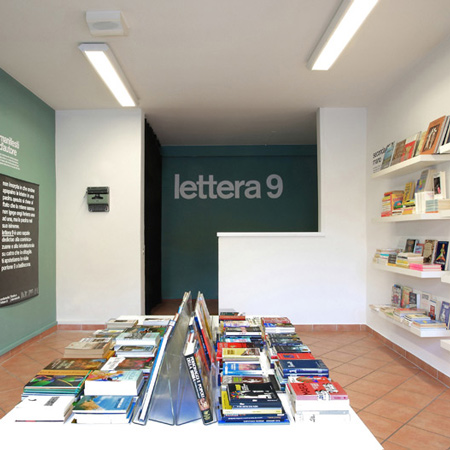
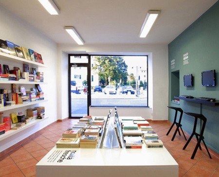
Lausanne graphic designer Demian Conrad has completed an identity and interior that reference typewriters for a combined library and internet café in Bellinzona, Switzerland.
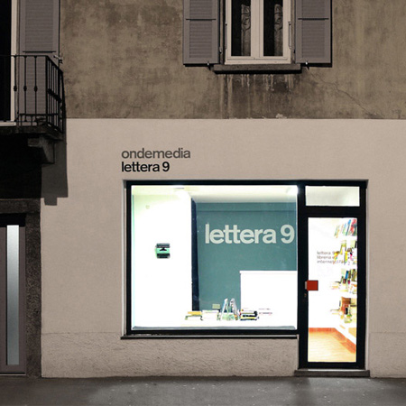
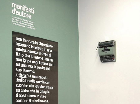
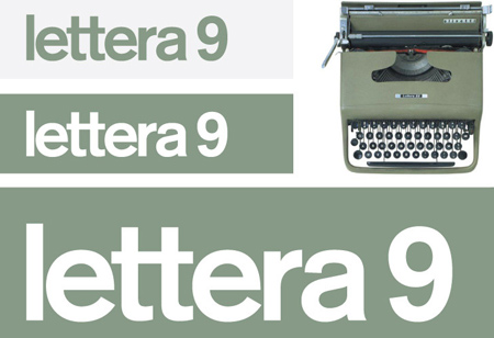
Conrad collects typewriters and the identity, lettera 9, references a vintage Olivetti model and the street number of the shop.
The machine in question is mounted on one wall alongside a poster created by Conrad for the shop.
Photographs are by Marco Agorri.
More about Demian Conrad on Dezeen: Posters for Brocante (December 2009)
Here's some more information from the designer:
Ondemedia came to me with the need of giving birth to a new space, between a library and an internet cafe. Thinking about books and internet, I analyzed the communicating points and noticed that text is the common denominator between them. Text as per a book or text as hypertext, the innovation lays in their relationship and not in the form.
I connected the text with the world of letters and being a lover and collectionist of type machines I could not resist to pay a homage to Olivetti "lettera22" by Marcello Nizzoli. Such a cult object which inspired me to use the civic number of the building and re-baptized as "lettera9". Inside the space a wall is dedicated to the digital and another to the analogic. The innovation lays in the relationship.
Project: Lettera 9
Client: Ondemedia
Where: Bellinzona - Switzerland
Art direction design: Demian Conrad
Photography: Marco Agorri
What: Logotype, Interior design, Poster