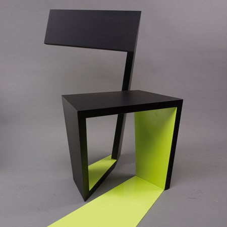
ABChairs by Roeland Otten
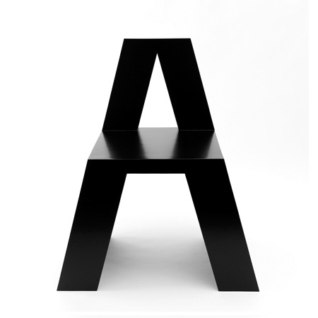
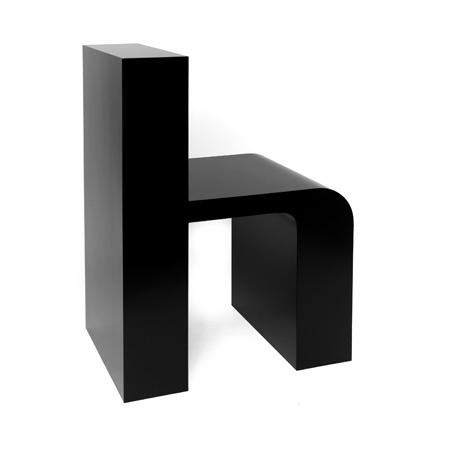
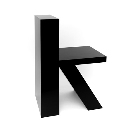
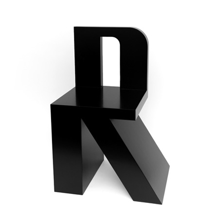
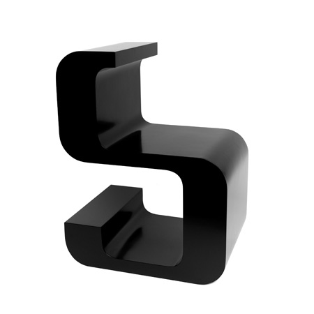
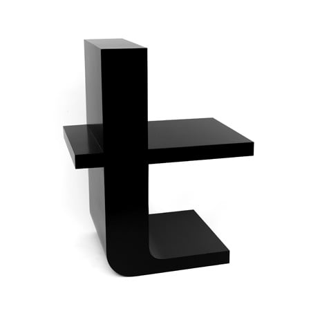
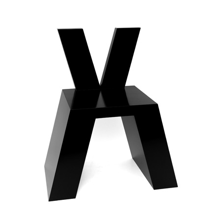
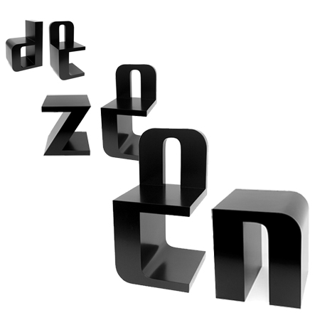
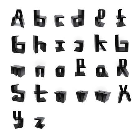
Rotterdam designer Roeland Otten has designed a collection of 26 chairs, each spelling out one letter of the alphabet.
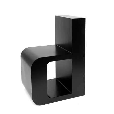
Called ABChairs, the seats can be arranged to form words.
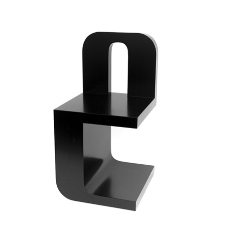
The prototypes of the chairs are made of lacquered MDF, however the designer intends to produce them using rotational moulded plastic.
Photographs are by Bas Helbers.
Here's a little bit of text from Otten:
ABChairs, an alphabet to sit on and chairs to form words with. These are the first 26 prototypes made of lacquered MDF.
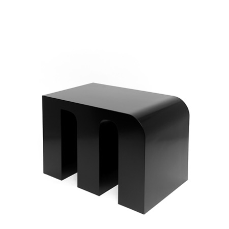
ABChairs’ future is one of a industrial manufacturing process, using rotational moulding of LDPE plastic.
I'm looking for a label or manufacturer(!). This way ABChairs will be more affordable for the mass market, lighter in weight, less fragile and suitable for outdoors use.
Smaller size ABChairs would also be applicable for children’s interiors, such as libraries and schools.
Limited editions of prototypes can be produced upon request. ABChairs are made possible by Fonds BKVB and Materiaal Fonds voor Beeldende Kunst en Vormgeving.
About me:
Roeland Otten graduated at the Design Academy Eindhoven in 1999 and founded his design studio in Rotterdam one year later.
He works with a ‘conceptual’ approach in different fields of media: from graphic design to new media and video, from product design to architectonic installations in public space and events. Roeland Otten is a provoker and an innovator, never shy of looking for new ways to tell a story and making a statement.
See also:
.
 |
 |
 |
| aCHAIR by Ivo Otasevic |
My Deer by Jeroen Wesselink |
Poliart Design Luca Nichetto for Casamania |