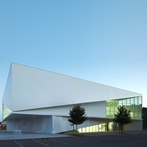
This multimedia library in Anzin, France, by Strasbourg architects Dominique Coulon & Associés is wrapped in overlapping slices of concrete.

Reading rooms at the Médiathèque d'Anzin are revealed to the town outside through exposed areas of glazing, while the triangular geometry continues inside.


Here's a little text from the architects:
The building reveals its preciousness at first sight.

Its pure, sophisticated geometry situates it as a public building.

The deliberate areas of transparency reveal its content.

The reading rooms present the building to the town in the manner of an invitation.

The multimedia library is covered with large white veils that reflect the light.

The building asserts it lightness, like an origami.

The successive folds and flaps repeat this image.

It is white, almost immaterial, like the mere projection of a concept, yet it is brimming with the life that constitutes it beyond its physical limits.

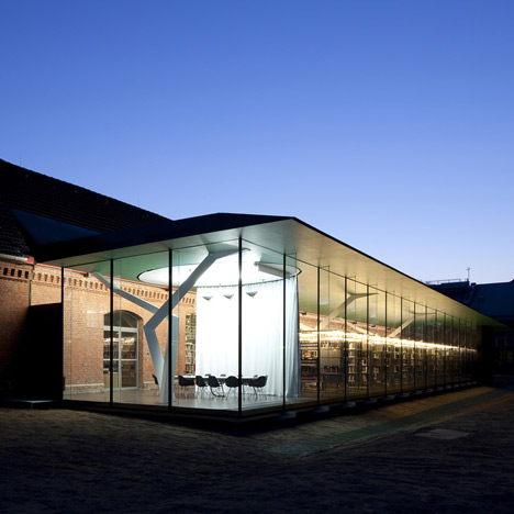
On the inside, there is abundant, uniform light.

The space is open and fluid, offering optimal flexibility.

The lighting effect produced by the tall gaps that appear to float in space is truly beautiful.

The volumes are independent and geometrically free, giving the whole a wonderfully poetic feel.


Click for larger image
See also:
.
![]() |
![]() |
![]() |
| Library in Münster by Zauberscho[e]n |
Library for Birmingham by Mecanoo |
Library in Colombia by Javeriana University students |


It has confusing lines. Very fun.
The interior is way better than the exterior.
Finally, a design that totally exemplifies a sophisticated geometric composition.
I lke the utmost effort by the architects to achieve a well-conceived, well-defined
layout through proper play of lines and angles that exude a very absorbing visual
harmony. To the architects…..Bravo!!!
Absorbing visual harmony?
Some contradicting ceiling lines and arbitrarily placed interior furnishing boxes constitute an absorbing visual harmony?
I. Think. Not.
Nice geometrical object with nice outside materials (what about the environnement ?).
But ceilings are very present and angular.
We would like to have access to the internal terraces.
Very clean lines, I am unsure about the interrupted ceilings within the building.
Very nice lines, and CG model.
The use of natural light is a great way of addressing some issues of sustainability
just like libeskind
This is just a built render. Why does EVERYTHING have to be flat and white?
To nickthegeek… Why shouldn't everything be flat and white? To hmmm… This is really nothing like libeskind and even if it was please descirbe the universally aceppteable truth as to why that would be a problem. To Thomas Washington… I think it's okay that this building actually does not have anything explicitly to do with sustainability.
This project is an incredibly sophisticated attempt to disguise the paradox of it's exterior and interior. Without the roof plan it is only through great turmoil that we are able to begin to imagine how an exterior that is presented as awkwardly "almost symmetrical can result in such idiosyncratic interior moments. Without the knowledge" of the roof plan the interiors almost seem decorated rather than consequential of any overall formal logic. That this congruity is not readily known is not at all a detriment to the project but rather the source of its richness… That just at the moment of slight discontent the project not only sustains interest but heightens it's own affects.