Double Family Home by Chris Lim
Zurich architect Chris Lim has completed two adjoined family homes in Zurich, centred around concrete stairwells.
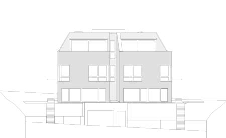
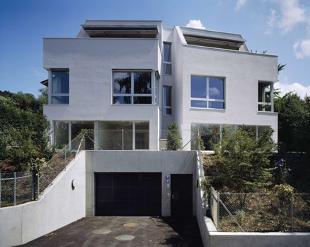
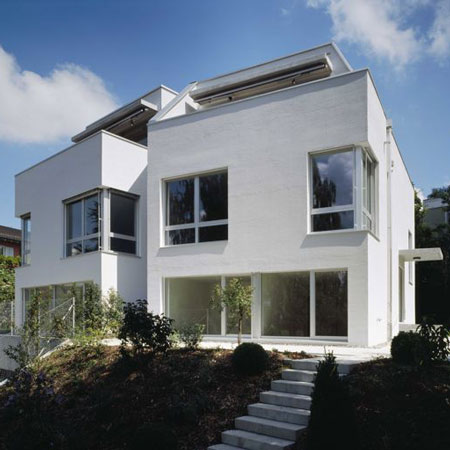
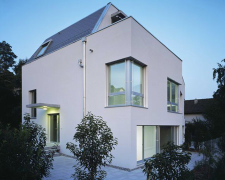
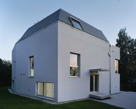
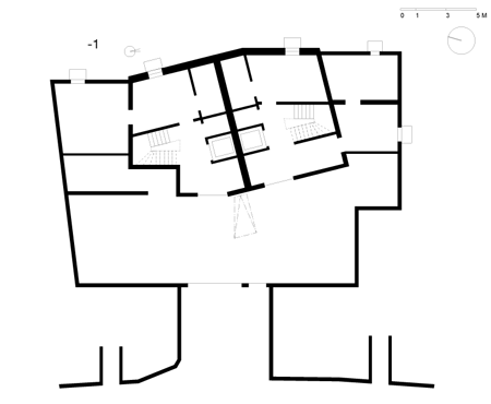
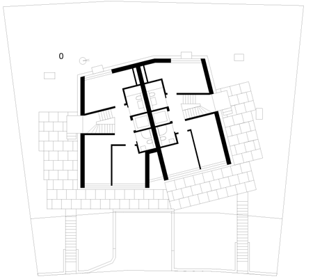
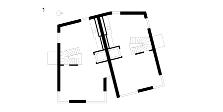
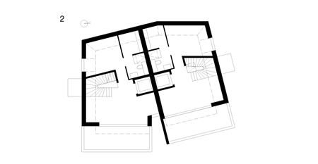
Called Double Family Home, the building consists of two homes for rental, joined at an angle.
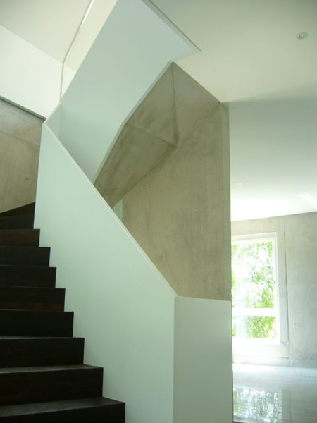
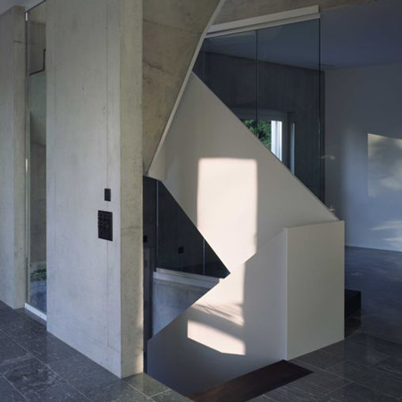
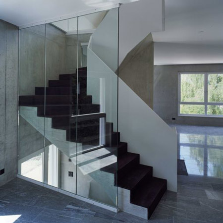
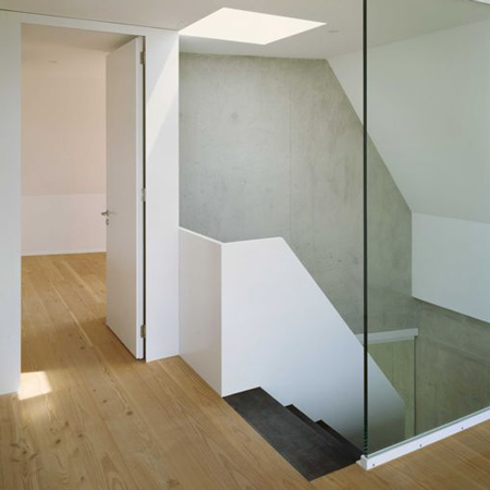
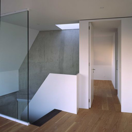
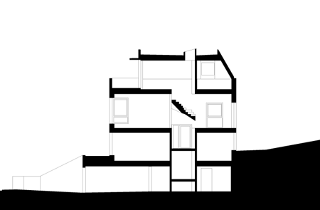
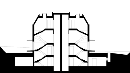
The design focuses on vertical movement between the spaces and features wooden stairs with raw concrete bannisters.
The information below is from Lim:
--
INTENTION- Although I had a private client for the commission, there was never the intention that he would occupy the house as his private home. Instead, he wanted two private homes for rent.
I was asked to design a double house, each unit big enough for a small family with two-three kids and with as much space as possible.
The challenge I faced was to carry out the client’s vision on a site that previously had been deemed just big enough for one small family home.
APPROACH- My approach was first to develop a grid-pattern for one single-family home that would make it possible to organise and divide the space into single and smallest units of the project.
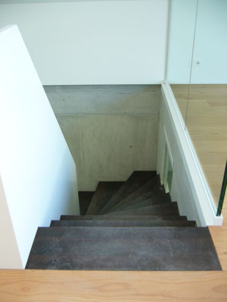
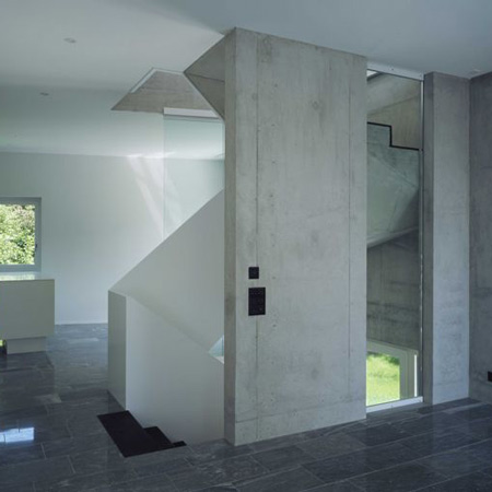
SIZE AND MATTER- A house is defined by the flow of movement through its space and the connection between its different levels.
I wasn’t happy with the concept of a conventional floor plan, which would have left no room to create a shifting experience when moving through the house.
But space was restricted and to compromise on the height of the rooms would have meant sacrificing other parts of the overall project.
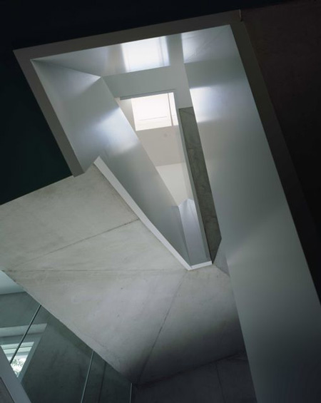
I was looking for a way to insert an element that would be capable of turning an ordinary space into a unique experience. Thus I came up with the idea to focus on the vertical movement to improve space.
The central staircase became the core of the house, its most interesting void separating the public and private levels through the difference in daylight and brightness.
DIVIDING AND PUTTING TOGETHER A set of double-flight stairs serves a similar function by connecting the garden to the two main floors, reserved for living and sleeping.
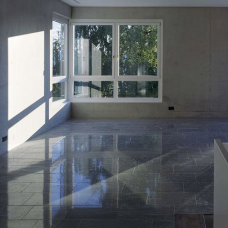
Daylight pours into the upper levels, bringing more daylight-brightness to emphasize the rooms’ social function, while the lower areas are slightly darker.
The aim was to create a sense of upward flow – we float upwards with the light as we move through the different levels.
INDIVIDUALITY - Within this common framework of the grid, I wanted to give each home its individual feel, while at the same time keeping the project’s overall goals in sight.
I decided to try out a slight angle in the main street façade. This finally led to splitting the façade into two separate units, making 1+1 equals 2, instead of dividing one façade into two halves.
LIGHT AND SPACE This simple act made it possible to bring in more daylight while at the same time upgrading the slightly darker west partition by setting the windows over the corner.
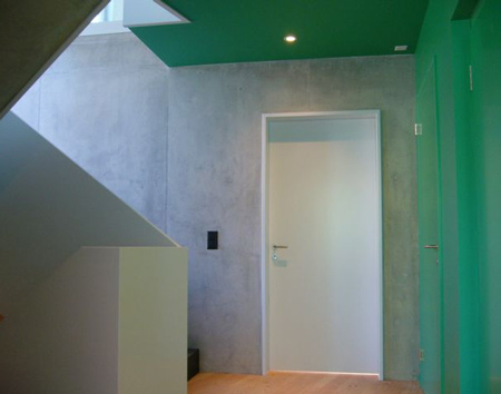
SENSE OF PLACE Designing living spaces meant to me creating spaces of quietness and harmony. As all rooms are strictly functional and not just for show, I wanted to keep things simple without going down the purely minimalist path. Instead, I opted for the reverse trend of chic, with more than a hint of pleasure and luxury.
I started to fill the empty spaces in the plan with daylight and shadows, pieces of furniture, images of life, to form patterns for living based on different visions, adjusting and varying dimensions and openings to make the rooms feel as large as possible for various functions.
At the same time I introduced subtle changes to create inner spaces with a discreet touch of elegance. The overarching goal was to maintain the balance between simplicity and magnificence.
Using natural brightness of daylight, different surfaces and materials, I aimed to create a sensitive space that marries minimalism with warmth to provide a relaxed and welcoming ambiance.