


Pastel gradients spread up the walls of this languages school in Valencia by local design studio Masquespacio (+ slideshow).

Masquespacio completed the interior design and brand identity at the 2Day Languages school for learning Spanish, inside a neoclassical building.
"We wanted to limit our intervention to a minimum," said the studio's creative director Ana Milena Hernández Palacios, "without forgetting the importance of equalising the mix between modern decoration and the beauty of the neoclassical architecture of the building."
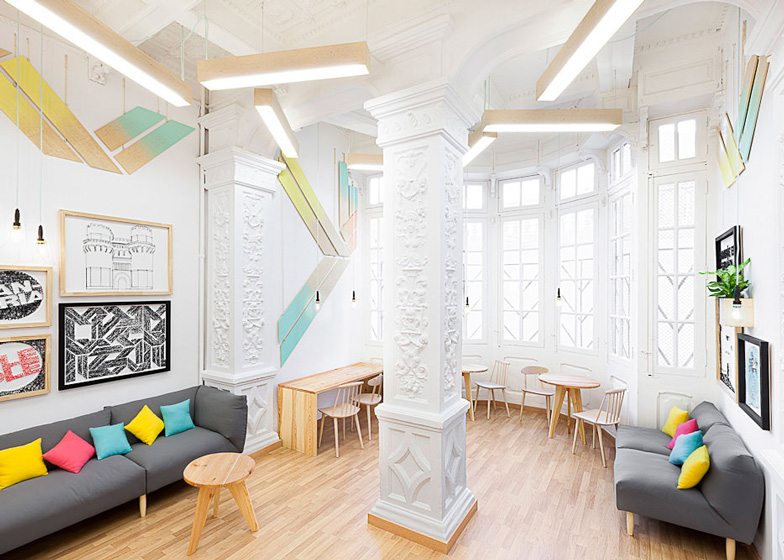
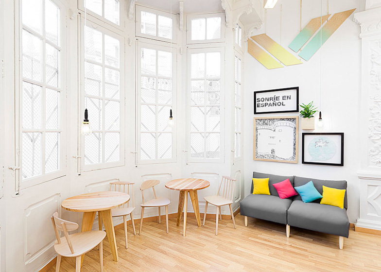
Decorative cornices and mouldings around doors, windows and columns were kept alongside new pine wood flooring and furniture.
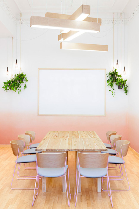
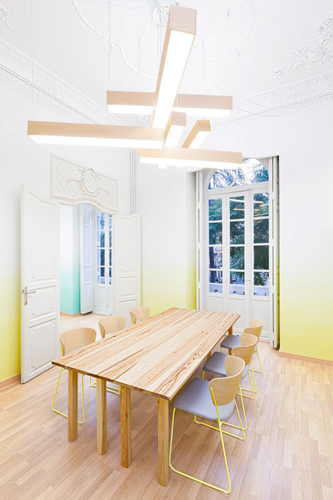
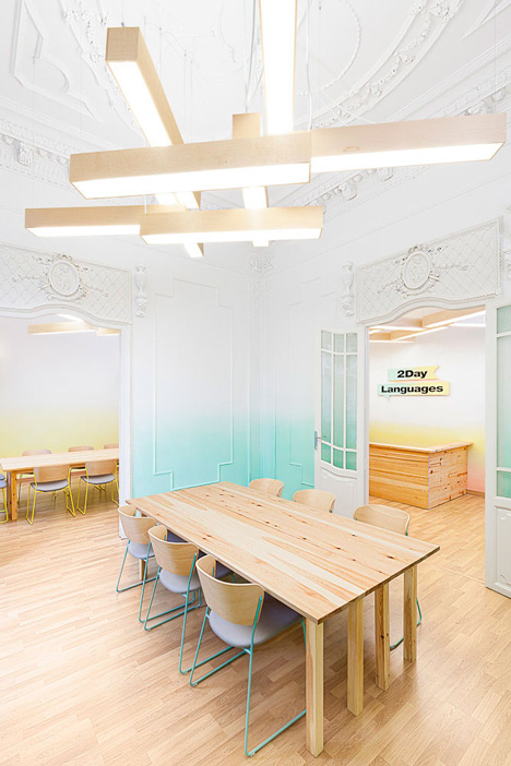
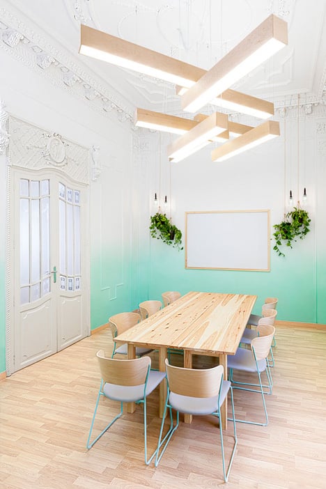
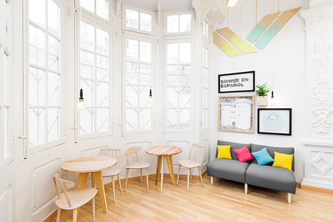
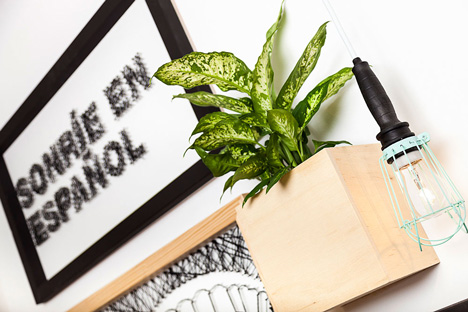
Each classroom is colour coded with pastel blue, yellow or pink on the walls, metal chair legs and pendant light cages.


"Every classroom contains a different colour that is fading as if presenting the progress in language learning," the designer said.

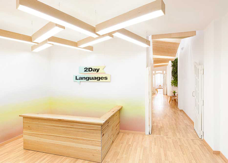
Wooden box lights overlap at right angles above study tables and are positioned in cross shapes over the reception desk.
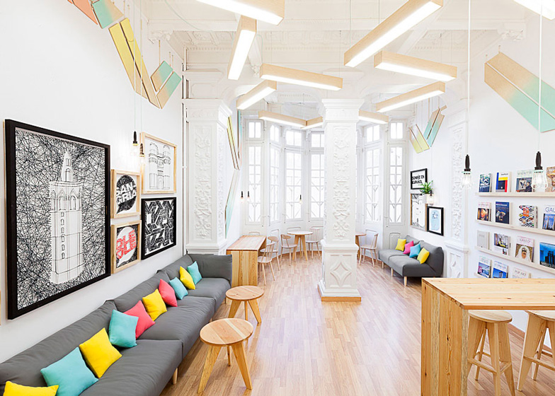
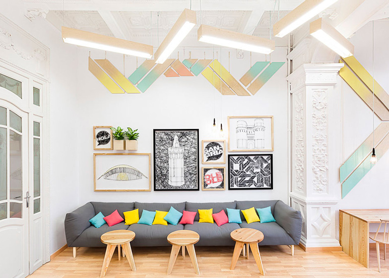
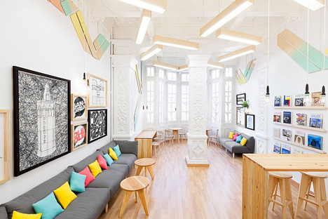
There's also a communal lounge for students to relax in, decorated sparingly with a combination of shades used elsewhere, plus a staff room.
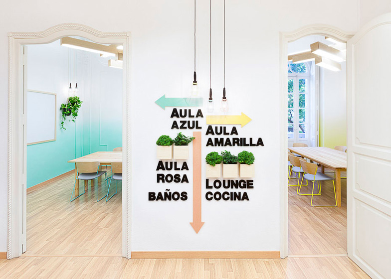
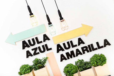
Visitors can follow the colourful signs around the buildings to find the right room.
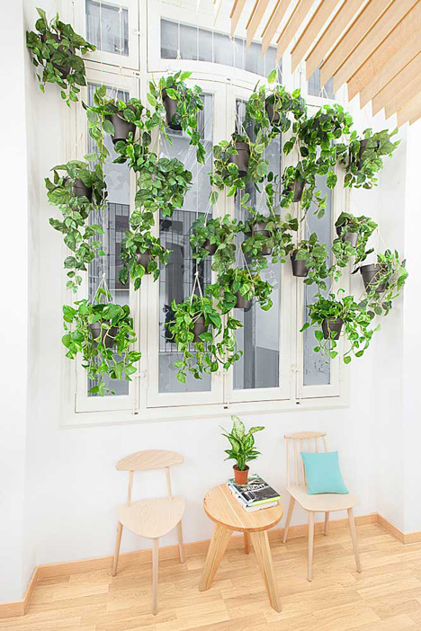
Small plant boxes have been attached to the walls, while other foliage grows in pots that dangle from the ceiling.
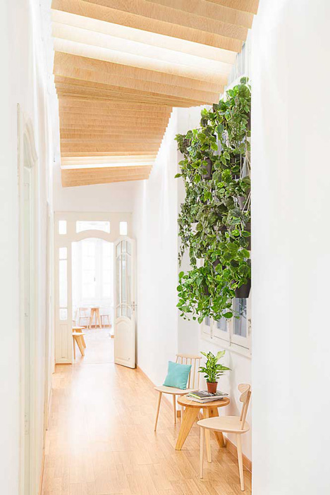
Thin samba wood slats form undulating ribbons that hide lights along the corridor ceilings.
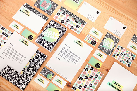
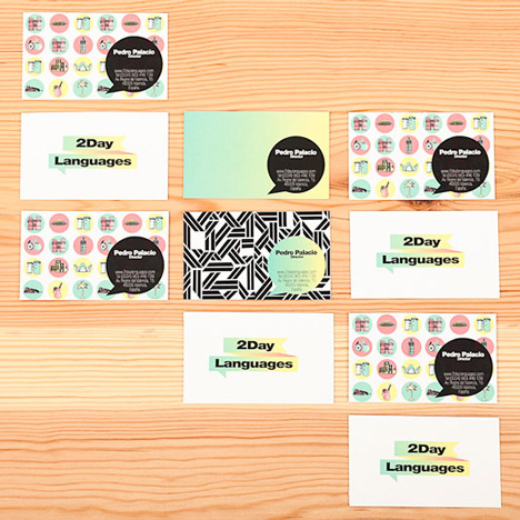
The branding uses the same colour scheme and patterns as the interior, paired with bold fonts.
Other interiors of educational facilities we've posted include a public school in Amstelveen that uses poetry as a design device and the economics department at the ROC professional training school in Apeldoorn, both in the Netherlands.
Photographs are by David Rodríguez from Cualiti.
See more design for education »
See more architecture and design in Valencia »
Read on for Masquespacio's project description:
Masquespacio present their last project done in a central area from Valencia, Spain. The studio specialised in interior design and communication created in this case the interior and the identity of 2Day Languages, a new Spanish school in Valencia.
This project in first case is based on the identity of 2Day Languages represented by a flag that is fused with a text bubble including the three fundamental characteristics of language learning: the levels, the goal and the conversation.
On the other hand it integrates the historic values from the city of Valencia that mixes modern and old architecture. A fusion symbolised in this new Spanish school through its neoclassical architecture and the intervention from Masquespacio's designers. The space is developed on an area of 183 m2 that contains three classrooms, a staff room and a lounge. Each of the classrooms and common rooms are a defragmentation from the brand identity of 2Day Languages and also incorporate parts of the Spanish language and the architecture of Valencia.
In first place it can be seen that the classrooms are containing the three brand colours, which in turn are a representation of the three levels A, B and C established by the Common European Framework of Reference for Languages, here seen as the colours blue, yellow and pink. Every classroom contains a different colour that is fading as if presenting the progress in language learning. On the other hand the sculptural lamps are another defragmentation from the graphical elements.

Ana Milena Hernández Palacios, creative director of Masquespacio comments: "As in the classrooms the students and their teachers are the protagonists, we wanted to limit our intervention to a minimum, without forgetting the freshness and 'good feeling' that needed to breathe each space, as well as the importance to equalise the mix between modern decoration and the beauty of the neoclassical architecture of the building. We opted for warm materials like pine to generate pleasurable sensations with functional features to make easier the school operations. Two tables instead of one in each classroom were chosen to be separated and stacked during activities. Also the chairs were chosen to offer maximum comfort to the students and with stack options for better circulation during activities."

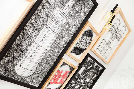
Getting out of the classrooms in the common areas, where the students of the different levels meet each other, levels and colours are mixed up together. This happens in the reception, but also in the hall through little shreds from the gradient colours added to the bottom part of the wooden ceiling. Last but not least the lounge room follows the same unity of colours, but this time merged into the decorative elements subtracted from the brand identity. Undoubtedly this part of the project is the one where the decoration has a more prominent role, faithful to the design established in other parts of the school. Headliner here is the representation of the communication elements, relevant words of the Spanish language and some icons from the architecture of Valencia, using a technique of knitting with wool and nails.
Masquespacio in this project wanted to remain true to its philosophy traduced into creativity, identity and democratic design always under the concept of designing a space to live and enjoy with a freshness that makes the users feel comfortable while being overwhelmed by emotions generated by the space itself.