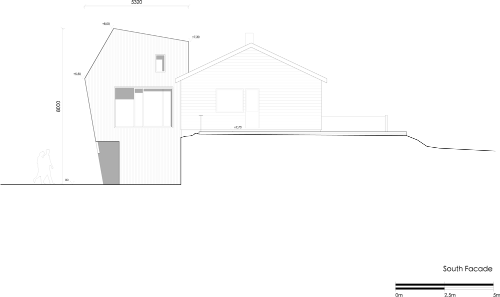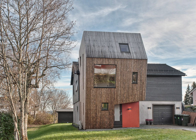
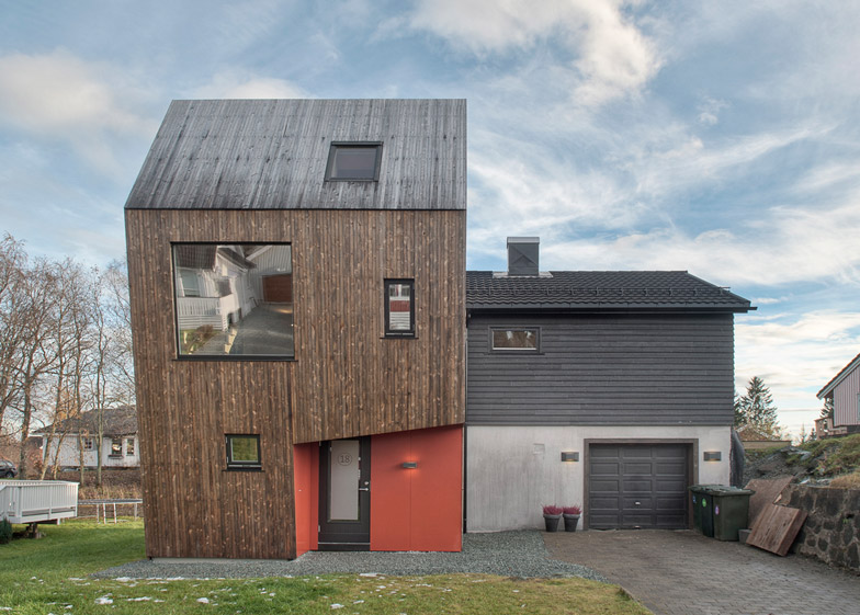
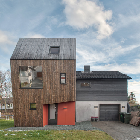
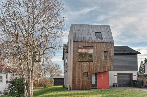
This top-heavy house extension in Trondheim, Norway, was designed by local office TYIN Tegnestue to maximise space on the first floor while minimising its footprint on the garden (+ slideshow).

TYIN Tegnestue was asked to create additional living space for a family of four and responded by designing an angular timber-clad volume that contrasts with the adjoining two-storey 1960s house.

"The idea was to not destroy the characteristics of the existing house and to let the addition stand out, so in 50 years you could still clearly read the two as being from separate times," architect Yashar Hanstad told Dezeen.

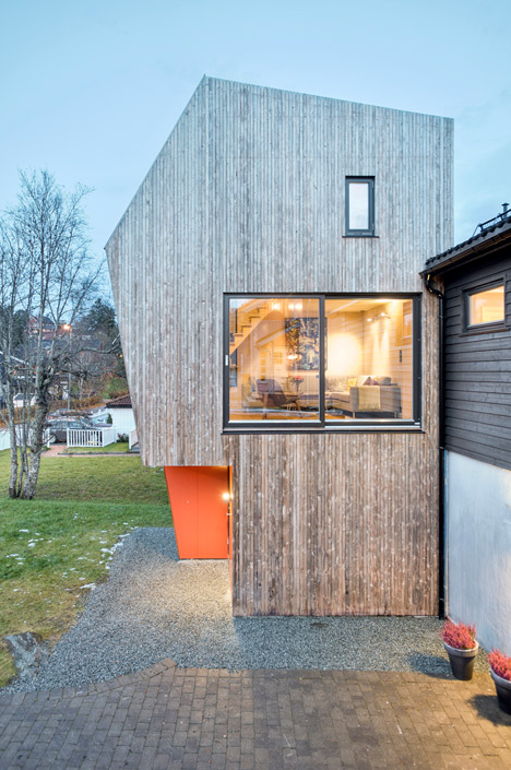
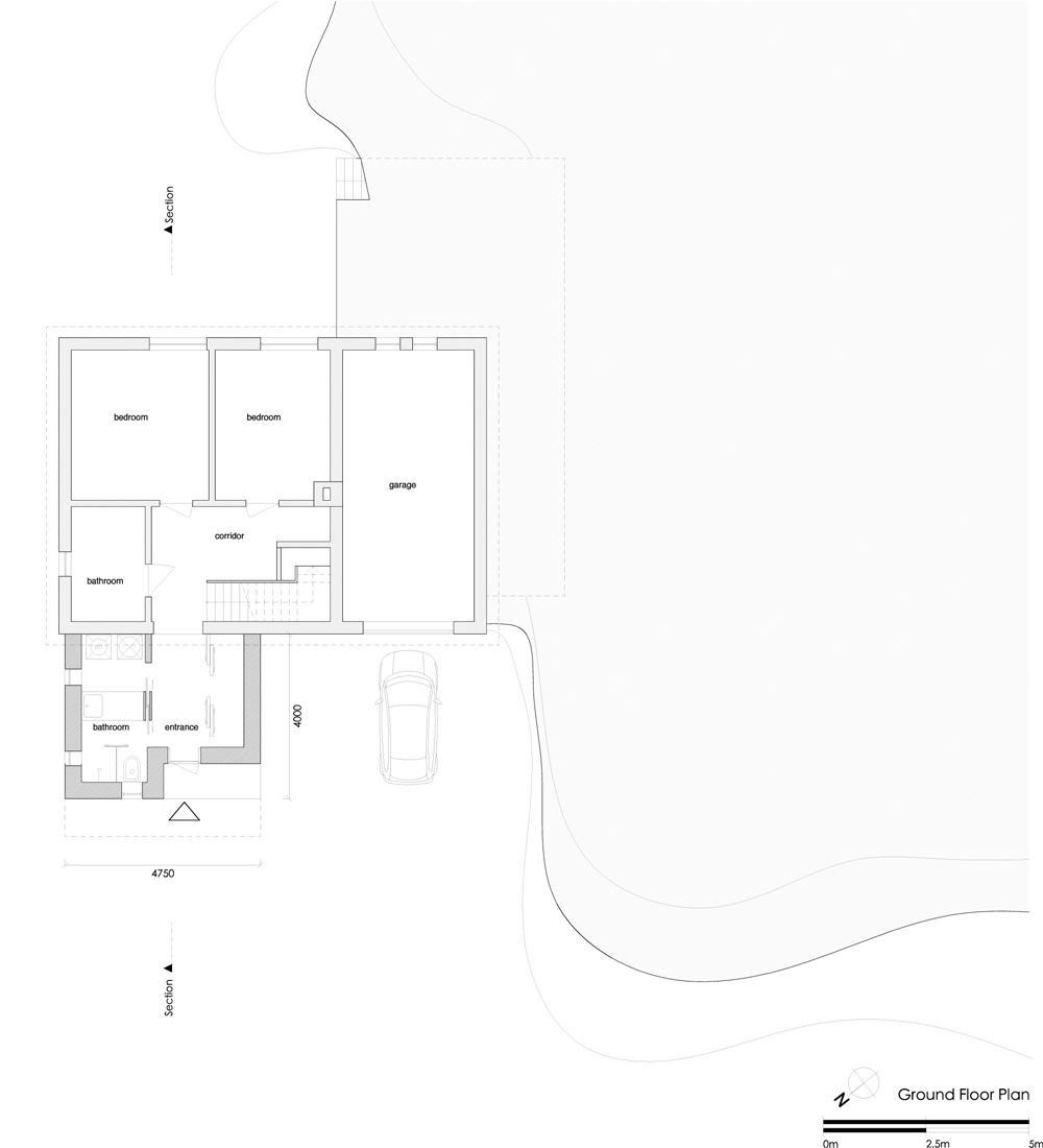
An entrance hall, bathroom and laundry room where all that was needed on the ground floor, so were all able to fit within a small area. Living areas upstairs needed more room, so the building swells outwards to accommodate this.

"Clients are always asking for more space than they actually need and square metres are expensive to build, especially here in Norway," Hanstad pointed out. "The living space definitely needed more space than the new entrance area, something that led to minimising the footprint."

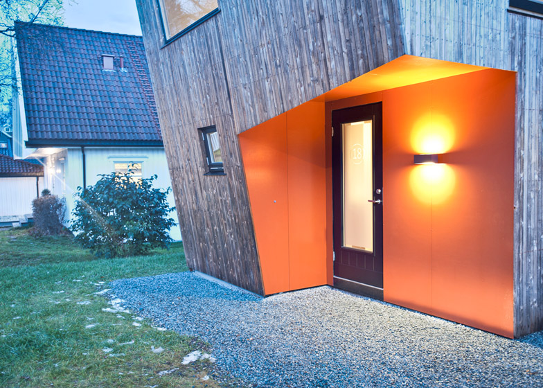
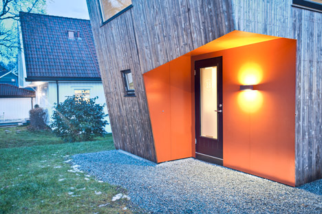
An angled recess in one corner marks the new entrance to the property. It leads to a hallway flanked by storage on one side and a combined bathroom and laundry on the other, but also connects to a corridor at the heart of the existing house.
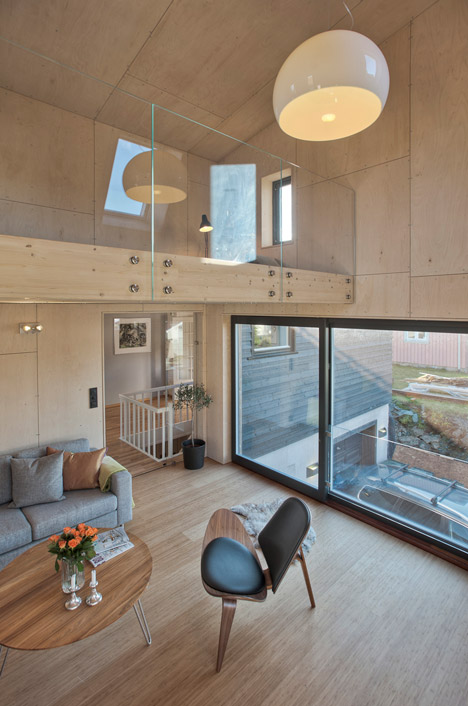
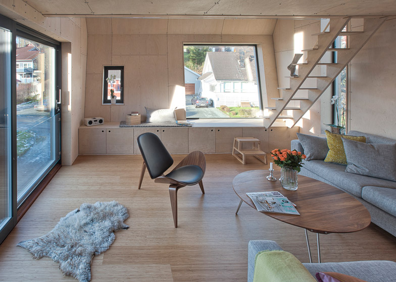
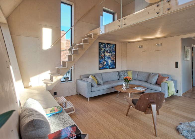
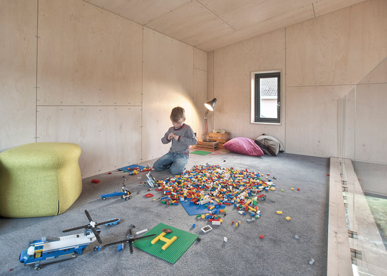
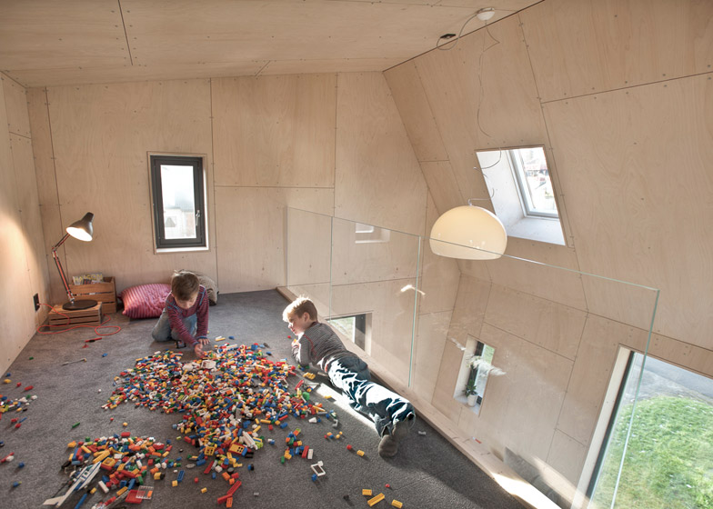
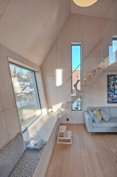
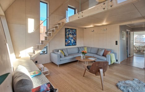
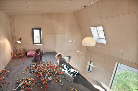
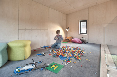
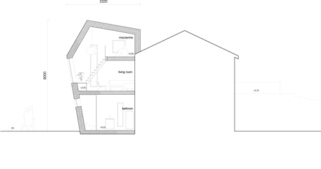
The new first-floor living room features high ceilings, allowing room for a mezzanine. This meets one of the key criteria of the brief for the Arne Garborgsveg 18 house – to provide a space for the family's children to play away from their parents.

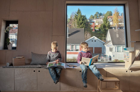
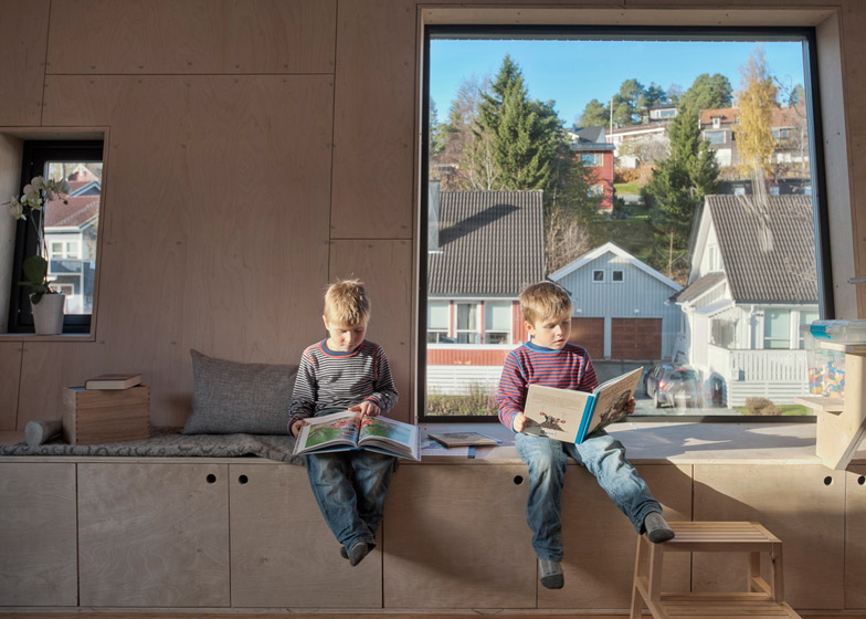
A square picture window is built into the room's sloping front wall, along which a storage unit has been fitted to provide additional seating. This also forms part of the staircase leading up to the mezzanine.
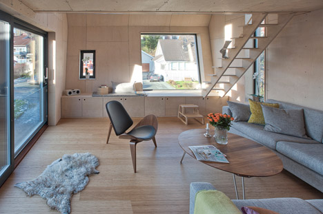
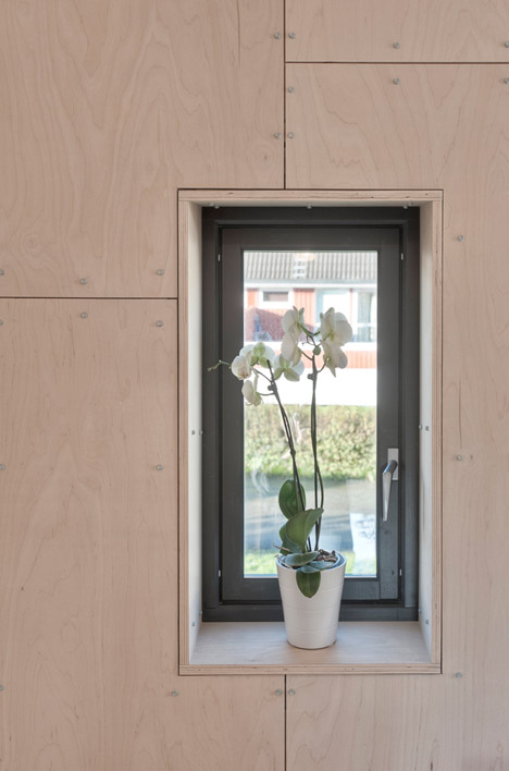
A patchwork of Norwegian birch plywood panels was used throughout the interior and features bolts that are left on show. Hanstad explained that the irregular interior surfaces are intended to diversify the building from the uniform ceiling heights that typify properties built in the area during the 1950s and 1960s.
"Somehow the houses feel a bit serious, so trying to give the client a new space that would break up this monotonous feeling became important," he explained, adding that the aim was to create "something new, with a sense of humour."
The exterior is clad with narrow boards of naturally treated pine and windows facing the street are tinted for privacy. The team says the appearance has received mixed feedback from neighbours, although Hanstad claimed that the majority now say it is "growing on them".

"A few are still raising their eyebrows, not accepting that this is an acceptable shape for a house," he explained. "Traditions stand very strong here and standing out is generally not very appreciated - something that this extension is doing."
"It's nice to see that small-scale architecture still can provoke Norwegians into discussing what is beautiful and ugly, how new and old should relate to each other or what we can accept of new buildings in already established private-house communities. All discussions that we as architects are very familiar with," he added.
Photography is by Pasi Aalto.
Here's a project description from TYIN Tegnestue:
Arne Garborgsei 18
This project is the result of our first attempt at commercial architecture in the Norwegian setting, and thus a learning experience. It is the first time of working with detail in accordance to building code and regulations on Norwegian soil. This resulted in 30 cm thick walls and roofs half a meter in thickness.
The project is an addition to a single-family house, in this case home to a family of four. The family wanted to expand their living space. In keeping with the methods adopted in the international setting, we assumed total entrepreneurship over this building process. In taking total control over the process, one also accepts total responsibility. The risk increases, not in the least financially.

On the ground floor the project created a spacious entry area with a combined bath- and laundry-room. The second floor of the addition adds a new multi-purpose room with a high ceiling. This constitutes a break with the monotonous section common to this type of house from the 1950s. The distribution of functions, answering to different needs, contributes to the particular shape of this addition. The house stands out in an otherwise very traditional Norwegian neighbourhood. It challenges the boundaries for what is acceptable within building norms. The feedback from the local area has been on both ends of the scale, ranging from positivity to skepticism.
The facade is cladded with naturally treated pine, the same environmentally friendly material used previously on our boathouse project. For the interiors of the addition, we decided to use Norwegian plywood from birch, with visible bolts and simple details. This project confirmed the notion that a close commitment to a project is a key factor in achieving the desired result. It also proves that the method we have learned and used in the international setting has relevance in Norway.