"Slap it on the corner of a credit card"
In this week's comments update, readers question whether Chermayeff & Geismar & Haviv's redesign of the US Open Tennis Championship logo was aimed at the wrong industry.
Moneyball: Chermayeff & Geismar & Haviv revealed a new minimal logo to modernise the US Open, but some readers questioned whether the redesign was too corporate for tennis.
"Looks more like a financial company logo than a sports logo," said Knownquantity.
"That seems apt given that it's tennis," added Waxwing, sarcastically.
"The skid mark ball is so financial, slap it on the corner of a credit card," retorted Arc*.
Adam Charlton was less critical, highlighting the potential longevity of the redesign: "To me, this feels built to last."
"Well, that old logo needed an update, but this is no better," wrote João Gonçalves, suggesting that the new logo was no improvement on the old one.
Marc Sicard was also far from impressed: "Redesign at its mehest."
The logo seemed to capture the imagination of at least one reader.
Do you think the new logo is too buttoned up? Join the discussion ›
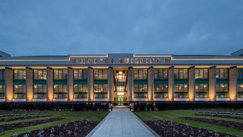
Sucking up: commenters marvelled at the exterior of the converted Hoover building, but opinions were split when it came to the interior.
One reader critiqued the above-bed placement of a skylight, "So much for sleeping in on weekends or for napping," Duckuscker remarked.
Brononamous was interested in having a room with a view: "You can have a great view of the massive A40 out of your window."
Zea Newland thought the kitchen was just for show: "The kitchen is fine as I don't think people buying those apartments will actually use it."
This reader thought the project was almost perfect.
Read the comments on this story ›
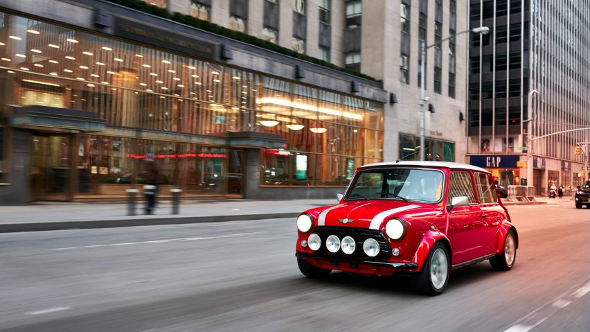
Battery-powered: readers only had good things to say about MINI's promotional electric version of the iconic Cooper model.
The classic car brand could do no wrong according to MrDelvoye: "MINI is timeless."
Other commenters were upset they couldn't get their hands on one – "Why a one-off!?" Tim Cheema exclaimed.
"In a better world, this would be the new MINI," lamented Frank Mobley.
"Why bait us with this beautiful concept car and then switch to producing a hyper-modern tron mobile?" asked a disappointed Steve Hassler.
This reader seemed to take a more paranoid approach to the design.
Read the comments on this story ›
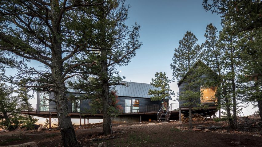
Confused cabins: readers got into a semantic debate over whether these two cedar-clad buildings could be called cabins.
Spookym liked the design, but wasn't sure it offered the atmosphere of a cabin, noting that it was "beautiful in its own way, but lacks the warm and cosy feeling that the word 'cabin' conjures up."
"Yet another gross and cynical misusage of 'blending in' and 'cabin', plus Barcelona chairs? Oh, c'mon," snorted Duckusucker.
But Tmgtheperson felt the opposite and wasn't afraid to show it: "Goodness. Pretty much everything about this very decadent 'cabin' makes me happy, and more than a little jealous."
This reader clearly had more pressing issues on his mind.
Read the comments on this story ›