"Priscilla, Queen of the Desert wore it better"
In this week's comments update, readers are concerned for the planet, and festival goers at Burning Man.
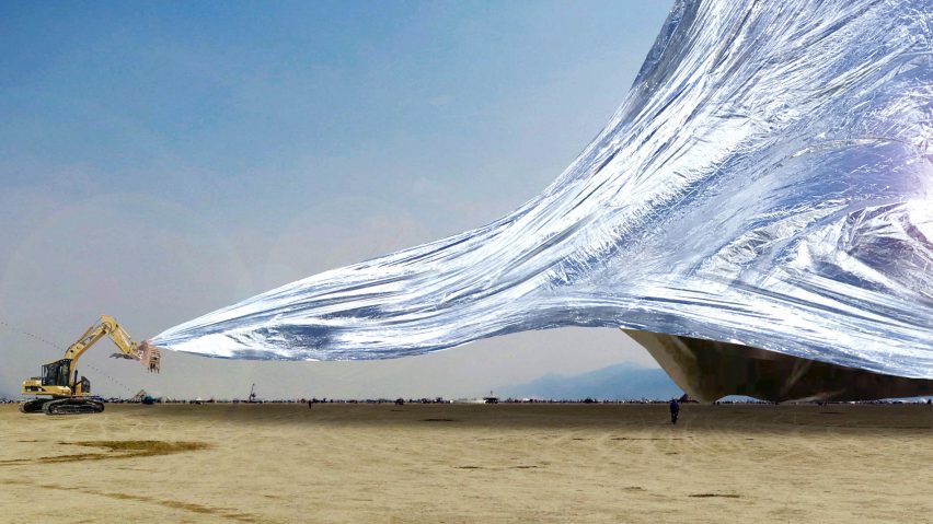
Safety first: Artist Alexander Shtanuk has launched a crowd funding campaign to raise funds for a giant metallic installation made from NASA emergency blanket for this year's Burning Man festival, leaving readers worried.
"These idiots ban plastic straws but play with a huge metallic/plastic bubble," commented an angry FamilyGene.
An equally annoyed Enuff Zenuff asked: "Won't it reflect too much sunlight back out into space, thus exacerbating man-made global warming?"
"Oh great, a giant solar mirror! How do you want these partiers done: rare, medium or well?" joked FormerEnlisted.
A bemused Aunt Zoo-Z added: "The overhead view of people lying on it brings to mind french fries on aluminium foil."
For one reader, something else came to mind:
What do you think of the giant blanket? Join the discussion ›
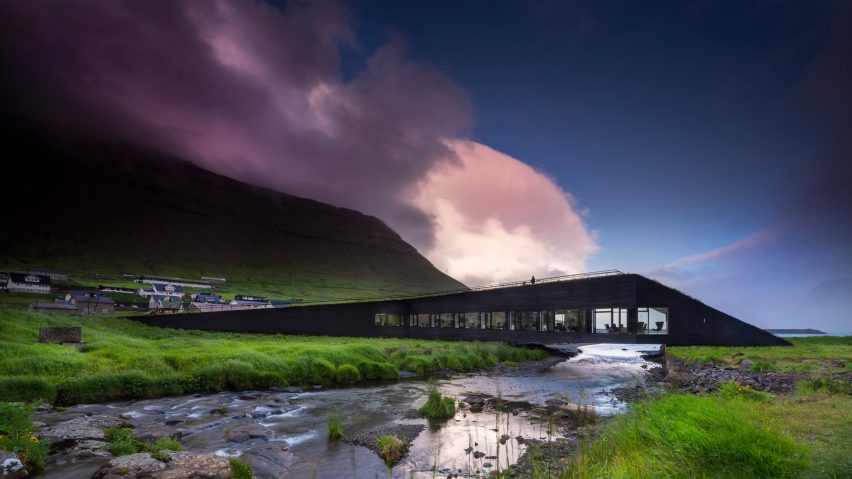
Bridging the gap: Scandinavian firm Henning Larsen has built a town hall across a river on the Faroe Islands, which polarised readers.
"One of the most beautiful buildings that I've ever seen," praised Johan Perezco.
A delighted Tony Wyer concurred: "Must be my current favourite building. The photography is without question, stunning."
Other readers, including Thomas, were far less complimentary: "Idiotic! A building should respect the landscape and not overwhelm like this does. Big fail by the architects and by whoever approved this travesty."
"Abstract and meaningless, despite the architect's attempt to justify it," added jb.
This commenter was more interested in the Faroe Islands' wildlife:
Is the bridge to your liking? Join the discussion ›
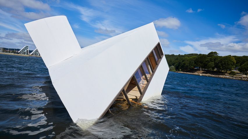
Treading water: readers are divided over Asmund Havsteen-Mikkelsen's scale model of Le Corbusier's Villa Savoye that has been sunk in a Danish fjord to make a statement about the failure of modernity.
"Well done, nice choice, objective achieved," congratulated jb.
Rodrigo Galvan-Duque disagreed: "I don't like artists who need a bull sh*t explanation to understand their work. Good artists communicate their ideas clearly."
"So this guy steals someone else's beautiful creation and in temper tantrum peacocks about throwing it into the water? Standing on the shoulders of others and crying that you are sinking is not admired or respected," added an unimpressed Maat.
"What is going to happen to the styrofome? We all know it's basically not recyclable, yet he sees fit to put tonnes of it into the sea. Sickening," added a concerned JayJay.
One reader made their feelings very clear:
What are your thoughts on the installation? Join the discussion ›
Fashion faux-pas: Burberry has updated its graphic identity with designs by chief creative officer Riccardo Tisci and British graphic designer Peter Saville, causing a stir amongst traditionalists.
"This is a tragedy. How bland. Long live the true Burberry, " lamented Henry.
Jason Tong was also disheartened: "The monogram looks like a bunch of pretzels. It's so busy it makes my eyes hurt."
Other readers, including Howard Stein, approved of the redesign: "Just excellent. Superbly drawn pattern element. Has all the class and wit, and malleability a contemporary logo should have. And it's fun! As well as so sophisticated."
Marc Posch agreed: "Well done. Sometimes tradition is a liability. With the new design, they have definitely left the daddy trench coat business. Bravo."
One commenter had another brand on the brain:
Is Burberry's new branding a success? Join the discussion ›