Volvo’s new logo features in today’s Dezeen Weekly newsletter

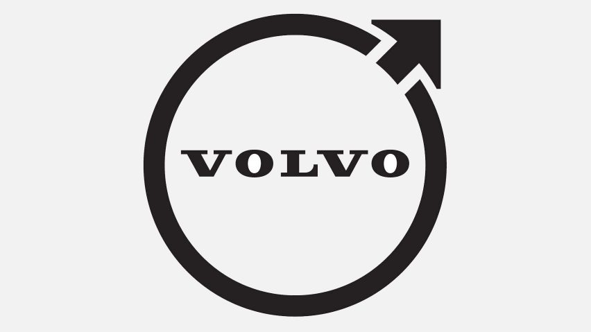
The latest edition of our Dezeen Weekly newsletter features Volvo’s new flat logo.
Swedish car manufacturer Volvo has revealed a flat, less colourful version of its longstanding Iron Mark logo.
The new identity retains the same circular shape and upward-pointing arrow first used by the brand in 1927.
Readers are disappointed, commenting that the design “lacks the attention to detail shown in the brand’s car designs”.

Other stories in this week’s newsletter include a Tumu Studio-designed home in Boulder, Colorado, BIG’s design for the Fuse Valley development in Porto, and Gensler’s redesign of the lobby inside the AT&T building in Midtown Manhattan.
Subscribe to Dezeen Weekly
Dezeen Weekly is a curated newsletter that is sent every Thursday, containing highlights from Dezeen. Dezeen Weekly subscribers will also receive occasional updates about events, competitions and breaking news.
Read the latest edition of Dezeen Weekly. You can also subscribe to Dezeen Daily, our daily bulletin that contains every story published in the preceding 24 hours.
Read more
Recommended stories

Dezeen Agenda features Honda’s revamped logo for electric vehicles
Why does everyone seem to hate the new electric Ferrari?
Dezeen Agenda features Bentley’s biggest logo revamp in a century
Dezeen Agenda features Lamborghini’s first rebrand in 20 years

Dezeen Agenda newsletter features Volkswagen’s 1960s-style electric van
Peugeot’s new logo features in today’s Dezeen Weekly newsletter
Dezeen Agenda features Microsoft’s rebrand of its core Office icons