"History does change perception"
Opinion: sometimes it becomes important to save a building that doesn't seem to work. Such is the case for Michael Graves' Postmodernist exemplar, the Portland Building, says Alexandra Lange.
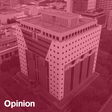
In the centre of the first wall of chronology in the new exhibition Michael Graves: Past as Prologue is a little shelf. On that shelf rests a cookie tin decorated to look like his Portland Building (1982). The proportions seem a little off, since the tin is taller than it is wide. In my mind, the Portland Building is a perfect cube, closer to its foreshortened appearance from the sidewalk, and closer to the penciled yellow-trace drawings of facades that were my first introduction to Graves's work.
In my memory these facade drawings are all squares, made up of triangles and half-rounds, chunky columns and square windows, ideal for transformation into an animated gif of architectural design as an exercise in two-dimensional composition. When Graves took on the Whitney Museum, in 1985, he tried to make Marcel Breuer's facade into one of those bits, stubbornly stuck in the lower left-hand corner of his pile. But Breuer's building resists the cookie tin. It would probably tip over. It would look dull on a shelf. While Graves suggests biscotti, Breuer doesn't seem like a sweet.
The exhibition celebrates 50 years of Graves's practice and it could not be better timed, as Graves – and the Postmodernist architecture for which he remains the poster boy – is back in the news. The Portland Building now requires $95 million in upgrades, which has started a larger conversation about its worth. When Graves spoke in Portland earlier this month, he was predictably pained at the idea that the city might tear it down. To him, "it was shimmering, it was so uplifting. There was Portlandia, there was the building."
But that was the outside. Asked about the small tinted windows, the low ceiling heights, the giant parking bay on the public green behind the building, Graves passed the buck back to the city, blaming the client for the garage, the energy crisis for the window tint, the budget for the ceilings. It sounded like a petulant performance: "Why don't you love me? And, all those parts of my building you hate? Not my fault. In fact, all those parts of the building are the parts not shown on the cookie tin: the inside, the backside, the dank side 'loggias'." Graves seems to dare critics – some bearing city budgets – to treat his building as the empty, decorative shell it was always accused of being. (It's been quite a fortnight for architectural petulance.)
I've been struggling with my own feelings about the Portland Building since I first visited the city in 2013. After that visit I wrote: "It has not aged well. To be more precise: it looked like shit. Dirty, damp, with a gloomy deep arcade. The colours evoked only the early 1980s, hotel ballrooms. It aggressively fills the block, leaving little room to look at its centralised composition."
That was rude, but that's how I felt. Graves argues for his office buildings as a humanist stair-step between the old masonry and cast-iron architecture of cities like Portland or Louisville, and the then-new straight-up-and-down glass towers. I found his teal tile more alienating than its Modernist neighbours, which include Pietro Belluschi's early, supremely elegant Equitable Building and Lawrence Halprin's craggy Open Space Sequence. If the building isn't good for the employees on the inside, and isn't good for the city on the outside, what's the point?
When arguing for saving a Brutalist building – preservation's current difficult child, 10 years older than Postmodernism – you have to move the conversation beyond looks, which hurt, toward intention and invention, which help. Graves seems to be trying to flip this strategy on its head, defining humanism scenographically. The point of the Portland Building, the part its own architect cares about, is its decorated surface. When Karrie Jacobs wrote, earlier this year, in defense of the Portland Building's strangeness, she spoke to former Oregonian architecture critic Randy Gragg, who took the same idea to a nullifying conclusion.
"Is it as influential through photographs of it as it would be standing there? Is it really something you have to experience in order to understand the importance of? And I think, probably not."
Walking through the Graves retrospective, the cookie tin wasn’t the only tabletop item that commanded attention. His 1984-85 silver tea service for Alessi, the product that started it all, is a beautiful, even powerful set of objects. The Alessi stainless steel teakettle, still great; the Target version, not bad. We do have Graves to thank for the streamlining and brightening of a vast range of everyday household products.
I loved the new walking canes Graves designed for Kimberly-Clark – paralysed from the waist down since 2003, Graves has devoted part of his practice to the very necessary redesign of healthcare equipment and facilities. In terracotta, teal and aubergine, they have handles shaped for different ailments, and bases designed to make the canes spring up when stepped on.
At that scale the colours feel engaging, not cheap; the shapes not arbitrary but fitted to the hand. At city scale, where (or what) is the hand? The operative phrase here is "at that scale", for that has always been the issue with Graves's architecture. It can look great as a drawing or a tin, but when your tea set and your architectural model have the same shapes and compositional rhythm, one of the realities will fail. (When you see architecture obviously influenced by Graves, like FAT's Community in a Cube, one can only hope it goes beyond the empty teakettle within the chalet and behind the super graphics.)
The result is the Portland Building, a historic place which we, as critics, must defend on its face value – but I believe, only for its face. I can't work up much emotion in its favour, but that, in this upside-down case, is not an empty indicator. Postmodernism is not, now, our style, but are we really comfortable demolishing its most prominent exemplar? When I think about buildings I'd demolish they tend to be those of the second rank: late Gwathmey, at Astor Place or at Yale. Jacobs is right that "it's a bad idea to do something irreversible when your judgment is clouded by disdain." That's what Brutalism's defenders keep saying about concrete.
Michael Kubo, Mark Pasnik and Chris Grimley wrote in their "Defense of Brutalism" that criticisms of that style often had as much to do with the urban renewal programs through which they were built, which could be remedied with "sensitive urban design". So, perhaps, could Graves's Portland Building, with a gut interior renovation thrown in for good measure. I hate to be in the position of telling a city it has to keep something I wouldn't want in my own, but history does change perception. By defining what is worth preserving about this building as symbolic, almost as thin as a cookie tin's walls, there's a chance to make it into a building that can work as architecture and not just a striking two-dimensional image.
Alexandra Lange is a New York-based architecture and design critic. She is a Loeb Fellow at Harvard's Graduate School of Design for academic year 2013-2014 and is the author of Writing About Architecture: Mastering the Language of Buildings and Cities as well as the e-book The Dot-Com City: Silicon Valley Urbanism.
Tickets are currently available for Michael Graves: Past as Prologue, a symposium dedicated to the architect's work with speakers including Peter Eisenman, Steven Holl and Paul Goldberger, that takes place on 22 November at Parsons The New School for Design in New York.