
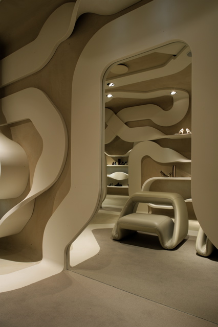
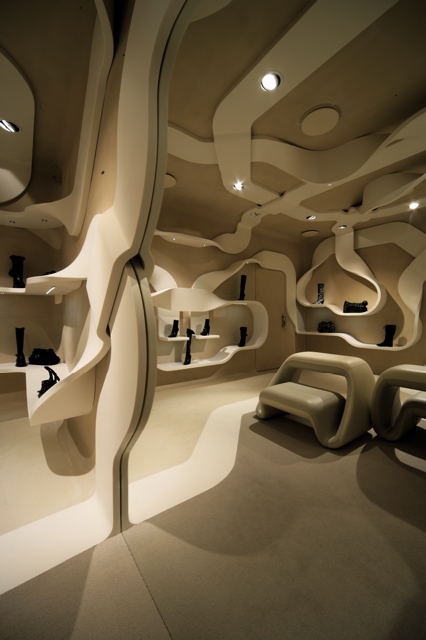
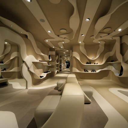
Milanese architect/designer Fabio Novembre has sent us images of his latest project – a flagship store for American shoe brand Stuart Weitzman at 27 Via dei Condotti in Rome.
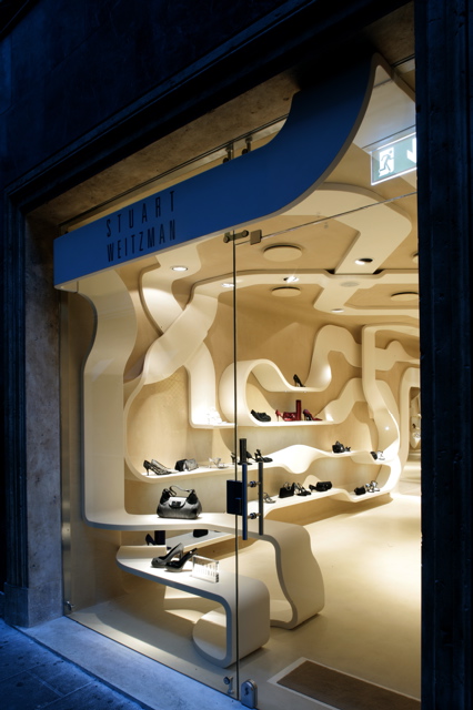
With Corian ribbons weaving across walls and ceiling to form shelving and architraves, the concept will now be rolled out at Stuart Weitzman stores elsewhere. “It’s a new design concept that will be used for the hundreds of flagship stores around the world,” Novembre tells us.


Podcast: Play in new window | Download
–
Posted by Marcus Fairs


April 11th, 2007 at 8:15 am
looks like someone just walpapered the whole room with toilet paper
September 8th, 2007 at 7:31 pm
awesome store never seen such a lovely store before
October 26th, 2007 at 12:46 pm
SOME THING CREATIVE YET SIMPLE !
SOMETHING TRENDY AND UNIQUE !
November 18th, 2007 at 1:53 am
spaguetis
December 13th, 2007 at 6:39 pm
wow, love the idea and the result. super sweet.
February 1st, 2008 at 6:14 pm
Wow, I have never seen a store go so wild on their architecture. I really love how the store is centered around the design, and not the other way around.
The design is awesome, and I hope someday all stores go as far as this store went with their design, and architecture. It’s really attractive, and attention catching.
Makes me want to go in there (even though I have not interest in high heeled shoes, or purses)
February 4th, 2008 at 10:47 am
Amazing..!! fantabulous…!!creative to the core..!
only seen such concepts on paper..nvr seen them in real ..
inspires one .. such a gr8 combination of art and execution..
April 12th, 2008 at 4:27 am
HA HA HA HA HA! ’spaguetis’ – Ha ha ha ha ha ha – hee…
April 14th, 2008 at 12:04 am
bellisimo! Fabio knows about art, and use it in architecture! that is good architecture!
April 22nd, 2008 at 3:29 pm
The arrangement of ‘toilet paper’ must be held in check by strong refinement of the function.
May 5th, 2008 at 7:40 pm
see new karim Rashid table/ chair
September 8th, 2008 at 12:07 am
Beige is no good, use color!
September 17th, 2008 at 6:42 am
truly great concept, great detailing
May 16th, 2009 at 9:02 pm
i agree, beige was not an inspired choice… it’s too monochrome! a pity, because the concept is great!
July 13th, 2009 at 4:23 pm
This design and style both of personality very much,and spectacular.If only in my opinion,i do not think that it is for a store design.
There is only one fault i think,is the height of space.It give me repressive.
August 7th, 2009 at 8:44 pm
It’s perfect in a store, and only in a store. This wouldn’t work anywhere else. There needed to be more color. Three or four colors. Then it would appear as though four ribbons would be winding along the walls. However, this is the type of design that you look back at three years from now and wonder “what were we thinking? It’s ugly”. Similar to when you see some designs from the ’70’s (not all though, but you know what I mean). That “ugh, what was our mindset back then?” feeling.
August 7th, 2009 at 8:47 pm
And I see that using only beige was to not detract from the products on display. But I don’t think using three or four colors would have done that. People are going into the store to buy shoes. They know what to look for.