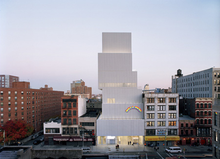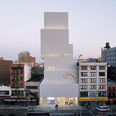
New Museum by SANAA opens in New York
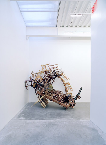
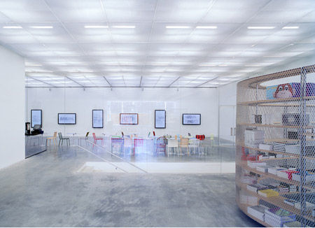
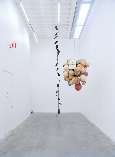
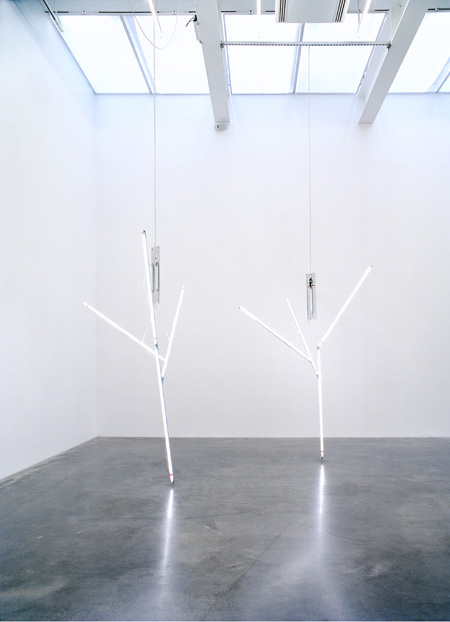
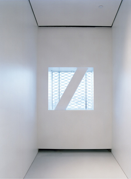
The New Museum of Contemporary Art, designed by Kazuyo Sejima + Ryue Nishizawa/SANAA, opened in New York on the weekend.
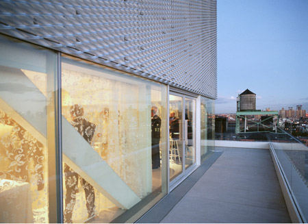
These photos are all copyright © Dean Kaufman.
More information on this project in our earlier story.