May 22nd, 2008

squ0078587-421.jpg

Architectural photographer Duccio Malagamba has relaunched his website with new images including these of CaixaForum Madrid by architects Herzog & de Meuron.

0140201-421.jpg

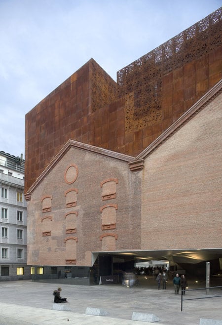
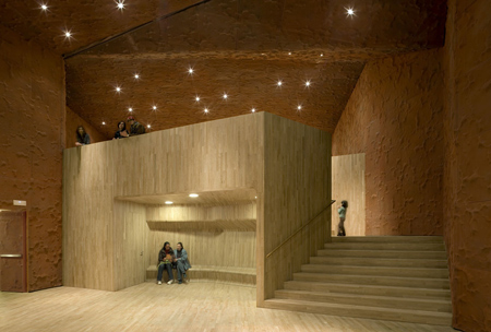
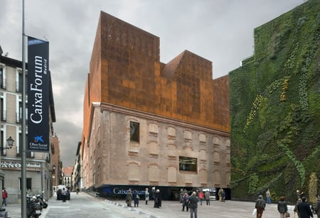
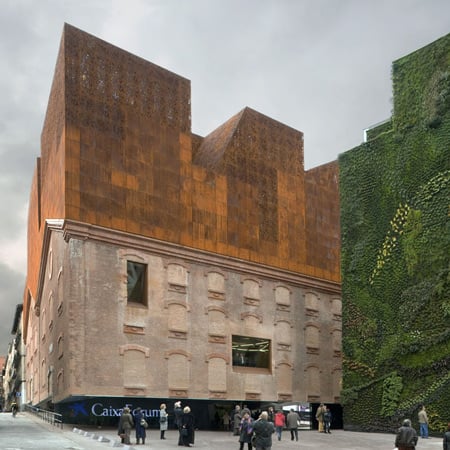
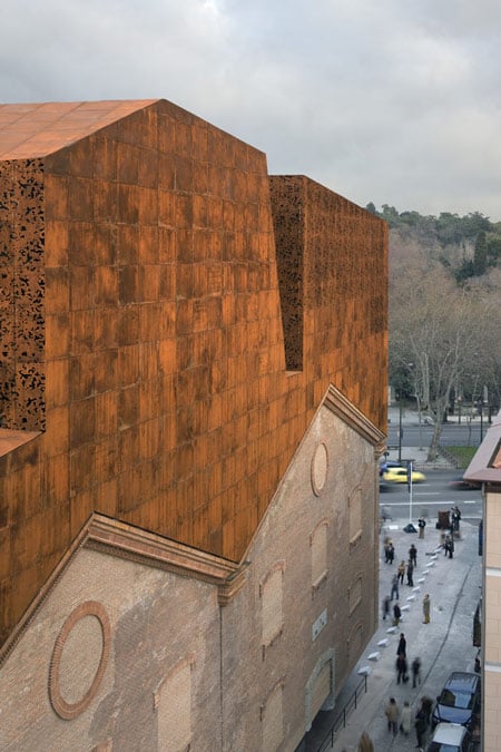
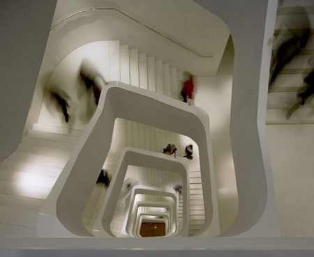
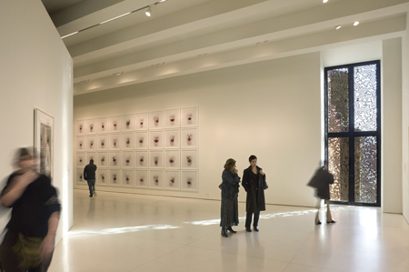
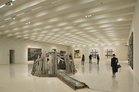
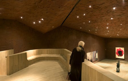
The CaixaForum arts centre, which opened earlier this year in Madrid, Spain, incorporates walls from a power station that previously occupied the site. It includes galleries, administrative offices and a restaurant in the upper levels, as well as an auditorium below ground level.

0278819-421.jpg

Malagamba’s website is now accessible to anyone and includes recent work alongside much of his archive. Projects can be searched by architect, location or type.

0211169-421.jpg

All photos here are copyright Duccio Malagamba and used with permission.

Here’s some more information about CaixaForum from Herzog & de Meuron:

A Magnet
The CaixaForum is conceived as an urban magnet attracting not only the art-lovers but all people of Madrid and from outside. The attraction will not only be CaixaForum’s cultural program, but also the building itself, insofar that its heavy mass is detached from the ground in apparent defiance of the laws of gravity and, in a real sense, draw the visitors inside.

0518368-421.jpg

A new address for the arts
The CaixaForum-Madrid stands on an advantageous site facing the Paseo del Prado and the Botanical Garden vis à vis. This new address for the arts is located in an area occupied until now by unspectacular urban structures, the Central Eléctrica Power Station, and a gas station.

0471719-421.jpg

The classified brick walls of the former power station are reminiscences of the early industrial age in Madrid, while the gas station, a purely functional structure, was clearly out of place. Like a vineyard that could never develop its full potential because it was planted with the wrong grape, this prominent location could not develop its full potential. The demolition of the gas station created a small plaza between the Paseo del Prado and the new CaixaForum in the converted power station.

0598166-421.jpg

A spectacular transformation
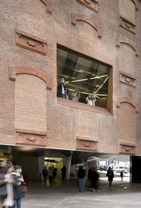
The only material of the old power station that we could use was the classified brick shell. In order to conceive and insert the new architectural components of the CaixaForum Project, we began with a surgical operation, separating and removing the base and the parts of the building no longer needed. This opened a completely novel and spectacular perspective that simultaneously solved a number of problems posed by the site.

0698935-421.jpg

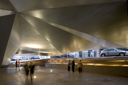
The removal of the base of the building left a covered plaza under the brick shell, which now appears to float above the street level. This sheltered space under the CaixaForum offers its shade to visitors who want to spend time or meet outside and is at the same time the entrance to the Forum itself. Problems such as the narrowness of the surrounding streets, the placement of the main entrance, and the architectural identity of this contemporary art institution could be addressed and solved in a single urbanistic and sculptural gesture.

0748575-421.jpg

A construction below and a construction above ground
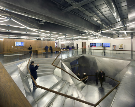
The separation of the structure from the ground level creates two worlds: one below and the other above the ground. The “underworld” buried beneath the topographically landscaped plaza provides space for a theater/auditorium, service rooms, and several parking spaces.

0858521-421.jpg

The multi-storied building above ground houses the entrance lobby and galleries, a restaurant and administrative offices. There is a contrast between the flexible and loft-like character of the exhibition spaces and the spatial complexity of the top floor with its restaurant/bar and the offices. The surprising sculptural aspect of the CaixaForum’s silhouette is no mere architectural fancy, but reflects the roofscape of the surrounding buildings.

0848481-421.jpg

0078587-421.jpg


Posted by Rose Etherington

45 Responses to “CaixaForum Madrid by Herzog & de Meuron”

  1. K. Rimane Says:

    Wow! i love the floating effect of the old building. Amazing architectural achievement!!!

  2. brown_ie Says:

    I LOVE HERZOG & DE MEURON!!! they are the best in the century…GOOD ONE!!!

  3. mvb Says:

    I visited it last month and it is incredibly amazing how the brick walls are supported, because there is no columns on the ground floor. The concrete cores and the steel structure are hidden so it is difficult to find where the trick is. All the building seems to fly over the head, in fact, it was a great surprise for me when I came into the first floor and I realised that the floor was hanging from steels columns welded to the second one. I think everything has been designed intelligently, that is why I really can’t say anything bad about this project. Unforgettable experience!

  4. s Says:

    o_O

  5. CPCP Says:

    incredible architecture!!!
    congratulations H+dM

  6. 知识分子 Says:

    very cool

  7. MIRTEC Says:

    lovely! great variation in spatial experience!

  8. abyssinian Says:

    The architectural version of Kim.K… (it excites me silly!!!)

  9. leandro locsin Says:

    a head on a head… genius!

  10. tim Says:

    Any one idea on this building is enough to make a building awesome. The fact that H&DM used eight different ideas is just them taking victory laps.

  11. edward Says:

    Audacious and original concept confidently executed. Great Show!

  12. kevin Says:

    beautiful decay

  13. Sandra Says:

    Great texture in different levels. Superb sensation and very poetic approach. So I love design. So heavy & so light.

  14. J Says:

    THIS is architecture.

  15. Oxotnic.gr Says:

    I think it’s been a really long time there’s been such a unanimous excitement about a project here, and it’s so worth it. It’s real architecture.

  16. jed Says:

    probably my favourite building for many many years.

  17. Adrian Says:

    Pure magic!

  18. Bernd Says:

    oh my god, this is so chichi.
    and didactic. the old building floating,
    the head on the head. and a bit of laser
    patterns here and there to make it into a
    sculpture without windows. haha!
    a great joke for a second but a sad anecdote
    for the future.
    can architects please start building buildings
    again?

    compared to zumthor in cologne this is so
    boring and passe.
    nice garden on the wall though.

  19. tiffany Says:

    UFB unidentified flying building! This is supercool.

  20. jed Says:

    i have to say it’s a real shame about the caixa branding/logo at the entrance.

  21. ror Says:

    h&dem are truly into their designs, this shows how pure the research of the source is. of course logo or staircase might be annoying but isn’t it an architecture for various people?

  22. João Says:

    wow, simply wonderful… so many different (and good) experiences in the same building… have to say i loved it…

  23. PT Says:

    most of the interiors are disappointing and weird but everything else is just really damn beautiful.

  24. carlo Says:

    niceeee!!!!!

  25. mekaratta Says:

    OMG! I thought it was rendering…
    Fantastic new vocabulary for restoration

  26. hat on Says:

    i thought it was in hamburg! a pity! the copy paste effect makes both projects seem more like objects and less like architecture!
    aren’t there any purists out there?
    be critical by looking a little further than your nosetip!
    i still like it somehow!

  27. Stefan Says:

    This is a subtle and intelligent work, I think unfortunately most of the interiors do not have the poetic sensation of the outside building…

  28. cs. claudio Says:

    GREAT, j’adore…

  29. Dariusz Says:

    amazing.. Can’t wait to see it soon!

  30. yuyu Says:

    Makes me feel like going to visit Madrid! THIS IS A MUST VISIT BUILDING!!!

  31. size Says:

    the collage of the new with the existing isn’t very well achieved, i think it was asked a little more sensibility with the old building, they simply glued one to the other!!

  32. michael Says:

    i disagree with bernd
    the garden on the wall is such an unnecessary gadget
    i like the playfulness of the whole composition
    a nice collection of qualified spaces and rooms
    a bit dubious about the covered semi sunken public space,
    barcelona was such a failure for that…
    in general, it seems well thought, and well crafted.
    well done H&M!

  33. Ryan Says:

    I’d agree that Zumthor in Cologne is more sensitive to the existing structure below, this project seems to be to disjointed from the exising shell.

    That said, it is a very new form that H&deM have created, and it seems like a very dynamic space inside. Can’t wait to visit!

  34. Bernardo Says:

    i totally agree with michael.
    there is such a variety of spaces. and it all comes together!
    i just finished reading smlxl and thousand plateaus
    by deleuze. these are fantastic books and
    this is exactly the architecture that emerges from it.
    it’s so complex! and so beautiful, the folds and everything.
    i think more computer-generated design should be
    used in architecture to create spaces like that. i love laser!
    well done H&M!

  35. sb Says:

    this is just an assemblage of of a few patterns out of a big
    architectural trend catalogue.
    i think anyone who likes this building is a pure fashion victim.
    so are HdeM, they got slowly into the trap of getting lost
    in their own language, something that they have started many
    years ago with a lot of wit and vigour.
    now they get swallowed and eaten by themselves and all the
    other HdeM offsprings in this world (zaha for example has the
    same problem).
    if they want to continue like that, they better work as interns
    for OMA.

  36. hat oFF Says:

    I WANT MORE CONSTRUCTIVE CRITICS! PLEASE!
    does nobody care about the before seen gehry copy paste effect?
    interior exterior … who did the interior? … or please explain!

    HELP!!!

  37. ruby yallouz Says:

    Genial!!! há muito não via arquitetura tão interessante !!
    a sensação do predio flutuante é simplesmente fantastica!
    e o interior melhor ainda, não deu em nenhum momento a sensação de opressor… parabéns adorei!

  38. Javiera Says:

    the details are very cool!!!!!!!!!!!!

  39. edgar velasco Says:

    saludos y echale un vistazo a esta pagina y puede ser buen tema tener conexion xon estos sitios para aprender y discutir de cosas nuevas.

  40. mario Says:

    I am afraid I can’t find the right word to tell you how uglly is this house. The first rate kitch ! ! !
    Massive, ‘historic’ and heavy corpus of brick walls hovering few meters aboe the ground ! Horrible !
    And above them there is _suddenly&coming from nowhere_ some structure which doesn’t correspond with anything below.
    Contrast ?
    But, shouldn’t a contrast have any of sense ?
    TGhis one doesn’t have any sense !

    This house is a big mistaeke and a kitch parade !

  41. jovan Says:

    this house looks sick and frightening !
    circus attraction for petty bourgeois taste

  42. Alex Says:

    I really appreciate it, but you should interpretate comments like last one of Jovan one and other too… I think that it isn’t the best way like he did his comment (something that he requires be carefully too). They could be the most sinceer comment done but not with the constructivism that architecture need…

  43. bas Says:

    i love love this!!

  44. mzlxy Says:

    i have to say the first picture makes it look quite like “Tamagotchi” the cartoon character with dark upper part and yellow face.
    believe me ,check the official website
    http://tamagotch.channel.or.jp
    on the upper left ,the first character~

  45. FilipE Says:

    Great!!!

Submit a comment

See our comments policy