
Paris-based architects Pierre Buecler and Jean-Christophe Poggioli designed the interior of the new Liberty of London concept store on Sloane Street, which opened last month.

The two-storey shop displays accessories, scarves, swimwear and jewellery. Women’s collections are on the ground floor and men’s upstairs.

The designers took inspiration from the architecture of the original store and archive of prints, as well as the Orient Express.

The following information is from Liberty of London:
–
LIBERTY OF LONDON UNVIELS NEW BOUTIQUE DESIGN
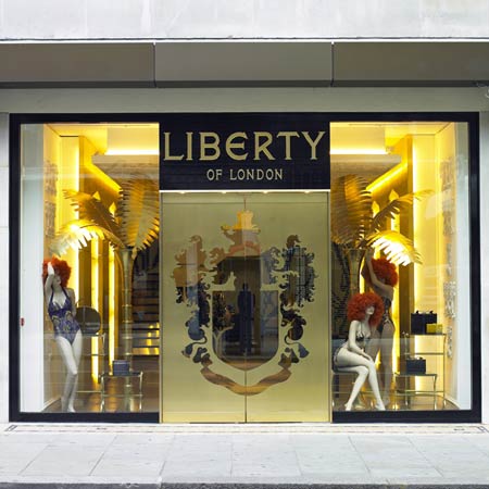
July 2008 sees the launch of the first Liberty of London concept store dedicated to the brand name and represents the first step in a planned world-wide expansion.

Conceived by Creative Director Tamara Salman and designed by Paris-based architects Pierre Buecler and Jean-Christophe Poggioli, the two-storey 1,800 sq ft store provides an opulent canvas for the men’s and women’s ready-to-wear, accessories, scarf, swimwear and jewellery lines.

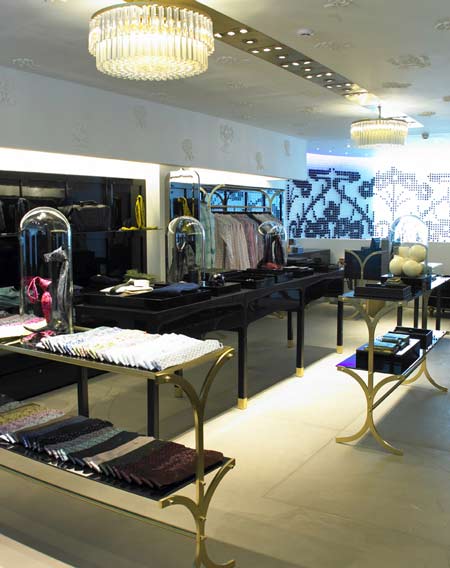
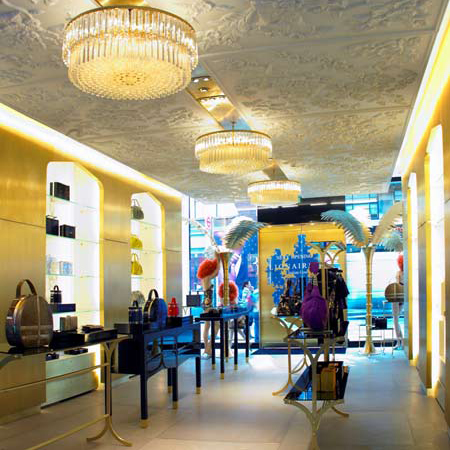
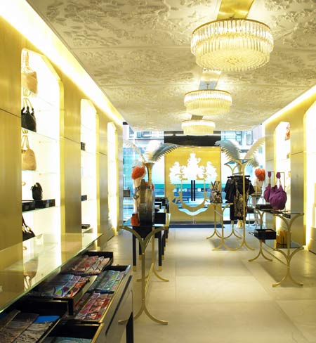
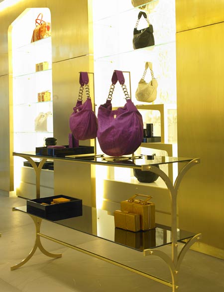
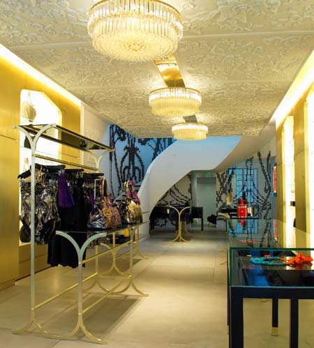
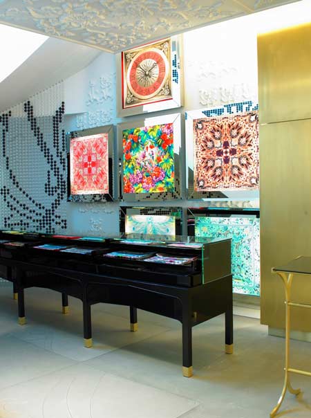
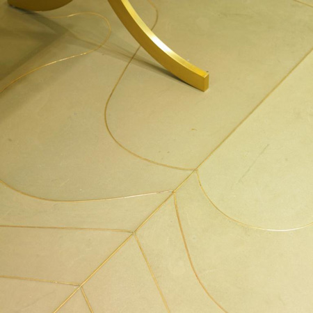
The ground floor is devoted to the women’s collections and takes its cue from the architecture and heritage of Liberty – evoking a distinct sense of exotic glamour and decadent opulence. Milk walls and gold arches drift through blackened oak and high gloss black furniture which in turn are grounded by a grey stone floor with a hair-line brass inlay of an abstract ‘Ianthe’ signature print.

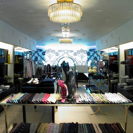
Stucco ceilings and walls are intricately carved from moulds of archive prints such as the floral ‘Chrystelle’ design giving the impression of a beautiful celestial garden. Medieval deer and birds adorn walls and appear to peek through the golden arch detailing.

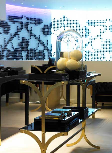
The centrepiece of the ground floor is an impressive three metre long scarf bar in black gloss petrified oak and glass. Back-lit scarf boxes float above to showcase individual and exclusive designs.

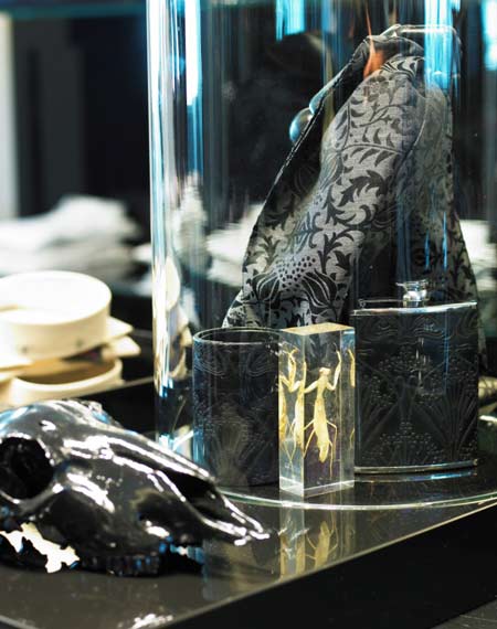
Paying homage to the Orient Express and the sheer glamour of travel, luggage racks act as product shelves and dressing room interiors echo a train carriage in lush dark purple velvet.

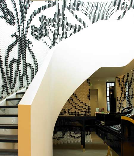
A dramatic curtain of transparent acrylic spheres, with ‘Ianthe’ highlighted in black, follows the line of a curved sweeping black oak staircase leading to the men’s floor on level one. Shafts of purple light, projected from above, cast a shimmering purple hue after dark.

Recalling the spirit of the original store, black gloss panelling mimics original wooden panelling. Once again ceilings and walls feature elements of floral mouldings taken from inside the Liberty building, interspersed with a swan and stag’s head – discreetly positioned to provide an element of surprise.

Flooring and furniture feature the same elements as the ground floor, with display cases styled in black matt oak – as if burnt – with miniature brass feet. Changing rooms follow the Orient Express style with exaggerated train seats and purple velvet décor.

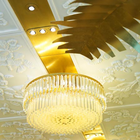
Lighting is contemporary and in ‘runway tracks’ with 60’s inspired modern circular chandeliers – on both ground and one – acting as the perfect foil to provide an unconventional use of light.
To commemorate the opening of the store, Tamara Salman has designed a limited edition ‘Ianthe’ print white box bag with hand-painted stripe – exclusively available at the Sloane Street boutique.
–
Posted by Rose Etherington


July 4th, 2008 at 1:36 pm
That’s really ugly!!
Like a tasteless wedding cake!
Why dezeen…
July 4th, 2008 at 2:07 pm
kitch
July 4th, 2008 at 2:23 pm
I much prefer something more along the lines of the Phillip Lim boutique by Jamo Associates but I don’t doubt that this is what the target clientele would love. I do like the entrance doors and storefront treatment.
July 4th, 2008 at 3:18 pm
UGLY in my book – hodgepodge lodge meets ghetto glitz – too many patterns going on here – what a shame!
July 4th, 2008 at 3:20 pm
there is so much going on here, you don’t know where to look first and…..
how do you get away from it!
July 4th, 2008 at 3:34 pm
I do not understand those coments, personately and all the poeple
around me find this shop really beautiful.
July 4th, 2008 at 3:54 pm
How amazing!! A pure art deco style!
July 4th, 2008 at 5:20 pm
it’s the craftmanship and detailing that lift it above similar projects. good work.
July 4th, 2008 at 5:43 pm
JUST COOL Design Blog Says:
” too many patterns going on here”
it’s Liberty! pattern is what the company is founded on.
July 4th, 2008 at 7:47 pm
hey
this is a great store. I agree the trees are maybe too much, but the furniture is very elegant and the staircase is beautilful. It is very Liberty and modern
congratulations Liberty !!!
July 6th, 2008 at 4:59 pm
if i say Bazart it’s OK it’s trendy
if i say Ugly it’s Ok it’s trendy
if i say kitch it’s Ok it’s trendy …
July 7th, 2008 at 12:21 pm
they had similar stylised palm trees at the mcdonalds in the mall on the other side of my town… in the 90’s…
July 8th, 2008 at 12:37 pm
Clements Retail were main contractor on the Liberty project, working alongside inspirational architects, Pierre Buecler and Jean-Christophe Poggioli. Please visit our web site – http://www.clementsretail.com
July 8th, 2008 at 6:26 pm
Branded, clever & a modern take on deco.
Great Job Pierre & Jean-Christophe!
July 16th, 2008 at 12:54 pm
Designed by Pierre Beuller & Jean-Christophe Poggioli of Architecture & Associes and Tamara Salman creative director of Liberty, shopfitted by Clements Retail, and with decorative relief ceiling & wall panels sculpted by Simon Doughty.
Series of large floral 3d frieze ceiling panels and Art Nouveau walls were all original sculpt by Simon Doughty who had interrupted archive artwork from Liberty. Modelling in plaster & clay formed a series of moulds to reproduce the repeat patterns, the final design was manipulated & arranged so to be approved by senior Liberty creative directors. Panel production for a limited edition of 12, was from a highly detailed casting silicon mould in dolomite calcium rich gelcoat fibreglass with hand finished acetone wash to produce matt plaster stucco finish.
Simon Doughty DesignRealisation is a commercial sculpture company who has worked on many unique projects for clients; architectural, museum & heritage environments, bespoke retail, exhibition, film & TV, ad campaigns, and public art works. Clients have included; Guinness, The Body Shop, Merrell, S4C, Paul Smith, adidas, Nissan, Reebok, BBC, Apple, and now Liberty.
July 21st, 2008 at 5:44 pm
ugly, kitch, useless
December 3rd, 2008 at 6:50 pm
where are the chandeliers from?
January 15th, 2009 at 12:34 am
Hi everyone,
believe me it really works in real life !, its has a great warmth and feel to the store.
We supplied the chandeliers for this project, we specialize in creating statement chandeliers for both trade and private individuals, and are working on some new projects for Libertys at the moment.
opiiumstudio@googlemail.com
Thanks x
April 8th, 2009 at 3:17 pm
Well done Simon superb work. Some of the people making comments here obviously have no idea about what Liberty stands for. Design is not about personal taste it’s about context and relevance to the target audience and expression an organisation’s core values. Is this design relevant to the target audience?? Yes. Does the design express the core values of the brand?? Absolutely. Just remember nobody ever erected a statue to a critic. (because most art critics are failed artists)
If you don’t like this work I guess Liberty is just not for you.