
The Limes Hotel by Argentinian designer Alexander Lotersztain opened at the end of last month in Brisbane, Australia.

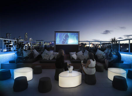
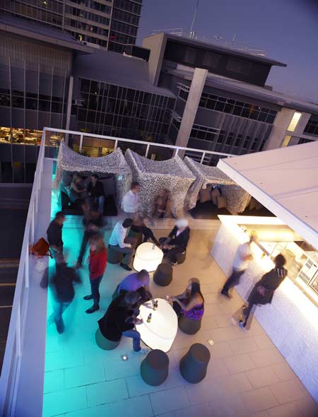
The hotel incorporates a roof-top bar and cinema and is the first Australian hotel to join the Design Hotels organisation.

Here’s some info from the hotel:
–
First Australian member of Design Hotels opens
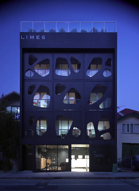
Designed by award-winning designer, Alexander Lotersztain, the first Australian member of Design Hotels, the Limes Hotel, opened June 27 in Brisbane.

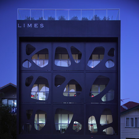
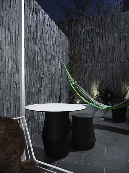
Located in Fortitude Valley, the hub of Brisbane’s nightlife, also known for its trendy cafes, shops, bars and restaurants, in keeping with this vibrant neighbourhood, Limes has been created to include a completely open air roof top bar and roof top cinema (in hibernation until Spring).

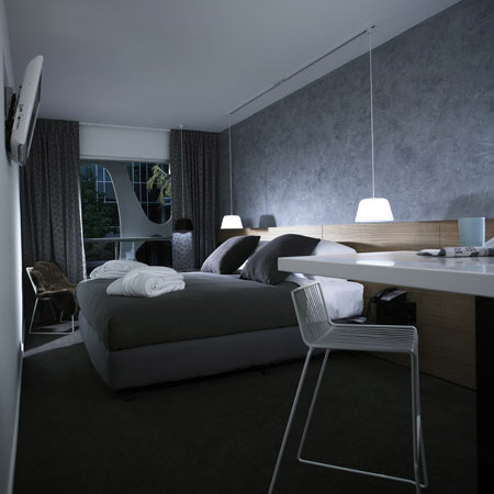
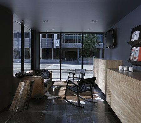
Drawing inspiration from a lifetime of international travel, with countless hours spent in aeroplanes and hotel rooms, Alexander concentrated his design focus on the 21 rooms to cater for the independent traveller, rejecting the 5-star norms and opting to focus on guests’ primary travel requirements through unique design solutions in styled lodgings.

“Attention to detail is reflected in my design choices, which are understated yet buzzing with the contemporary energy of Brisbane and the Valley surrounds,” Alexander said.

The rooms feature custom Corian (by Dupont) kitchen benches and toilette vanities, Blackbutt timber bed heads, custom powder coat aluminium door handles, splash-back and floating bedside tables, Luna Textiles curtains and bathroom wall tiles by Bisazza. Each room has an individually hand painted feature wall created by using a mineral coating technique (Julien Fantone, Idea Creations).

“The Limes concept is an emphasis on the essentials to make a pleasing and at times novel experience, whether staying for a night, a drink, a movie or all of the above,” Alexander said.

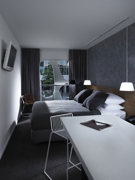
Where design permitted, mundane items such as rubbish bins and cables are minimised or completely hidden. This not only makes the room look cleaner and visually clearer, but also from a practical aspect, makes the servicing of the room more efficient.

“I wanted to make Limes a design experience, however stripped of the associated design ideals of something unattainable. I shifted the design focus to make the guest feel special, yet not afraid of jumping into the bed like it was their own.”
Limes is a stunning yet simple urban retreat, and throughout all facets of the hotel from the rooms to the roof top bar and cinema, Alexander has created a modern and warm atmosphere unencumbered by excessive ornamentation.
“I decided to view the hotel in its absolute entirety – considering the intended look and feel, and paying heavy attention to the interiors, furniture, surfaces and finishes, as well as extending my design influence to Limes’ music and drinks list. I went on to give the Limes a “face” by tangibly branding the hotel through its facade – an extension of the Limes logo on a gross scale. By leaving no facet of the hotel to chance, one feels what I can only describe as the “spirit” of Limes when in its presence. A strong feeling within the doors of Limes and a residual impact realised on returning home.”
–
Posted by Rose Etherington


July 11th, 2008 at 1:11 am
Finally, some material sensuality. I’ll be booking my flight to Brisbane shortly. The one room layout feels cramped with the hanging TV and narrow space between bed and wall. I wonder what sorts of solutions would work here. The façade feels extremely chic yet offers guests a little privacy. That seems like a good balance between open and closed. My only real complaint are the 3 apples. Could those have been, limes?
July 11th, 2008 at 4:01 am
very nice, the front facade estructure seems very light. Besides the strange white tent at rooftop terrace, the hole project is nice.
July 11th, 2008 at 5:05 am
The rooms look small but the details look great and the bar area is fabulous. Much more subtle and original than many other design hotels i have seen or stayed in lately.
July 11th, 2008 at 7:59 am
A very dynamic and exciting, yet understated design. My only concern is the context. Is that a single family home I see to the right of it?
July 11th, 2008 at 10:15 am
Beautifully designed!
July 11th, 2008 at 11:35 am
As mentioned the rooms seem just a teeny bit two narrow but the rooftop facilities make up for it…in season. Impeccable taste in details. But I always wonder when the exterior photos are all taken at night
July 11th, 2008 at 2:07 pm
Fantastic cover-design!
July 11th, 2008 at 2:10 pm
horrible
July 11th, 2008 at 2:21 pm
can anyone say contextual relationship. Look how this monster sits up against the frail little timber houses that surround it. Ignorant, pretentious and irresponsible.
July 11th, 2008 at 3:25 pm
“contextual relationship”
Check the pic of the roof top and the surrounding buildings. The guy in the
frail timber house is just waiting for the right moment to cash out.
July 11th, 2008 at 4:52 pm
The treatment of the facade has a very strong resemblance to a design by Vincent Callebaut for, mind you, a hotel in Brussels. In the design by Callebaut I see a more refined use of the shapes and spacing of the openings, with a gradual changing in density over the total height of the facade. This causes a different view for each room. Just check out http://vincent.callebaut.org/planche-belliard_pl10.html
July 11th, 2008 at 5:16 pm
why can’t you do graphics that welll - lol
July 11th, 2008 at 7:20 pm
facade isn’t original (at least formally speaking- maybe tectonically)- toyo ito’s Mikimoto store? among others in tokyo..
thats not to say it doesn’t work well.
July 12th, 2008 at 8:17 am
just cos you put organic holes in the facade of an ugly box, it does not therefore make it anything other than an ugly box
the rest of it is so much wallpaper
July 13th, 2008 at 5:34 am
seen it, its dreadful worse during the day.
July 14th, 2008 at 4:31 am
Just beautiful and stylish.
July 14th, 2008 at 7:59 am
perfect space management +cool design
July 18th, 2008 at 12:55 pm
cool skin for a plain jane - the exterior on this project makes the whole design
July 20th, 2008 at 11:04 am
nothing original here just a collection of other peoples ideas rehashed - do your research, credit your inspiration and be original!
July 20th, 2008 at 7:49 pm
this disorder as a skeen of the architecture is fantastic
July 23rd, 2008 at 7:10 am
What is going on - it isn’t ethical for people posing as designers not to acknowledge when they have copied the ideas of more talented designers. Where are the design police? Disappointing that people don’t appreciate the true design heros! If you want to see the ‘original’ hotel that looks just like this one visit http://vincent.callebaut.org/planche-belliard_pl10.html, also mentioned above.