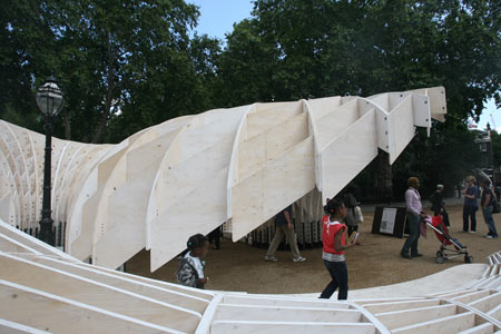
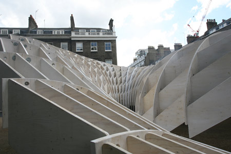
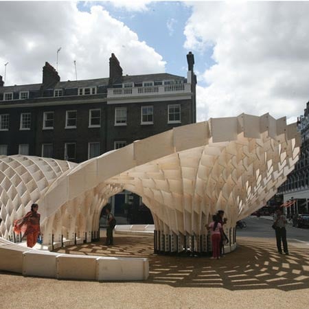
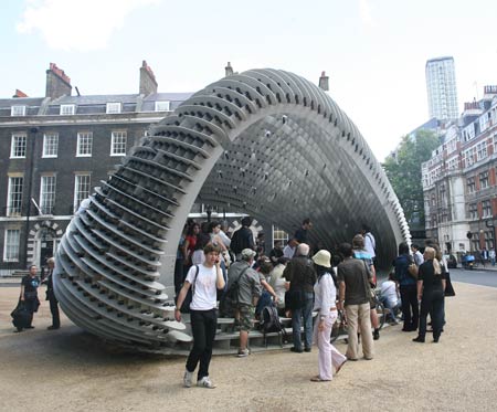
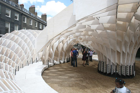
Second and third year architecture students at the Architectural Association school in London have completed this year’s AA Summer Pavilion, called the Swoosh Pavilion.

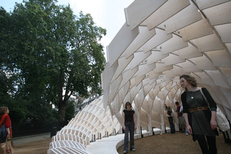
The structure is located outside the AA in Bedford Square and coincides with the London Festival of Architecture, which runs until this weekend.

In what is turning out to be something of a glut of pavilions, Swoosh joins the [c]space Pavilion (above), which is also located in Bedford Square. See our previous story for more info about this one.

Photographs by Richard Green. Here’s a bit of text from the London Festival of Architecture:
–
The Swoosh Pavilion is the 2008 AA Summer Pavilion built annually by the second and third year students of Intermediate Unit 2 tutored by Charles Walker and Martin Self. For the students who conceive, design and construct the pavilion it’s a phenomenological exercise, going from idea to design and finally realization.


–
Posted by Rose Etherington


July 15th, 2008 at 9:54 am
is this geometrical effort (money, time, construction calculation) for what?
July 15th, 2008 at 10:56 am
I’ve seen CAD Cam designs that don’t even come close to measuring up with this project, especially from 2nd and 3rd year students. The scale seems considerably appropriate and the form of the egg crate is far more expressive, stimulating, and useful when compared to most digital design projects.
Well done.
July 15th, 2008 at 12:17 pm
buff enough
July 15th, 2008 at 1:00 pm
I really like this - it looks different from all angles! At times I was thinking snake skin scales, others crochet… It’s very evocative. Like the little girls in the first picture I just want to touch it and climb on it!
July 15th, 2008 at 1:52 pm
very nice
July 15th, 2008 at 2:08 pm
very nice sharp edges! dont blink when walking,
just stare from a distance and lust on its beauty. visually engaging, bodily disengaging.
July 15th, 2008 at 2:10 pm
….You want to touch and climb on the little girls….?!
July 15th, 2008 at 2:54 pm
money&time wasted…
July 15th, 2008 at 4:23 pm
money, time & construction calculation, NOT WASTED dude, how long your senses can have the opportunity to feel that space and form for real, in real size, not as another project on your hard drive.
maybe you will go, take a look, another look, and admit that is a very good exercise.
remember that this is a pavilion not a office building or another building with a exact purpose.
AND yes, experiments involves money & time.
July 15th, 2008 at 4:51 pm
“how long your senses can have the opportunity to feel that space and form for real, in real size, not as another project on your hard drive. ”
i like these language experiments
July 15th, 2008 at 6:12 pm
Very very nice and creative:::::::::::::::::
July 15th, 2008 at 6:44 pm
MARCOS does not justify spending a euro more on anything outside of the purely functional. He’s probably an engineer enamored with the tried and true calculus of today, which was yesteryears experimentation and wanton money squandering.
July 15th, 2008 at 6:45 pm
Fuller would have balked at such commentary.
July 15th, 2008 at 8:43 pm
great project, truly beautiful. Such a great effort by all the students of complex simplicity.
P.S. Ms Zahaha take notes and stop polluting the world with your ugly buildings…
July 15th, 2008 at 10:09 pm
just afraid that schools are far from the reality. very nice big model but it will be better to show more critics to the reality? or is just advertisemnt for the school?
July 15th, 2008 at 10:13 pm
see ps1 pavillon from work ac
July 15th, 2008 at 10:44 pm
it reminds me of the Siza and Souto de Moura pavillion for the serpentine gallery.
July 15th, 2008 at 11:49 pm
Dont really understand why this pavillion got so much more attention in the press than the space pavillion which just looks so much better in reality. Only problem with both of them is neither of them are going to keep the rain off. . . . .
July 16th, 2008 at 1:00 am
Ha, money and time wasted. You boring tools are banished. Marcos and vvv, go and buy some grey paint together.
July 16th, 2008 at 1:23 am
Ummmm, is it just me or don’t they ALL look the same? Over these years AA has been pushing their students to keep producing these geometries with NO functionality, NO sustainability, NO narrative, NO poetic, NO relation to the users of the space, NO relation to the site, context etc… it is barely a “pretty” structure/sculpture people!
July 16th, 2008 at 1:24 am
Very beautiful.
July 16th, 2008 at 10:01 am
what s up?
July 16th, 2008 at 10:30 am
sam: it’s also to give a chance to the students to explore digital fabrications. afterall, AA’s main job is to educate their students, not the public.
July 16th, 2008 at 11:50 am
i dig this a lot… modern craft… its what architecture is facing in desertion… most of the comtemporary stuffs looks just soo simple and dull… but this one… entertaining and clean… very nice… very very nice… thumbs ups
July 16th, 2008 at 12:06 pm
Seems too heavy and thick. Compare to the ethereal Technicolor Bloom.
July 16th, 2008 at 5:32 pm
It’s an amazing structure you just can’t help yourself from touching it. I spent monday in the sun photographing it, what a joy, pics on my site when feature has been published soon.
July 17th, 2008 at 1:43 pm
Looks like a tech-rip-off of Alvaro Siza’s Serpentine pavilion!
July 18th, 2008 at 12:19 am
form follows money..
July 18th, 2008 at 3:37 am
I like this a lot. Mind opening!! Very sexy.. Maybe it looks like this or that.. But remember folks, these are the works of year 3 and 4 students.. They’ll get better over the years.
July 18th, 2008 at 2:28 pm
Once these guys go out of school they’ll have one of two options: Spend daddy’s money or look for a job and do real usable stuff. Sorry for being a party pooper… but that’s how it is. Oh, you can also change your profession…
July 18th, 2008 at 9:25 pm
good work , id love to see the student projects of those nay saying fannies
July 19th, 2008 at 2:50 pm
The show has begin.
Irrelevant architecture needs show. Needs to impact in the media.
!Look at me look at me !
July 20th, 2008 at 1:30 am
Marcos, it is about CRAFT. Reconnecting designing with making. One mustn’t lose sight of the fact that architecture is MADE by someone. Often a much more interesting person than the DESIGNER. The crartsman is healty and lives outdoor rewarded by the tactile fruits of his labour while the designer clicks his mouse indoor becoming excited by the radiant light of his plasma monitor. Archiecture must have a SOUL. Try to get out more.
July 21st, 2008 at 4:57 pm
finally a coherent feedback
May 27th, 2009 at 3:26 pm
Some people think that architecture students should build useful sheds, but no poetry. I think that students should try utopias for them to be able get to new places in space.